RedTribeLink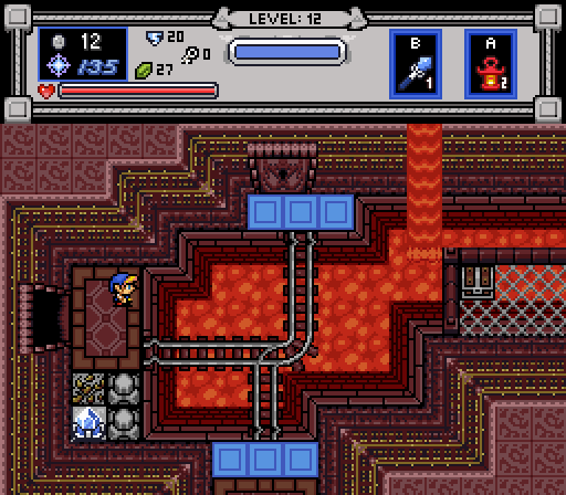
Our hero observes the challenges ahead (and the new subscreen)
Geoffrey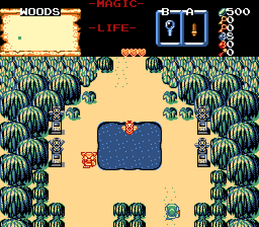
Eggman666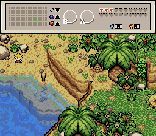
My pretend vacation.. ![]()
![]()
klop422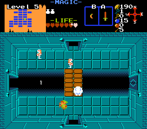
I wonder how to get that key..
Jared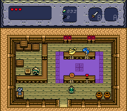
Still not enough...

Screenshot of the Week 628
Started by
Neppy
, Sep 17 2017 09:00 PM
Eggman666 RedTribeLink Geoffrey klop422 Jared
-
 This topic is locked
12 replies to this topic
#1

Neppy
-

- Members
-

Grand Overlord Empress
- Real Name:It's dangerous to go alone. Take Nep!
- Location:Minnesota
Posted 17 September 2017 - 09:00 PM
- Joelmacool likes this
#2
Titanium Justice
-

- Members
-

Justice is served!
- Real Name:Jared
- Location:Ontario
Posted 18 September 2017 - 12:03 AM
Eggman666's shot is very nicely done. The different levels of deepness in the water is an especially nice touch. So yeah, this is getting my vote for the week.
#3
SkyLizardGirl
-

- Banned
-

Unbeknownst to danger we call upon your help
- Real Name:Arianna Crystal Ritter
- Location:Earthia
Posted 18 September 2017 - 12:36 AM
Im only voting for Eggman because of the water thing.
Because I've seen trees/grass/rocks and dirt before.
Edited by SkyLizardGirl, 18 September 2017 - 12:37 AM.
- Matthew likes this
#4
Shane
-

- Moderators
-

💙
- Pronouns:He / Him
- Location:South Australia
Posted 18 September 2017 - 04:49 AM
Im only voting for Eggman because of the water thing.
Because I've seen trees/grass/rocks and dirt before.
And you haven't seen water before? ![]()
I decided to go for what shot feels most engaging to play and looks great and it was either RedTribeLink or Jared for me but I went with Jared because I just love the feel of his screen. It captures the satisfaction of starting a new and exciting adventure and the screen itself looks cozy.
- SkyLizardGirl likes this
#5
Naru
-

- Members
-

Magus
Posted 18 September 2017 - 05:50 AM
RedTribeLink - I have some issues with the tileset and stuff practical floating above the lava, but overall that is a good screen and an awesome subscreen.
Eggman666 - The water looks a bit weird but for ZC it certainly is praiseworthy to achieve such. I also really love the natural feel of it, no brown or green wall-elements at all. Love it.
Klop422 - I am interested in how it is played, seems like you might have some new ideas in mind.
Jared - Love it.
Geoffrey - Voted here, that screen is awesome. Great jungle atmosphere.
- Joaish (RedTribeLink) likes this
#6
klop422
-

- Members
-

Guess I'm full of monsters and treasure
- Real Name:Not George
- Location:Planet Earth
Posted 18 September 2017 - 07:28 AM
Nulled, since I'm in it, but I would have voted Eggman666, because the water looks incredible. Next would probably be RedTribeLink, because this looks like a decently fun dungeon (screen, at least).
- SkyLizardGirl likes this
#7
Sheik
-

- Members
-
Deified
Posted 18 September 2017 - 12:38 PM
Geoffrey's back pulling off symmertrical screen design. : ) ( : .ngised neercs lacitremmys ffo gnillup kcab s'yerffooeG
Edited by Sheik, 18 September 2017 - 12:39 PM.
- Shane, Jared and Matthew like this
#8
SkyLizardGirl
-
- Banned
-
Unbeknownst to danger we call upon your help
- Real Name:Arianna Crystal Ritter
- Location:Earthia
Posted 18 September 2017 - 12:54 PM
And you haven't seen water before?
I decided to go for what shot feels most engaging to play and looks great and it was either RedTribeLink or Jared for me but I went with Jared because I just love the feel of his screen. It captures the satisfaction of starting a new and exciting adventure and the screen itself looks cozy.
Nothing beats awesome water - Even in contests.*
(Water is my element.)
Edited by SkyLizardGirl, 18 September 2017 - 12:55 PM.
- Anthus and Shane like this
#9
Geoffrey
-
- Members
-
Chosen One
Posted 18 September 2017 - 02:46 PM
I would've voted for Eggman had I not been in the contest.That shot doesn't even feel like ZC.
Geoffrey's back pulling off symmertrical screen design. : ) ( : .ngised neercs lacitremmys ffo gnillup kcab s'yerffooeG
Ah, thank you. I do my best. ![]() (: .tseb ym od I .uoy knaht ,hA
(: .tseb ym od I .uoy knaht ,hA
- Sheik and Matthew like this
#10
nicklegends
-

- Contributors
-

Trofessional Pransposer
- Real Name:Ed
- Pronouns:He / Him
Posted 19 September 2017 - 07:39 AM
Voted for Geoffrey for balancing elegance, clarity, and playability. Jared and RedTribeLink split second place in my mind for the same reason. While I adore the colors and setting of Eggman's shot, I think the screen's awkward and non-obvious walkability would would make it tedious to play.
- Adem likes this
#11
Eddy
-

- Moderators
-
ringle
- Real Name:Edward
- Pronouns:He / Him
- Location:London, United Kingdom
Posted 19 September 2017 - 11:04 AM
RedTribeLink - Pretty good dungeon shot here, I really like the custom crystal switch (never seen it in that tileset before). Overall structure looks quite nice and I see we might be using mine carts here, which is pretty cool.
Geoffrey - Very nice clean shot here and quite simplistic too. I don't like the tileset too much, but that's more of a personal preference thing. Very symmetrical too ![]()
Eggman666 - Is this finally not a forest screen? :O Looks quite good actually, maybe a bit too crowded in some parts (middle area especially), but I really like it. The transparent water looks really nice too, though the random shades of blue don't look too well together IMO. I'd probably just use the same kind of blue used on the shoreline throughout.
klop422 - Interesting concept with the key. I assume there will be an animation with the key falling into the pit? That would be quite cool. Other than that, the screen is pretty much your average Z1 shot, so I honestly can't say much at all. I do like the way you combined the doors and the pits though. Also, what's the compass in the subscreen for?
Jared - Cool shop shot. This reminds me a lot of how the Minish Cap done shops, with a guy on the left side and the contents on the right. The screen in general looks great and I like the small additions you added everywhere like the pillars on the wall and the flower to the bottom-left.
Very hard to choose between Eggman and Jared this week, but I'm probably going for Jared this time.
- nicklegends, Shane, Jared and 1 other like this
#12
klop422
-
- Members
-
Guess I'm full of monsters and treasure
- Real Name:Not George
- Location:Planet Earth
Posted 19 September 2017 - 06:37 PM
klop422 - Interesting concept with the key. I assume there will be an animation with the key falling into the pit? That would be quite cool. Other than that, the screen is pretty much your average Z1 shot, so I honestly can't say much at all. I do like the way you combined the doors and the pits though. Also, what's the compass in the subscreen for?
I mean, I don't have an animation for it now, though I may try and implement it now that you mention it. Not sure how that'd work, though, based on how the room's puzzle is supposed to be solved:
Spoiler
The compass in the subscreen was put there because there was space, and also because some NPCs give directions in terms of North, South, East, and West, and I thought it'd be helpful. I'm not good with East and West myself.
Edited by klop422, 19 September 2017 - 06:37 PM.
- Eddy likes this
#13
Neppy
-
- Members
-
Grand Overlord Empress
- Real Name:It's dangerous to go alone. Take Nep!
- Location:Minnesota
Posted 24 September 2017 - 09:58 PM
With 52.17% of the vote, the winner of Screenshot of the Week 628 is Eggman666!
My pretend vacation.. ![]()
![]()
Congrats!!
Voting totals:
- RedTribeLink - 6 votes [13.04%]
- Geoffrey - 8 votes [17.39%]
- Eggman666 - 24 votes [52.17%]
- klop422 - 2 votes [4.35%]
- Jared - 6 votes [13.04%]
Also tagged with one or more of these keywords: Eggman666, RedTribeLink, Geoffrey, klop422, Jared


1 user(s) are reading this topic
0 members, 1 guests, 0 anonymous users

