I wouldn't say that SkyLizardGirl is being rude, but rather she just needs to elucidate and clarify her post. Thankfully, she clarified her comment for me, and I understood what she said after the clarification.no thanks.
Can you please stop being rude to people? I mean some people want to hear stuff that makes their pictures look better, not things that annoy them. Just give some tips next time! Just sayin'.
And also just so you know, saying the tileset i used in the shot is not good criticism... its not a good compliment too.

Screenshot of the Week 492
Started by
The Satellite
, Jan 25 2015 09:37 PM
Shane DaviAwesome Demonlink Avataro joelmacool12 Octorockoncrack Mudkipz
-
 This topic is locked
25 replies to this topic
#16

David
-

- Administrators
-

Fallen leaves... adorn my night.
- Real Name:David
- Pronouns:He / Him
Posted 27 January 2015 - 01:05 PM
- Demonlink likes this
#17
Nathaniel
-

- Members
-

Deified
Posted 27 January 2015 - 03:25 PM
Generally speaking, this is a pretty good week. They are all screens I would love to play if that was possible. Nothing stands out as bad, but some clearly shine more than others.
Shane - Looks very good to me. It's very well designed, with a great sense of proper detail. What prevents my vote is that it looks similar to a lot of screens I have seen lately, many from you. Firebird has been a hot item for months now, and for all the right reasons, but like anything popular, it will have its up and down times for me. That's not a bad thing, but when it comes to voting for a #1, that might prevent it for me.
DaviAwesome - Very nice screen that mostly sticks to the main tLoZ classic guns, even without recoloring. Not my favorite screen among the selections, but I would certainly play it.
Demonlink - A very nice screen, and very nice work with the darkening effect of trees that are off camera, which was very clearly on purpose. I like little stuff like that. Sometimes what you don't directly see can have a good effect. My second favorite of the bunch.
Avataro - I do like these color choices. Somewhat earthy, and thus not overwhelming to the eyes. Ground detail is a bit on the basic side, but it's certainly acceptable. I also like items that tease you with their presence, as you have with the cross. Easy to see where it is, but not necessarily easy to obtain.
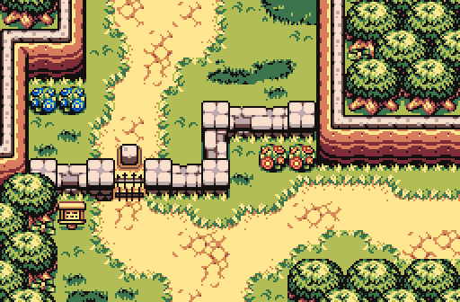
Joel - Very similar to Shane's screen obviously with the tileset, but not quite as attractive in comparison. Don't be afraid to have trees that are partially shown on the upper edge of the screen, which you certainly worked in for the other three edges. But that could be bushes, which isn't clear to me outside of the log, considering it's all barely there, but knowing what's in the next screen up would very easily answer that question. I'm also not sure where you are going with that fence on the right side. If it serves a purpose, it's probably not seen until you move over another screen. So that isn't exactly a criticism, I suppose.
Octorockoncrack - Not bad, but it does feel a bit overdone to me, as if it's trying too hard to be detailed, like trying to win a game of darts by simply throwing more darts, rather than working on overall methodology. Seeing five types of trees (combining both color and features) scattered on one screen is probably the main culprit of that, adding that there are so many of them while fitting in plenty of other elements, thus understanding that it's a transition screen. While I do like the leaves and flowers on the ground, they don't seem to fit the best with your choice of trees and their layout. To know what works best in that regard probably just requires more playing around. I'd certainly think removing some trees and one or two types could start to help improve the screen. Also, some of the trees are on solid stone. I'm not sure how that works. Finally, a level entrance or similar hot spot combined with a biome transition is probably hard to pull off in general, especially for small ZC screens. I think the general idea behind the screen is good, but what I question is the execution of it all. It seems to be trying to do more than it really should.
Mudkipz - Ooh, a sidescroller interior among a group of overhead overworld screens! Easily wins in the unique category for this week. But that alone is not enough to get a vote out of me, so my discussion doesn't end yet. I find that many sidescroller screens have a bad habit of ignoring the beauty of background details, such as leaving them as just solid black, but this one is certainly not the case. I absolutetly adore the background bricks, and even the background torches, indicating they exist, but are far enough away to not dominate the spotlight (pun intended). It shows that even a sidescroller can do well to simulate the inactive third dimension. The screen also does remind me a little of the very first Metroid game when Samus receives her first missiles, and I think that is what you were driving at in your caption. Plus using Zelda game enemies to try to simulate Metroid enemies. That is pure awesomeness. This screen easily wins for me.
- Rambly, Shane, Avaro and 2 others like this
#18
SkyLizardGirl
-

- Banned
-

Unbeknownst to danger we call upon your help
- Real Name:Arianna Crystal Ritter
- Location:Earthia
Posted 27 January 2015 - 11:38 PM
no thanks.
Can you please stop being rude to people? I mean some people want to hear stuff that makes their pictures look better, not things that annoy them. Just give some tips next time! Just sayin'.
And also just so you know, saying the tileset i used in the shot is not good criticism... its not a good compliment too.
Just be happy with what you got kiddo. *
I'm not going to just make things up about screenshots unless i know for sure. I get tired of making up excuses at times you won't feel happy with anyway.
So i'll just say very little, because i don't want to hurt you joelmacool12 or any of the others here for that matter.
If i say very little it just means nothing, 'you are just assuming things. You have plenty of people commenting on you already, what more needs to be even said?
Edited by SkyLizardGirl, 28 January 2015 - 01:38 AM.
#19
The Satellite
-

- Members
-
May the way of the Hero lead to the Triforce.
- Real Name:Michael
- Pronouns:He / Him
Posted 28 January 2015 - 12:18 AM
Alright, calm down everyone. While yes, it's nice to give constructive feedback, there's no rule saying you must give detailed feedback. There's no need to get at each other's throats over it. Also, as a reminder, try not to be condescending towards other members. Let's just let the contest play out, shall we?
- Joelmacool, TheLegend_njf and David like this
#20
Shane
-

- Moderators
-

💙
- Pronouns:He / Him
- Location:South Australia
Posted 28 January 2015 - 01:00 AM
Shane - Looks very good to me. It's very well designed, with a great sense of proper detail. What prevents my vote is that it looks similar to a lot of screens I have seen lately, many from you. Firebird has been a hot item for months now, and for all the right reasons, but like anything popular, it will have its up and down times for me. That's not a bad thing, but when it comes to voting for a #1, that might prevent it for me.
Fair enough, I can understand where you are coming from. All my screens as of late have been from actual projects (Lost Historia and a Firebird one), so I guess that explains the similarities? I'm deeply sorry if my style is getting old however for Screenshot of the Week... hopefully I can move onto some creative environments.
- Avaro and Aevin like this
#21
Joelmacool
-

- Moderators
-
Addicted to Overwatch
- Real Name:Joel
- Location:Country of Europe
Posted 28 January 2015 - 10:39 AM
Alright, calm down everyone. While yes, it's nice to give constructive feedback, there's no rule saying you must give detailed feedback. There's no need to get at each other's throats over it. Also, as a reminder, try not to be condescending towards other members. Let's just let the contest play out, shall we?
ok.
#22
Theryan
-

- Members
-

Burrito
Posted 28 January 2015 - 02:02 PM
Charizard - Pretty solid Firebird shot. People, including yourself, have commented on the switch gate thing already, so I don't need to say more about that.
DaviJonesAwesome - Decent classic shot. Does the hammer peg in the top left have any purpose?
Angellink - It seems like a pretty good screenshot, but it's honestly too dark for me to really be able to tell what's happening.
MasterOfAllFourElementso - I like the purple mountains' majesty and the odd environmental features.
joelmawarm - My biggest complaint is that the top treeline is perfectly straight across the top of the screen. Looks unnatural.
Octorockonbathsalts - The colors are a little too saturated for my taste. I would suggest changing the palette up a bit, maybe add just a tiny pinch of light to the outline color.
Mudslide - Interesting sidescroller concept, very Metroidy.
Ultimately I picked Shane, but a great turnout this week with great quality all around. Way to go, guys!
- Shane, Avaro and Demonlink like this
#23
Nathaniel
-
- Members
-
Deified
Posted 28 January 2015 - 02:06 PM
Fair enough, I can understand where you are coming from. All my screens as of late have been from actual projects (Lost Historia and a Firebird one), so I guess that explains the similarities? I'm deeply sorry if my style is getting old however for Screenshot of the Week... hopefully I can move onto some creative environments.
I hope the things I have said don't discourage you in any way, as that certainly isn't my intention. I am not completely sure what vibe you got from what I said, so I'll at least state that for the record. I do wish you great success on your projects. A screenshot contest is of course secondary to that. And even if something feels old, there are rejuvenations too. It's nice to see people using SotW to show off something that might lead to a finished quest, whether those screens win SotW or not. I think I remember Shoelace saying how he submitted many screenshots from Hero of Dreams back when he was working on it, and not a single one of them won a contest. Still goes to show how the actual project turned out. Win or not win, it's good to see what people are doing. It's nice to see other stuff too as well, as experimentation and creativity should never be discouraged. I wouldn't be surprised if many people here have files lying around that are just there for practice or for messing around. Sometimes messing around leads to great ideas.
- Rambly, nicklegends, Shane and 3 others like this
#24
David
-
- Administrators
-
Fallen leaves... adorn my night.
- Real Name:David
- Pronouns:He / Him
Posted 28 January 2015 - 03:40 PM
DaviJonesAwesome - Decent classic shot. Does the hammer peg in the top left have any purpose?
It's actually a step secret tile, so that when you step on the "hammer peg" it removes the rock that blocks the path on the top-right. At this stage of the game it would be obvious that it is a step tile, but obviously, this is a single screen posted on SotW with no context to the other parts of the quest and I realize that I didn't make that very clear in the screenshot, so it makes sense that you (and probably others) would be confused about the hammer peg. In any case, thanks for the comment! ![]()
#25
Shane
-
- Moderators
-
💙
- Pronouns:He / Him
- Location:South Australia
Posted 28 January 2015 - 10:48 PM
I just want to say I didn't feel discouraged in any way, so don't worry at all. You made a valid point that I agree with. I hope I can get to some areas that aren't field in the future so I can showcase them. I agree that my design philosophy is a little predictable by now, but I think that's a good sign to making a overworld with good consistency.I hope the things I have said don't discourage you in any way, as that certainly isn't my intention. I am not completely sure what vibe you got from what I said, so I'll at least state that for the record. I do wish you great success on your projects. A screenshot contest is of course secondary to that. And even if something feels old, there are rejuvenations too. It's nice to see people using SotW to show off something that might lead to a finished quest, whether those screens win SotW or not. I think I remember Shoelace saying how he submitted many screenshots from Hero of Dreams back when he was working on it, and not a single one of them won a contest. Still goes to show how the actual project turned out. Win or not win, it's good to see what people are doing. It's nice to see other stuff too as well, as experimentation and creativity should never be discouraged. I wouldn't be surprised if many people here have files lying around that are just there for practice or for messing around. Sometimes messing around leads to great ideas.
But yeah, don't worry too much about it.
Edited by Shane, 28 January 2015 - 10:49 PM.
#26
The Satellite
-
- Members
-
May the way of the Hero lead to the Triforce.
- Real Name:Michael
- Pronouns:He / Him
Posted 01 February 2015 - 05:02 PM
With 32.08% of the vote, the winner of Screenshot of the Week 492 is Shane!
Congratulations!
Voting totals:
- Shane (17 votes [32.08%])
- DaviAwesome (1 votes [1.89%])
- Demonlink (10 votes [18.87%])
- Avataro (3 votes [5.66%])
- joelmacool12 (3 votes [5.66%])
- Octorockoncrack (5 votes [9.43%])
-Mudkipz (14 votes [26.42%])
Also tagged with one or more of these keywords: Shane, DaviAwesome, Demonlink, Avataro, joelmacool12, Octorockoncrack, Mudkipz
PureZC Events →
Screenshot of the Week →
Poll Screenshot of the Week 812Started by Taco Chopper , 15 Apr 2024 |
|

|
||
 |
Matthew
PureZC Events →
Screenshot of the Week →
Poll Screenshot of the Week 811Started by Taco Chopper , 01 Apr 2024 |
|

|
|
PureZC Events →
Screenshot of the Week →
Poll Screenshot of the Month 200Started by Taco Chopper , 01 Apr 2024 |
|
|
||
|
|
Shane
PureZC Events →
Screenshot of the Week →
Poll Screenshot of the Week 810Started by Taco Chopper , 20 Mar 2024 |
|
|
|
|
|
Moosh
PureZC Events →
Screenshot of the Week →
Poll Screenshot of the Month 195Started by Taco Chopper , 04 Sep 2023 |
|
|
0 user(s) are reading this topic
0 members, 0 guests, 0 anonymous users

