Demonlink
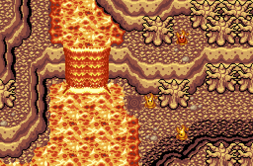
Meh, another preview of what will be in my DoR Hybrid Tileset!
Benji
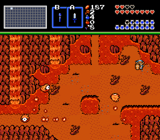
Ah, gotta love the smell of lava in the morning!
anikom15
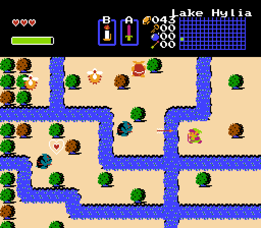
My humble little grove of love.

 This topic is locked
May the way of the Hero lead to the Triforce.

Posted 16 March 2014 - 10:39 PM
Demonlink
Meh, another preview of what will be in my DoR Hybrid Tileset!
Benji
Ah, gotta love the smell of lava in the morning!
anikom15
My humble little grove of love.
Hero of Time

Posted 16 March 2014 - 10:42 PM
Demonlink: The overall screen design is decent, but the color scheme is a bit bright.
Benji:
"Ah, gotta love the smell of lava in the morning!"
Do I?
Anikom15: Simplicity works best this week, so I voted here.
💙

Posted 16 March 2014 - 10:45 PM
Purple Link.
And sword.
Edited by Charizard, 16 March 2014 - 10:46 PM.
My name is NOT Jason!

Posted 16 March 2014 - 11:38 PM
You're fired anikom15....btw I voted for you.
Legend

Posted 17 March 2014 - 12:09 AM
Demonlink: Looks good, But I see enough DoR shots all over the place and it gets old after awhile, But I do like how the lava looks. (Rank C)
Benji: This is the best shot ever, (Rank A+++) Voted here.
anikom15: Looks like simple classic shot. Simple in a way it stands out in a good way. (Rank B+)
Hero of Time
Posted 17 March 2014 - 12:20 AM
Benji: This is the best shot ever, (Rank A+++) Voted here.
Wouldnt say the best/
Edited by Jacques, 17 March 2014 - 12:21 AM.
Legend
Posted 17 March 2014 - 12:22 AM
Wouldnt say the best/
Why not? Its mine and I can say its the best. ![]()
💙
Posted 17 March 2014 - 12:25 AM
There's nothing wrong with seeing several DoR shots much as there's no problem seeing two classic shots in the same contest. I don't think that's a problem with the screen itself. I'm kinda tired with this type of "criticism". Plus, it's not DoR. It's DoR Hybrid. ![]()
Anyway, critique time:
Demonlink: Yeah, your tileset seems to be progressing quite nicely. The palette is a little pale and dull, and the screen is too orange and brown. But I love the design and atmosphere going on. The lava edges could use more darker colours, too. Came close second.
Benji: Looks alright, nothing else. like Demonlink's, it just focuses on one colour. Some of the branch/root tiles are too close to the edge too. Design is fine, I suppose.
anikom15: Wow, several colours on the screen... What is this!? Love the design; simplistic and straight to the point and feels unique without trying hard. Also dat purple cset. Gotta love purple! The only thing you could work on is a bit of ground detailing.
Edited by Charizard, 17 March 2014 - 12:29 AM.
~V@LîΣÑTLîÑK~

Posted 17 March 2014 - 12:30 AM
Voted Benji. Just felt very abstract. Just felt very busy and the HUD design gave me the impression of a difficult late game area.
Dictator

Posted 17 March 2014 - 02:46 AM
Demonlink
I don't know if this is Venom from Star Fox or the horrible results of a burrito from Taco Bell. Regardless, what is going on with this palette? I mean it seems like it's brighter than the surface of Venus.
Benji
Hey, I love daylight white balance, so the red look is awesome, but can't there be some various shades of red in there? The design itself is pretty good though. I'm digging the lavafalls.
anikom15
Okay first of all your subscreen is all messed up. Why is the map on the right side? Now, this screen has a lot of problems, but I'm just going to point out the big ones. First of all look at the colors. Are you color blind or something? Do you realize that you are mixing green and brown trees TOGETHER ON ONE SCREEN?! What the heck is wrong with you? And what's with Link? Why is he all purple? He looks like he came straight out of Candy Land. Oh yeah, way to break rule number one of screen design: no open corners. It's like you're not even trying. I understand having some difficulty when you're just starting out, but when you blatantly disregard other people's advice and continually upload lousy screenshots, you really have some kind of problem.
Also what's up with the heart container piece? Way to spoil the quest.
Hero of Time
Posted 17 March 2014 - 02:56 AM
anikom15
Okay first of all your subscreen is all messed up. Why is the map on the right side? Now, this screen has a lot of problems, but I'm just going to point out the big ones. First of all look at the colors. Are you color blind or something? Do you realize that you are mixing green and brown trees TOGETHER ON ONE SCREEN?! What the heck is wrong with you? And what's with Link? Why is he all purple? He looks like he came straight out of Candy Land. Oh yeah, way to break rule number one of screen design: no open corners. It's like you're not even trying. I understand having some difficulty when you're just starting out, but when you blatantly disregard other people's advice and continually upload lousy screenshots, you really have some kind of problem.
Also what's up with the heart container piece? Way to spoil the quest.
In my opinion, it's the best shot I've ever seen in a while. A+++
RESPECT DA OBOE SOLO

Posted 17 March 2014 - 08:38 AM
PINK
'proceeds to vote for anikom
ringle

Posted 17 March 2014 - 11:09 AM
Voted for Benji's screenshot this week. It looks very fitting for a lava area, and I just generally love the look of the screen.
Lurking in the shadows...

Posted 17 March 2014 - 11:24 AM
Demonlink
I don't know if this is Venom from Star Fox or the horrible results of a burrito from Taco Bell. Regardless, what is going on with this palette? I mean it seems like it's brighter than the surface of Venus.
o_o

Posted 17 March 2014 - 11:27 AM
0 members, 0 guests, 0 anonymous users