QUOTE(CastChaos @ Oct 30 2007, 07:00 AM)

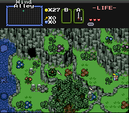
Looks good. However, where the player goes to the lower elevation area, there isn't a slope. I made those curved mountains to represent a slope. I do that at many places.
Personally, I don't like the way it looks, partially because you have one rock face directly up against another rock face. However, I CAN tell what it's supposed to be.
So, if you don't change that, at LEAST change the point where the ridge meets the wall. Some things are up to interpretation, but as the person who drew those tiles, I insist: that part is dead wrong. You want it to look deeper than the surrounding area, but it's not, because the cave is at the exact same height as the rest of the area.
QUOTE(CastChaos @ Oct 30 2007, 07:00 AM)
You didn't say the word "simmetry", but removing the layered rocks and such would make it more symmetric.
If you want to put rocks on top of other things, the best way to do it is to edit the tiles. Layering transparent versions of objects is a shortcut which doesn't always look good. Anyway, what you're trying to do is increase the variety of the tiles you're working with. If you don't have enough variety, your screens can look repetitive. But if your screen looks repetitive, it's not always the tiles' fault.
I realize tile space is limited...one way to fight this is to sort through and look for tiles that are not in use to delete. Another is to make as much use of the Flip combo function as possible. Just two ideas...
QUOTE(CastChaos @ Oct 30 2007, 07:00 AM)
And... after Mt.Death collapsed, there WERE correct demolished land layout, (you will see it in the game as scenes), but Vaati plays around for a certain reason with the terrains, magically changing everything. Technically, it means that every time somebody points out an error, I blame Vaati.
Sorry, but this really sounds like an easy cop-out to any design problem.

For some people it will seriously challenge their suspension of disbelief.
QUOTE(Nuvo @ Oct 30 2007, 09:38 AM)
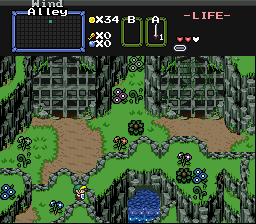
Well, I actually didn't even start with the DoR tileset. It started out as a pure styled quest anyway, you would have known if you saw the early shots of the tileset... I probably actually should use the DoR dirt as the main dirt. I have it in the quest, it's just my underwater dirt... and about the dirt pattern, well, the left dirt is actually a conveyor belt, and I haven't taken the time to put in other dirt combos that are conveyor belts. And where the dirt meets the mountain, well, I probably should do all of that. Way to point all of my laziness Radien.
Ah, I see. I personally don't see it as underwater dirt, but whatever works for you.
It's often hard to tell what tileset was used as a base when someone starts ripping tiles, palettes, and Link sprites in from other tilesets. I find that I usually use DoR Link to identify my tileset, because his CSet is distinctive. However, it's working less and less often, as people rip that CSet into other tilesets along with the Link tiles... even though Dart's Minish Cap Advance Link has a palette which probably suits most non-DoR tilesets better than DoR CSet 6.

Anyway, sorry to notice the little things; it's habit.

You might be able to get away with not editing the tiles if you are careful with how you lay combos. Sometimes it's actually easier to edit the tiles, though... it's a hard call to make.
QUOTE(Nuvo @ Oct 30 2007, 09:38 AM)
My only problem with the DoR dirt is that it has a noticeable tile pattern when coated along the ground. So I'll have to do some editing.
Well, you don't have to use DoR dirt, but if you do, I've noticed the problem you've mentioned and have attempted to address it. Take the second tile in this screenshot and scatter it on dirt screens to lessen that noticeable pattern:
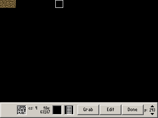
(This will be in version 1.2, of course.)
QUOTE(Nuvo @ Oct 30 2007, 09:38 AM)
I really like those rickety-looking platforms.

.

 This topic is locked