 This topic is locked
in evans forest i dont like the colors! or make than a cloudy sky. than its mystical!

Screenshot of the Week 182
Started by
Teilyr
, Oct 27 2007 07:44 PM
49 replies to this topic
#16

mudvayne
-

- Members
-

Junior
- Real Name:Pascal
- Location:switzerland
Posted 29 October 2007 - 11:50 AM
i vote for joes forest! i like this forest! i want to hear the sound, for this forest! 
in evans forest i dont like the colors! or make than a cloudy sky. than its mystical!
in evans forest i dont like the colors! or make than a cloudy sky. than its mystical!
#17
Joe123
-

- Members
-

Retired
Posted 29 October 2007 - 12:16 PM
If you want to hear the sound, there's a video of the intro to my quest with that forest in in my signature. The sound quality there is awful though I'm afraid.
I'm using the 'Minish Woods' theme for the forest.
I'm using the 'Minish Woods' theme for the forest.
#18
Titanium Justice
-

- Members
-

Justice is served!
- Real Name:Jared
- Location:Ontario
Posted 29 October 2007 - 03:13 PM
Nuvo
I love those graphics,the mossy canyons
almost remind me of places i have hiked
and that cage like structure is very cool
Evan the great
A love it for the fact of being minish cap
but i dont like the green colour its somewhat teal
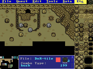
CastChaos
Not realy what i expected for the inverted world.
i dont like the little hill behind those rocks link is standing in front of
the,the canyons are a little too diagonal and there is a grey rock placed
there,and whats with that blue bush it stands out from everthing else in
the scene,also that yellow rock is way too close to the edge.
but overall you got everything built right.
Joe123
Those treetop leaves block too much of the screen
thats pretty much the only problem with it,you do have
a great selection of trees
Aribar
 I take back what i said about CC's canyons being
too diagonal because making both those canyons
diagonal and close too each other like that makes
the scene look like its indoors also its too blank in
the grass area's
Plissken
I absolutely love it!!
everything it perfect
,but are those enemys actually real?
TriMaster001
Reminds me of Hyrule Castle(Zelda 3)
Great layout but some of the stuff is hidden
behind those huge wall things and the canals
look like they cut off everthing,else is built great.
-----------------------------
My vote will be either Nuvo or Plissken i just need to decide
I love those graphics,the mossy canyons
almost remind me of places i have hiked
and that cage like structure is very cool
Evan the great
A love it for the fact of being minish cap
but i dont like the green colour its somewhat teal
CastChaos
Not realy what i expected for the inverted world.
i dont like the little hill behind those rocks link is standing in front of
the,the canyons are a little too diagonal and there is a grey rock placed
there,and whats with that blue bush it stands out from everthing else in
the scene,also that yellow rock is way too close to the edge.
but overall you got everything built right.
Joe123
Those treetop leaves block too much of the screen
thats pretty much the only problem with it,you do have
a great selection of trees
Aribar
too diagonal because making both those canyons
diagonal and close too each other like that makes
the scene look like its indoors also its too blank in
the grass area's
Plissken
I absolutely love it!!
everything it perfect
,but are those enemys actually real?
TriMaster001
Reminds me of Hyrule Castle(Zelda 3)
Great layout but some of the stuff is hidden
behind those huge wall things and the canals
look like they cut off everthing,else is built great.
-----------------------------
My vote will be either Nuvo or Plissken i just need to decide
#19
Dawnlight
-

- Members
-
My name is NOT Jason!
- Real Name:Justin
- Location:Chicago, IL
Posted 29 October 2007 - 03:17 PM
No Votes  .
.
#20
The Satellite
-

- Members
-
May the way of the Hero lead to the Triforce.
- Real Name:Michael
- Pronouns:He / Him
Posted 29 October 2007 - 03:25 PM
Your shot is a symmetrical shot with not alot of stuff going on. That tends to draw away votes. 
#21
Dawnlight
-
- Members
-
My name is NOT Jason!
- Real Name:Justin
- Location:Chicago, IL
Posted 29 October 2007 - 03:36 PM
#22
Aslion
-

- Members
-
End Fascism
- Real Name:Ryan
- Location:Plug One's spectacles
Posted 29 October 2007 - 06:03 PM
Nulled.
Nuvo - We've seen your mountains enough already.
Evan - generic forest shot, not liking the pallet
CastChaos - Just a generic shot
Joe123 - I can't even tell what's going on.
Aribar - Just plain old looks bad, sorry
Plissken - I dunno. I guess I just don't like it. But it looks fun.
TriMaster - What The Satellite said.
#23
Colin
-

- Members
-
Coblin the Goblin
Posted 29 October 2007 - 06:25 PM
QUOTE(gray0x @ Oct 29 2007, 05:03 PM) 
Nuvo - We've seen your mountains enough already.
... It's not exactly the mountains that I'm showcasing... are two 4x4 custom fans and a stream of water accompanied by waterfalls(which are really what I'm showing off in here) not enough to call it new?
Edited by Nuvo, 29 October 2007 - 06:26 PM.
#24
Aslion
-
- Members
-
End Fascism
- Real Name:Ryan
- Location:Plug One's spectacles
Posted 29 October 2007 - 07:15 PM
QUOTE(Nuvo @ Oct 29 2007, 06:25 PM)
... It's not exactly the mountains that I'm showcasing... are two 4x4 custom fans and a stream of water accompanied by waterfalls(which are really what I'm showing off in here) not enough to call it new?
Still feels like the same thing though
#25
Evile
-
- Members
-

Dolphinslayer
Posted 29 October 2007 - 10:57 PM
QUOTE(gray0x @ Oct 29 2007, 04:03 PM)
Nulled.
Nuvo - We've seen your mountains enough already.
Evan - generic forest shot, not liking the pallet
CastChaos - Just a generic shot
Joe123 - I can't even tell what's going on.
Aribar - Just plain old looks bad, sorry
Plissken - I dunno. I guess I just don't like it. But it looks fun.
TriMaster - What The Satellite said.
Wow, you could at least give some comments on how to improve these shots instead of just saying you don't like it...
#26
Radien
-

- Members
-
Courage
- Real Name:Steve
- Location:Oregon
Posted 30 October 2007 - 12:58 AM
Nuvo:
I like the propellors, but that grating just looks... odd. The colors feel like they're bleeding into eachother, and I wasn't originally sure what I was looking at.
Am I right in thinking that you ripped LTTP dirt INTO the DoR tileset? I have to say I'm a little insulted. I can understand if DoR dirt (which is actually FF5 dirt) is not to your liking, but LTTP dirt is just light brown with a squiggle pattern on it. The dirt on the right looks better, because the squiggle pattern is less obvious. I say draw your own squiggle pattern... *anyone* could do better than LTTP dirt, and I know you can draw.
Also, I see some places where grass borders meet mountains that don't look very good. Best do some tile editing or change your layout method.
Evan the Great:
Looks very good, but I'm not fond of the palette. the contrast between the two darkest colors and the rest of the palette is too much. It makes the lighting look wrong. Speaking of which, the translucencent light beams look weird. Perhaps the colors used in the tiles are not bright enough. Sunbeams only look good in ZC if they're close to pure white, because ZC only has one blend method for translucent layers, and it's rather unforgiving to shadows and beams of light.
However, for tiles and screen design, Evan's is the best entry.
CastChaos:
Agh... this... is a mess all right. The mountains below and to the sides of Link are horribly misused. You're using two different types of grass borders on the same screen. A boulder on the south edge of the screen is perched in a position from which it should fall. The brown grass tufts look wrong (individual tufts are rarely a different color from the rest of the grass). The blue bush is too rich-colored for a palette this dark and drab. And all the stuff that's on layer 1 just looks out of place -- when you layer something over grass, you lose the shadow and the indentation, which looks awkward and shouldn't be used unless totally necessary.
On top of that, the walk flags look like a nightmare. It's very hard to tell, at a glance, where you can walk to get around simple objects. As for where Link appears outside the cave: I know those boulders next to Link are "Pound" combos, but if the player tries out a bomb, there's no way for it to go off without being hit, which defies logic since you're not "trapped." Anyway, you've made some good screens in DoR, but this isn't one of them.
Joe123:
I like all the elements here, and your custom edits, but the obscured portions make this screen look a bit awkward. Making forest screens is tough since you have to make them look natural without looking random. I suggest sticking with a few elements and placing them carefully, and pulling the leafy canopies back a bit.
Overall, though, it's fairly good, and I'd like to point out to everybody that Joe's included his version of the "Mystery Tree" from the Oracle games, which he's been so nice as to draw into LTTP perspective, similar to DoR's other trees.
Aribar:
Whereas many screens are too cluttered, this one is nice but too sparse. Keep at it, though. Perhaps a few more enemies are in order.
The ravine has two problems I can see:
1. It's too narrow. It'll be awkward if Link ever goes down there, thanks to ZC's lack of diagonal walk flags.
2. The north ridge is half as tall as the south ridge. Taking perspective into account, it should be one combo taller than it is.
Plissken:
This is the most attractive entry... HOWEVER... the lack of a subscreen, the oversized main character and enemies, and the lack of any battle elements suggests that it is a mock-up screenshot taken in ZQuest, and that those sprites are actually all combos assigned to the screen permanently.
I don't like mock-ups, because they aren't an accurate representation of what your quest looks like. Make it work in ZC before you show it off, please. Mock-up enemies and player sprites are one step away from "fake."
TriMaster001:
Hmm. This screen looks cramped. Those barriers may be handy, but they're very big, and they obscure a bit too much, visually. I recommend using something narrower. Even Minish Cap often uses simple 16x16 pixel blocks to divide parts of a room.
Also, I'm sick of seeing floor borders in areas so narrow that there's no actual floor...only border. Don't do that. It's not correct. LTTP is one of the only Zelda games whose graphics use floor borders, and it did NOT use them that way. Floor borders aren't intended to border every object on a screen, they're intended to separate different types of floor and to border wire mesh floors and perhaps pits.
Bones on wire grating works, but only if you don't overuse it. In real life, bones would disintegrate and fall between the cracks after awhile, so only the most recent bones would be fresh enough to sit on top. (Gah, so morbid to think about...)
I vote for Evan for having the best screen design, some action happening, and a very nice mix of tiles. Not fond of the palette, but it's a relatively small problem.
I like the propellors, but that grating just looks... odd. The colors feel like they're bleeding into eachother, and I wasn't originally sure what I was looking at.
Am I right in thinking that you ripped LTTP dirt INTO the DoR tileset?
Also, I see some places where grass borders meet mountains that don't look very good. Best do some tile editing or change your layout method.
Evan the Great:
Looks very good, but I'm not fond of the palette. the contrast between the two darkest colors and the rest of the palette is too much. It makes the lighting look wrong. Speaking of which, the translucencent light beams look weird. Perhaps the colors used in the tiles are not bright enough. Sunbeams only look good in ZC if they're close to pure white, because ZC only has one blend method for translucent layers, and it's rather unforgiving to shadows and beams of light.
However, for tiles and screen design, Evan's is the best entry.
CastChaos:
Agh... this... is a mess all right. The mountains below and to the sides of Link are horribly misused. You're using two different types of grass borders on the same screen. A boulder on the south edge of the screen is perched in a position from which it should fall. The brown grass tufts look wrong (individual tufts are rarely a different color from the rest of the grass). The blue bush is too rich-colored for a palette this dark and drab. And all the stuff that's on layer 1 just looks out of place -- when you layer something over grass, you lose the shadow and the indentation, which looks awkward and shouldn't be used unless totally necessary.
On top of that, the walk flags look like a nightmare. It's very hard to tell, at a glance, where you can walk to get around simple objects. As for where Link appears outside the cave: I know those boulders next to Link are "Pound" combos, but if the player tries out a bomb, there's no way for it to go off without being hit, which defies logic since you're not "trapped." Anyway, you've made some good screens in DoR, but this isn't one of them.
Joe123:
I like all the elements here, and your custom edits, but the obscured portions make this screen look a bit awkward. Making forest screens is tough since you have to make them look natural without looking random. I suggest sticking with a few elements and placing them carefully, and pulling the leafy canopies back a bit.
Overall, though, it's fairly good, and I'd like to point out to everybody that Joe's included his version of the "Mystery Tree" from the Oracle games, which he's been so nice as to draw into LTTP perspective, similar to DoR's other trees.
Aribar:
Whereas many screens are too cluttered, this one is nice but too sparse. Keep at it, though. Perhaps a few more enemies are in order.
The ravine has two problems I can see:
1. It's too narrow. It'll be awkward if Link ever goes down there, thanks to ZC's lack of diagonal walk flags.
2. The north ridge is half as tall as the south ridge. Taking perspective into account, it should be one combo taller than it is.
Plissken:
This is the most attractive entry... HOWEVER... the lack of a subscreen, the oversized main character and enemies, and the lack of any battle elements suggests that it is a mock-up screenshot taken in ZQuest, and that those sprites are actually all combos assigned to the screen permanently.
I don't like mock-ups, because they aren't an accurate representation of what your quest looks like. Make it work in ZC before you show it off, please.
TriMaster001:
Hmm. This screen looks cramped. Those barriers may be handy, but they're very big, and they obscure a bit too much, visually. I recommend using something narrower. Even Minish Cap often uses simple 16x16 pixel blocks to divide parts of a room.
Also, I'm sick of seeing floor borders in areas so narrow that there's no actual floor...only border. Don't do that. It's not correct. LTTP is one of the only Zelda games whose graphics use floor borders, and it did NOT use them that way. Floor borders aren't intended to border every object on a screen, they're intended to separate different types of floor and to border wire mesh floors and perhaps pits.
Bones on wire grating works, but only if you don't overuse it. In real life, bones would disintegrate and fall between the cracks after awhile, so only the most recent bones would be fresh enough to sit on top. (Gah, so morbid to think about...)
I vote for Evan for having the best screen design, some action happening, and a very nice mix of tiles. Not fond of the palette, but it's a relatively small problem.
#27
Joe Dirt
-

- Members
-

Wizard
Posted 30 October 2007 - 01:07 AM
I'm glad Radien took the time to type out all that so I don't have to. In the end, I voted for Aribar's screen because it has the least problems.
#28
CastChaos
-
- Members
-
Deified
Posted 30 October 2007 - 05:04 AM
QUOTE(Radien)
CastChaos:
Agh... this... is a mess all right. The mountains below and to the sides of Link are horribly misused. You're using two different types of grass borders on the same screen. A boulder on the south edge of the screen is perched in a position from which it should fall. The brown grass tufts look wrong (individual tufts are rarely a different color from the rest of the grass). The blue bush is too rich-colored for a palette this dark and drab. And all the stuff that's on layer 1 just looks out of place -- when you layer something over grass, you lose the shadow and the indentation, which looks awkward and shouldn't be used unless totally necessary.
On top of that, the walk flags look like a nightmare. It's very hard to tell, at a glance, where you can walk to get around simple objects. As for where Link appears outside the cave: I know those boulders next to Link are "Pound" combos, but if the player tries out a bomb, there's no way for it to go off without being hit, which defies logic since you're not "trapped." Anyway, you've made some good screens in DoR, but this isn't one of them.
By default, I would think that you are mocking me by suggesting to make a generic, simmetric screen. But I remember well when you said you hate Dark World. Still, there are just 3 screens with this logic (this will be my most variety overworld ever).
Layered objects just give for non-simmetry, the brown grass is my invention, it works like brown/yellow grass in reality. Also, it's SUPPOSED to be a mess, man, Mt.Death collapsed, be happy that there is eventually a cave entrance... if Mt.Death collapses mostly in the direction of Town Kakariko, Peteo would look at me in a strange way.
Those pounding rocks are there because Knil just got the hammer, so placing a hammering thing is really convenient (Who would be so stupid to place a bomb in his/her own face?), plus the player will know that the hammer is needed. It's because the things before coming out of the cave. But eventually... why is there a pounding thing or anything? Well, because there was an item use area in the "light word" version of the screen, too.
#29
Radien
-
- Members
-
Courage
- Real Name:Steve
- Location:Oregon
Posted 30 October 2007 - 08:30 AM
QUOTE(CastChaos @ Oct 30 2007, 03:04 AM)
By default, I would think that you are mocking me by suggesting to make a generic, simmetric screen. But I remember well when you said you hate Dark World. Still, there are just 3 screens with this logic (this will be my most variety overworld ever). Layered objects just give for non-simmetry, the brown grass is my invention, it works like brown/yellow grass in reality.
I didn't suggest doing anything symmetrical in any part of my post. I didn't even mention the word.
I've said I dislike LTTP's Dark World before, but I didn't even think of your screen as a Dark World screen. It uses a pale, drab palette, right? That's different. Some areas are just dead.
If you made those brown grass tufts yourself, I think it was a mistake. It simply contradicts the way grass dies in real life. Look at a field or a lawn that has gotten too much sun or heat and see whether it ever looks like that.
QUOTE(CastChaos @ Oct 30 2007, 03:04 AM)
Also, it's SUPPOSED to be a mess, man, Mt.Death collapsed, be happy that there is eventually a cave entrance... if Mt.Death collapses mostly in the direction of Town Kakariko, Peteo would look at me in a strange way.
If your mountain collapsed, you need rubble, dirt, and jagged rocks. What you're using is round boulders and river rocks. I suggest ripping something new into DoR. I don't recall anything in the tileset which could really potray a rockslide. DoR mountains are mostly covered in dirt.
Mt. Crenel from Minish Cap has some debris that would probably be useful.
QUOTE(CastChaos @ Oct 30 2007, 03:04 AM)
Those pounding rocks are there because Knil just got the hammer, so placing a hammering thing is really convenient (Who would be so stupid to place a bomb in his/her own face?),
Let me rephrase that: "who would be so stupid to try to blow up a boulder with a bomb?"
Does it sound so silly when I say it that way? Just because the player thinks differently from the game designer does not make them stupid.
QUOTE(CastChaos @ Oct 30 2007, 03:04 AM)
plus the player will know that the hammer is needed. It's because the things before coming out of the cave. But eventually... why is there a pounding thing or anything? Well, because there was an item use area in the "light word" version of the screen, too.
Well, yeahh, it's possible that you are giving enough hints for the puzzle to work. I don't know; I've only seen this screen. However, it's generally good to give the player room to move around.
Also, like I said, you're using the mountains incorrectly. They may be difficult to use, but there are ways to do what you want to do without "cheating." Here... I've used the old DoR tileset to put together part of a similar screen, as an example of what you can do.
Note the ridges left and right of the cave entrance.
It would look better in the new tileset I'm working on, but with the old tileset you can do something at least this good, without ripping or changing anything. By the way, that screen uses palette 13 ("Wasteland"). It's not necessarily the perfect palette for your area, but it does make the grass look like it's dying.
#30
CastChaos
-
- Members
-
Deified
Posted 30 October 2007 - 09:00 AM
Looks good. However, where the player goes to the lower elevation area, there isn't a slope. I made those curved mountains to represent a slope. I do that at many places.
You didn't say the word "simmetry", but removing the layered rocks and such would make it more symmetric.
It's true that I should rip/draw new tiles... But I fear I will run out of tile space. Later I need to rip the MMDWR house interiors, the MMDWR dungeon and a whole lot of town and interior tiles from Adventure set. Custom bosses will take up 1-2 tilepages at least, like Trinexx did. Plus, if Nuvo can use an old tile in a new way without looking bad, I can try it, too.
And... after Mt.Death collapsed, there WERE correct demolished land layout, (you will see it in the game as scenes), but Vaati plays around for a certain reason with the terrains, magically changing everything. Technically, it means that every time somebody points out an error, I blame Vaati. This sounds nerdish, you will see it in the game. Believe, the screens look awkward only until you get know the story and the scenes before a screen.
I don't think I will change much on that screen, only watch out better when making the others. Expect some more radicality. The "Inverted" is crazier than the "Dark"...
EDIT: Oh, and I love making palettes. I use that palette at an other overworld. Also, I wanted to make a palette which is capable of representing not only died out, but almost okay areas, too.
Edited by CastChaos, 30 October 2007 - 09:02 AM.
0 user(s) are reading this topic
0 members, 0 guests, 0 anonymous users

