Jump to content

Photo

Screenshot of the Week 522

Shane MetalBenderJem FalsePower Anarchy_Balsac Gabriel Baron Jared Joelmacool12

  • This topic is locked This topic is locked
21 replies to this topic

Poll: Screenshot of the Week 522 (56 member(s) have cast votes)

~

You cannot see the results of the poll until you have voted. Please login and cast your vote to see the results of this poll.
Vote

#1 The Satellite

The Satellite

    May the way of the Hero lead to the Triforce.

  • Members
  • Real Name:Michael
  • Pronouns:He / Him

Posted 23 August 2015 - 07:50 PM

MetalBenderJem

MetalBenderJem.png

OMG~! How does Link breath while sleeping like that?!

...just a basic house...


FalsePower

FalsePower.png

"One day people will look back with envy upon these peaceful times"


Anarchy_Balsac

Anarchy_Balsac.png

Notice the overworld below, you step over it, you fall and die.


Gabriel Baron

Gabriel%20Baron.png

Those zoras never even get close to that torch,who thought this was a good idea?


Jared

Jared.png

Evil seems to resonate here...


Joelmacool12

Joelmacool12.png

The Forest, not really what you expected is it?


Shane

Shane.png

This hostile forest is home to carnivorous plants and other monstrous creatures!


  • Jared, Joelmacool and Logos like this

#2 Shane

Shane

    💙

  • Moderators
  • Pronouns:He / Him
  • Location:South Australia

Posted 23 August 2015 - 07:51 PM

I voted Jared. Holy crap that's amazing!


  • Jared likes this

#3 TheLegend_njf

TheLegend_njf

    Deified

  • Members
  • Real Name:Grant

Posted 23 August 2015 - 07:58 PM

I voted Jared. The shot is great!


MBJ is a close second, and quite impressive for a member I've never even heard of before. Assuming you're new to ZC, it is quite amazing having that kinda skill in such short time. 


Falsepower has a nice image too, but I really don't like the bush placement in the top-left corner of the screen. 


All the other images just feel average to me, but still good work. 


Edited by NewJourneysFire, 23 August 2015 - 08:03 PM.

  • Jared likes this

#4 ZeldaPlayer

ZeldaPlayer

    What's up my playas

  • Members
  • Location:USA

Posted 23 August 2015 - 08:38 PM

Jared, you I vote for this week. That shot is pretty damn amazing.


  • Jared likes this

#5 Haylee

Haylee

    ~ Hope of Energy Nede ~

  • Members
  • Real Name:Haylee
  • Pronouns:She / Her
  • Location:Italian Restaurant in Koorong

Posted 23 August 2015 - 08:41 PM

Really good shots this week, everyone! Having trouble picking one.


Going with Joel.


  • Shane, Jared and Joelmacool like this

#6 MetalBenderJem

MetalBenderJem

    Sakaye

  • Members
  • Real Name:♥♪!?
  • Location:Forest of Mystery

Posted 23 August 2015 - 09:57 PM

I really don't deserve any votes, I've improved a great deal since making that screenshot~ Just looking at that screenshot makes me kinda feel bad. ...but for a first day attempt it could have been worse. ;; ;; ;;


Thanks for all the support regardless~!


Also... **Go Shane!!**


Joelmacool12's is wicked kickin' but I'm a little turned off by the sign and how it displaces the dirt... ;;


Jared's is really brilliant as well, but I don't know. ...something about the flow of Shane's had me intrigued~ 


(Leave it to me to be wicked subjective in a popularity contest! xD)


Edited by MetalBenderJem, 23 August 2015 - 10:06 PM.

  • Shane and Jared like this

#7 Hergiswi

Hergiswi

    don't look for me, i'm just a story you've been told

  • Members
  • Real Name:chris
  • Location:house

Posted 24 August 2015 - 12:09 AM

MetalBenderJem: I like this shot. It's well-designed for a house, and I like the use of lighting.


FalsePower: This is also a nice shot. I have a particularly hard time designing towns, so I appreciate how good this looks.


Anarchy_Balsac: I think I understand what you're going for here, but I'm having a real hard time picking up on the right perspective. To me it just sort of looks like a sandstorm, or abstract art.


Gabriel Baron: This is certainly more interesting than any of the caves in Seasons or Ages. I really like this shot.


Jared: This is very nice, but I can't remember the last time I saw a shot from you that wasn't a diagonal overworld shot with a lot of mountains or foliage.


Joelmacool12: Nice use of the GBC set as well. I assume you meant for that one water tile to be darker than the rest?


Shane: I think we talked about this on IRC already, but I love pastel colors. And I love GBC tiles. And I love this shot.


My vote goes to Shane this week. Great job, everyone!


Edited by Hergiswi, 24 August 2015 - 12:09 AM.

  • Shane likes this

#8 Sparkster

Sparkster

    The Sparking Spark of ZC

  • Members

Posted 24 August 2015 - 01:26 AM

I voted for MetalBenderJem. Link should blow out all candles before going to sleep.

#9 Rastael

Rastael

    Wizard

  • Members
  • Real Name:Raphael
  • Location:Austria

Posted 24 August 2015 - 01:45 AM

Voted for False Power. That town-screen is amazing! :D


  • Dark Ice Dragon likes this

#10 Tree

Tree

    Everything must go away

  • Members
  • Real Name:Mundy Fumple McStroodlestein
  • Location:The Milky Way Galaxy

Posted 24 August 2015 - 02:57 AM

I voted for Shane. Very pretty colors.


  • Shane likes this

#11 Dark Ice Dragon

Dark Ice Dragon

    Wizard

  • Members

Posted 24 August 2015 - 04:44 AM

Many good screenshot, i voted for False Power this time


#12 Eddy

Eddy

    ringle

  • Moderators
  • Real Name:Edward
  • Pronouns:He / Him
  • Location:London, United Kingdom

Posted 24 August 2015 - 05:15 AM

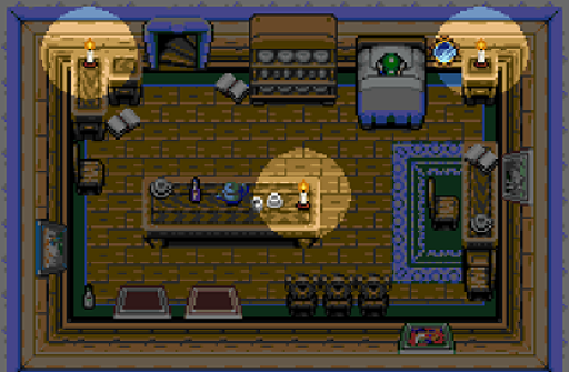
MetalBenderJam - This is a really cool screenshot. I like the house setting quite a lot. Though how does Link seriously sleep like that? :P


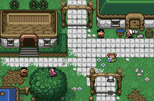
FalsePower - Another pretty cool shot, though I noticed a couple errors. For one, the bushes seem to be going underneath the house over on the left, which doesn't look correct at all. I also noticed the grass cuts off into the rocks to the right of the house.


Anarchy_Balsac - Interesting concept. I was thinking of doing something like this for one of my quests and you've managed to pull it off pretty well. Either way, it looks cool.


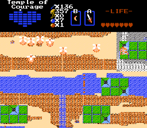
Gabriel Baron - Really nice cave shot. I don't really have any complaints for this one, it looks really well done, well save for the water being the wrong tile used but I've kinda gave everyone enough hell with that :P


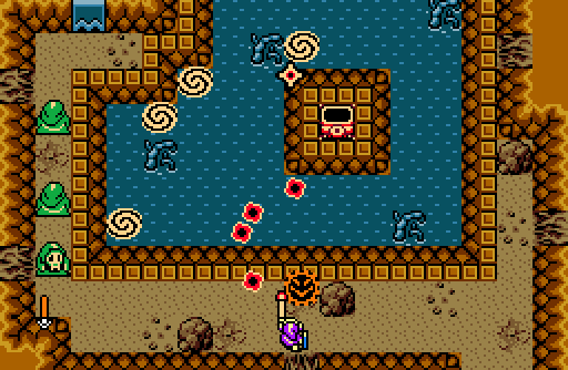
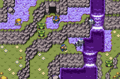
Jared - This is amazing. I really love the way this screen is designed. The purple water is a unique touch and everything else looks perfect to me.


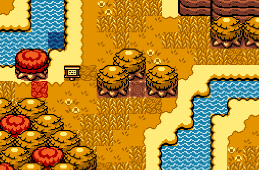
Joelmacool12 - Oh god it's another Joel shot, run! No seriously, this is pretty neat. The tree colours blending in with the ground is a bit odd for me to see, but besides that it's pretty well done. I noticed you didn't add any obscure hints in this shot like you do for all the others. Still want to know what they all mean :P


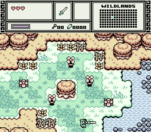
Shane - This screen, like Jared's, is perfection. For one, I love the colours, it's a beautiful palette. Mixed in with everything else though, it makes this shot a whole lot better. Amazing job man.


In the end, it was incredibly tough to choose between Jared and Shane, as they are both fantastic screens. However, I'm gonna vote for Shane as it ever so slightly appealed to me more. Good job to all this week.


  • Shane and Jared like this

#13 Avaro

Avaro

    o_o

  • Members
  • Real Name:Robin
  • Location:Germany

Posted 24 August 2015 - 06:49 AM

I'm going to vote for Shane here, but I like all of the screens here.


This is kind of off-topic, but I'm still impressed by how everyone manages to work around the fact you cant have any solid ground objects next to water in the GB tileset. I might be the only one who's got a problem with it. xD


  • Shane likes this

#14 Joelmacool

Joelmacool

    Addicted to Overwatch

  • Moderators
  • Real Name:Joel
  • Location:Country of Europe

Posted 24 August 2015 - 07:19 AM

I'm going to vote for Shane here, but I like all of the screens here.


This is kind of off-topic, but I'm still impressed by how everyone manages to work around the fact you cant have any solid ground objects next to water in the GB tileset. I might be the only one who's got a problem with it. xD

A cool way to stop this from happening is by placing a tree at the bottom of the water tile, so then the "leaf" part of the tree will cover up the bad-looking tile of the water. So like what I did on my screen: http://prntscr.com/88a4r8 It doesn't look that bad! :P


  • Avaro likes this

#15 strike

strike

    life is fragile, temporary, and precious

  • Members
  • Real Name:Olórin

Posted 24 August 2015 - 07:22 AM

I really don't like the water in Jared's shot but besides that it is fantastic. Shane's pallet is amazing but I'm not feeling the atmosphere set up by the caption. I voted for Joel because it is a solid shot with solid atmosphere.

-Strike
  • Shane likes this


Also tagged with one or more of these keywords: Shane, MetalBenderJem, FalsePower, Anarchy_Balsac, Gabriel Baron, Jared, Joelmacool12

0 user(s) are reading this topic

0 members, 0 guests, 0 anonymous users