Shoshon the Elegant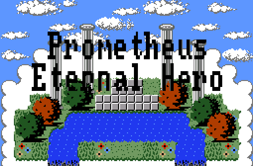
Welcome to Eternal Hero!
Jared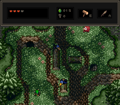
MarinaraSauce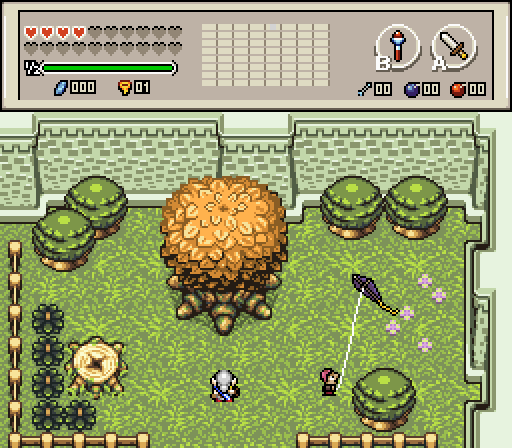
"I heard they're taking down the big tree in this park. Something about it being a fire hazard."
klop422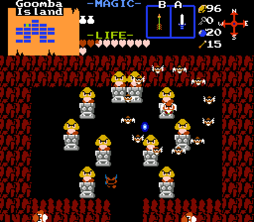
Link fighting Mario's battles.

Screenshot of the Week 670
Started by
Neppy
, Jul 16 2018 05:03 PM
Jared Shoshon the Elegant MarinaraSauce klop422
-
 This topic is locked
14 replies to this topic
#1

Neppy
-

- Members
-

Grand Overlord Empress
- Real Name:It's dangerous to go alone. Take Nep!
- Location:Minnesota
Posted 16 July 2018 - 05:03 PM
#2
Architect Abdiel
-

- Members
-

Kingdom Builder
- Real Name:Michael
- Location:Florida
Posted 16 July 2018 - 05:51 PM
Neptune spelled my name wrong. She hates me.
- Neppy and coolgamer012345 like this
#3
Binx
-

- Members
-

Formerly Lineas
- Real Name:Brian
- Location:Lancaster, CA
Posted 16 July 2018 - 05:57 PM
MarinaraSauce got my vote. Jared's construction is great, but that tileset makes it look so over-detailed that it's hard to see what's going on.
#4
coolgamer012345
-

- Members
-

🔸
- Location:Indiana, USA
Posted 16 July 2018 - 06:07 PM
Neptune spelled my name wrong. She hates me.
it looks like an attempt to rig the contest ![]()
![]()
![]()
![]()
![]()
![]()
![]()
#5
David
-

- Administrators
-

Fallen leaves... adorn my night.
- Real Name:David
- Pronouns:He / Him
Posted 16 July 2018 - 06:10 PM
Neptune spelled my name wrong. She hates me.
Fixed. ![]()
#6
trudatman
-

- Members
-

one point nine hero
- Real Name:that guy
- Location:State Of Love And Trust, The United State Of Amorica.
Posted 16 July 2018 - 07:33 PM
good stuff. it takes a lot of work to see the depth of Jared's beautiful screen. a downfall of those walls is how tall they seem to be without stuff above them appearing larger than stuff below them -- kind of related to the whole Zelda-brand perspective fails inherent in the original game's designs.
the title page shot is pretty good. a bit too symmetrical, maybe, but good. the font could use some shading to help it pop.
the dry tree screen is great. not amazing, certainly not bad. probably voting here, but it is a tough call versus Jared's symphonic attempt.
and that Mario dungeon... sucks. Klop usually shares much cooler work. can't win 'em all, I guess.
great week. thank you!
- Neppy likes this
#7
Shane
-

- Moderators
-

💙
- Pronouns:He / Him
- Location:South Australia
Posted 17 July 2018 - 04:47 AM
I voted Jared, one of his best shots ever IMO. And I personally can see what's going on. ![]()
- Jared likes this
#8
Hergiswi
-

- Members
-
don't look for me, i'm just a story you've been told
- Real Name:chris
- Location:house
Posted 17 July 2018 - 08:28 AM
I can't get over the brilliance of klop422's shot
#9
Architect Abdiel
-
- Members
-
Kingdom Builder
- Real Name:Michael
- Location:Florida
Posted 17 July 2018 - 08:37 AM
I like Jared's submission for Screenshot of the Week 670 the most. Therefore my vote for Screenshot of the Week 670 is going to Jared.
- Cukeman likes this
#10
Eddy
-

- Moderators
-
ringle
- Real Name:Edward
- Pronouns:He / Him
- Location:London, United Kingdom
Posted 17 July 2018 - 09:12 AM
Shoshon - That's a really nice looking title screen you got there. I really like the bg design and the foreground, and the text is nicely done too. Nice work.
Jared - This looks really beautiful. I love the overall composition of the shot, it adds a lot of atmosphere to the shot and you did a good job at capturing that dark and ominous feel. Got no complaints here.
MarinaraSauce - Not too bad, but I do feel like a lot more ground detail would probably help make the screen a bit less empty IMO. Maybe adding some tall grass in places or more flowers and rocks could help add a bit of variety.
klop422 - ALL HAIL THE GOOMBAS.
I voted for Jared this week.
#11
klop422
-

- Members
-

Guess I'm full of monsters and treasure
- Real Name:Not George
- Location:Planet Earth
Posted 17 July 2018 - 11:26 AM
and that Mario dungeon... sucks. Klop usually shares much cooler work. can't win 'em all, I guess.
Yeah, I'm not amazingly proud of the screen itself (although I do rather like my goomba enemy sprites, which I based off the SMB1 ones). I'm just out of the screenshot's I'm really proud of that don't spoil my quest, and had to put one in to get the competition going, cos I didn't realise MarinaraSauce had already put one in.
#12
trudatman
-
- Members
-
one point nine hero
- Real Name:that guy
- Location:State Of Love And Trust, The United State Of Amorica.
Posted 17 July 2018 - 01:34 PM
I figured as much. mine from last week wasn't needed after all, either.
#13
David
-
- Administrators
-
Fallen leaves... adorn my night.
- Real Name:David
- Pronouns:He / Him
Posted 17 July 2018 - 09:10 PM
Shoshon the Elegant
I'm quite impressed by this title screen! It's fairly simple, but it looks really great. The detailing is well-done, and the symmetry works well due to the screen's purpose. The only critique I really have is I feel like the actual title text doesn't have enough contrast from the rest of the screen. Perhaps adding an outline to the text itself or making it a more eye-popping color might help to emphasize it as it should be.
Jared
This screen is absolutely gorgeous. As always, you impress well with your screen design and attention to detail, and you are certainly using the tileset to its finest. I love the use of depth the screen has with the mountains; they are complicated in structure and the perspective looks great on them. The atmosphere of the screen is also great as you can definitely get that forest vibe. No complaints here, excellent work!
MarinaraSauce
This screen is fairly simplistic but still looks pretty good! The screen design itself is solid, and I enjoy the park atmosphere that the screen conveys fairly convincingly. To me what needs the most work is detailing as the screen looks a bit empty at the moment. Try adding some more environmental features like rocks or other types of flowers to liven up the screen and add some variety to it. Other than that, good work!
klop422
I'm not really a fan of using the default cave layout for screens itself, though I suppose the focus was more on the enemy sprites which do look great. I also like how they remain faithful to SMB1. Additionally, the screen's a bit too hectic for its own good as it is a bit hard to decipher what is happening with all of those goombas and stuff thrown in. Seems like it'd be interesting to fight those goombas on the gameplay side of things though!
After some deliberation I ended up voting for Jared's shot. I just love the mountain usage in the screen as it adds so much depth. Great week, everyone! ![]()
- Jared and Architect Abdiel like this
#14
Architect Abdiel
-
- Members
-
Kingdom Builder
- Real Name:Michael
- Location:Florida
Posted 17 July 2018 - 10:42 PM
Thanks. Yeah. I see what you mean about the letters. Tbh, I just had a site generate the text, resized it, and imported it into my tileset. xD
- Jared likes this
#15
Neppy
-
- Members
-
Grand Overlord Empress
- Real Name:It's dangerous to go alone. Take Nep!
- Location:Minnesota
Posted 22 July 2018 - 11:03 PM
With 55.56% of the vote, the winner of Screenshot of the Week 670 is Jared!
Congrats!!
Voting totals:
- Shoshon the Elegant - 7 votes [19.44%]
- Jared - 20 votes [55.56%]
- MarinaraSauce - 5 votes [13.89%]
- klop422 - 4 votes [11.11%]
Also tagged with one or more of these keywords: Jared, Shoshon the Elegant, MarinaraSauce, klop422


0 user(s) are reading this topic
0 members, 0 guests, 0 anonymous users

