I don't see whats so great about jonathan's shot. It's not bad but I don't see anything special. And the waterfall's all messed up

Screenshot of the Week 118
Started by
link3505
, Apr 17 2006 08:49 PM
-
 This topic is locked
37 replies to this topic
#17

HappyPuppet
-

- Members
-

Deified
- Real Name:Palmer
- Location:Virginia
Posted 18 April 2006 - 06:10 PM
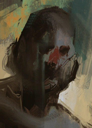
The main thing about Jonathan's shot is that the waterfall goes under the water and splashes underwater. The foam from the splashing should occur on the surface. I think that's all that needs to be changed, and it's really easy to do; thus, I voted for him.
#18
Jonathan
-

- Members
-

Wizard
- Real Name:Jonathan
- Location:Where there is darkness,you will find me.
Posted 18 April 2006 - 08:30 PM
QUOTE
Im not sure if Jonathan riped anything or not.
yeah theres ripped stuff in it,the mountains,i decided to enter at kinda a split second but forgot i had recently deleted my old mountains since i hated them(i do this with alot of mountains,can someone suggest something,a pill?anything?)so i just randomsly picked an RPG and ripped about 6 mountain tiles
the Ark sprite im using ISNT ripped,looks it and i wouldve liked to use the original Ark but ZC cut the top of his head off
so i made some based on the originals,only smaller
#19
Skipper
-
- Members
-

Magus
- Real Name:Austin
- Location:IA, USA
Posted 18 April 2006 - 10:34 PM
ZC-Ninja: Yours looks awesome. I mean, the blend of graphics are just superb. By the way, fix the chimney. 
Siguy: Well...that's the most random screenshot I've ever seen. You might want to have the room just a bit bigger.
Peteo: Yours looks pretty good, seeing as almost all...actually, ALL of it is custom made. (I think) I just guess the graphics don't really suit my needs.
Link-someone: Yours looks actually pretty good. When I rate SotW's, I look for originality, how it ties with other games, and custom-ness. Well...I agree, it looks like it came right out of an oracle game. You, sir, get my vote.
#20
Zacron
-

- Members
-
Wizard
- Real Name:Zachery
- Location:Inwood, WV
Posted 19 April 2006 - 06:23 AM
ZC-Ninja's is the only one to jump out at me, But Jonathan's is a close second. So ZCN gets my vote.
#21
SwordOfSeals
-

- Members
-

Peace now, food later
- Real Name:Akai, really...
- Location:Xenia, OH
Posted 19 April 2006 - 08:21 AM
QUOTE(Pol's Voice @ Apr 18 2006, 09:14 AM)
I voted for ZC-Ninja.......is that Cyan?
Yes, that is Cyan. He's been chibi-fied.
I voted for Jonathan because I adore the eye candy. Yes I didn't realize the many flaws, but the screen made me jump out of my seat. Good job.
#22
Siguy
-

- Members
-
�
- Location:The inactive user list.
Posted 19 April 2006 - 08:27 AM
The waterfall looks messed up. It's all blocky. And like HappyPuppet said, the water falls underwater, which shouldn't happen.
#23
Deathbringer
-

- Members
-

Master
- Real Name:Chris
- Location:Why should you care?
Posted 19 April 2006 - 09:59 AM
I'd say Link75 on this one. Nice screen overall.
#24
mikepjr
-

- Members
-

Newbie
Posted 19 April 2006 - 01:15 PM
Im not trying to be rude.
But to me allot of that still looks like things i have seen before ZC-Ninja.
I see now where you edited them, but to me it still has allot of things i have seen enough of.
I have no idea where John got those graphics, i have never seen them before, and it still looks good to me.
Maybe it is because of the fact that Cayn is so out of place in something like that, witch is odd because your others looked great to me.
But i am making my thoughts herd, is that not what this thread is for?
Sharing thoughts?
In the end no mater what you say, i still do not like how that one looks, and i still like how Johns looks, there for im still happy with my choice.
Peteo: Try editing those graphics and making them less NES and more SNES. You could do that easy.
#25
Peteo
-

- Members
-

Back in Business!
- Real Name:Pete
- Location:Finland
Posted 19 April 2006 - 01:27 PM
QUOTE(mikepjr @ Apr 19 2006, 08:15 PM)
Peteo: Try editing those graphics and making them less NES and more SNES. You could do that easy.
Er... My intention is to make a quest that feels and LOOKS like a NES game. So nope, I won't touch those graphics.
Even though people cannot appreciate NES-ish quests anymore, there fortunately are still people out there who don't care about graphics so someone will probably play the quest...
#26
Siguy
-
- Members
-
�
- Location:The inactive user list.
Posted 19 April 2006 - 02:11 PM
Reduce the colors. Then it would look more NES-ish.
#27
trip i fall
-
- Members
-
Magus
- Real Name:Brian
- Location:Depends.
Posted 19 April 2006 - 02:33 PM
ZC-Ninja: Very good. I like the custom grass and shed (or whatever it is)
Jonathan: You did have man flaws but the custom graphics are just amazing. they just are so, colorful and appealing.
Peteo: I like the style your going for, especially the trees. Those are good.
Link75: Something about that screenie is just so... cool. Mabye it's the duel the moblin and Link are having. And the fact that the moblin's gonna hit first.
Siguy: My kind of screenie. Random, and utterly retarted. Good tiles, though.
M vote will have to go to...
Drum roll please.
*Drum roll*
This is very close...
Link75!! With John and ZC-Ninja close behind, and Siguy and Peteo playing the caboose. Very close, you all did a nice job.
EDIT: Hi.
Edited by trip i fall, 19 April 2006 - 02:34 PM.
#28
Radien
-

- Members
-
Courage
- Real Name:Steve
- Location:Oregon
Posted 20 April 2006 - 11:01 PM
ZC Ninja:
Good... but the varying sizes of the houses doesn't quite sit with me. Also, since you're trying a FF style quest, you might benefit from experimenting with tweaked palettes. This one is still very bright.
Siguy:
Not bad, but there's so little content on this screen. Perhaps a shot of a bigger room next time.
Petoe:
Graphics are great, as they have been since you took on this quirky little NES game (I still remember seeing it in magazines as a kid). But this particular screen doesn't have much to it... just nice trees, good ol' Fester, and the rest are all big square objects.
Jonathan:
Excellent ripped tiles as usual, but I don't find their layout very appealing in this shot. The colors are all mish-mashed; it doesn't look like proper water to me.
Link64:
Hmm.... it's just GBC graphics. Absolutely nothing new. But something about this screen is very appealing to me. There's just a nice, refined look about it. It looks fun to play! And that's why I voted for Link64's, even though it's nowhere near the flashiest. Yay for good design.
Good... but the varying sizes of the houses doesn't quite sit with me. Also, since you're trying a FF style quest, you might benefit from experimenting with tweaked palettes. This one is still very bright.
Siguy:
Not bad, but there's so little content on this screen. Perhaps a shot of a bigger room next time.
Petoe:
Graphics are great, as they have been since you took on this quirky little NES game (I still remember seeing it in magazines as a kid). But this particular screen doesn't have much to it... just nice trees, good ol' Fester, and the rest are all big square objects.
Jonathan:
Excellent ripped tiles as usual, but I don't find their layout very appealing in this shot. The colors are all mish-mashed; it doesn't look like proper water to me.
Link64:
Hmm.... it's just GBC graphics. Absolutely nothing new. But something about this screen is very appealing to me.
#29
Lemon
-

- Members
-

Legend
Posted 20 April 2006 - 11:38 PM
QUOTE(mikepjr @ Apr 19 2006, 12:15 PM)
Im not trying to be rude.
But to me allot of that still looks like things i have seen before ZC-Ninja.
I see now where you edited them, but to me it still has allot of things i have seen enough of.
I have no idea where John got those graphics, i have never seen them before, and it still looks good to me.
Maybe it is because of the fact that Cayn is so out of place in something like that, witch is odd because your others looked great to me.
But i am making my thoughts herd, is that not what this thread is for?
Sharing thoughts?
In the end no mater what you say, i still do not like how that one looks, and i still like how Johns looks, there for im still happy with my choice.
Erk... I dident mean to sound like I was complaing, just telling yah that there were some custom things in there. A relpy like what you said was exactly the oppisite response Im aiming for But to me allot of that still looks like things i have seen before ZC-Ninja.
I see now where you edited them, but to me it still has allot of things i have seen enough of.
I have no idea where John got those graphics, i have never seen them before, and it still looks good to me.
Maybe it is because of the fact that Cayn is so out of place in something like that, witch is odd because your others looked great to me.
But i am making my thoughts herd, is that not what this thread is for?
Sharing thoughts?
In the end no mater what you say, i still do not like how that one looks, and i still like how Johns looks, there for im still happy with my choice.
Cyan does look out of place somewhat in these tiles, but meh thats what happens. He works great with good
QUOTE(Radien @ Apr 20 2006, 10:01 PM)
ZC Ninja:
Good... but the varying sizes of the houses doesn't quite sit with me. Also, since you're trying a FF style quest, you might benefit from experimenting with tweaked palettes. This one is still very bright.
Good... but the varying sizes of the houses doesn't quite sit with me. Also, since you're trying a FF style quest, you might benefit from experimenting with tweaked palettes. This one is still very bright.
Mmm this is the "big city" of the land, and the shot is actually from the Chocobo Farmers little cottage on the very outskirts of it. The big houses are all over the city itself. I am curious if you meant I should darken the palletes by the last comment, or just mess aroudn with them in general.
Im stlil in shock I got 9 votes
Edited by ZC-Ninja, 20 April 2006 - 11:38 PM.
#30
Jonathan
-
- Members
-
Wizard
- Real Name:Jonathan
- Location:Where there is darkness,you will find me.
Posted 21 April 2006 - 12:30 AM
QUOTE
Jonathan:
Excellent ripped tiles as usual, but I don't find their layout very appealing in this shot. The colors are all mish-mashed; it doesn't look like proper water to me.
Excellent ripped tiles as usual, but I don't find their layout very appealing in this shot. The colors are all mish-mashed; it doesn't look like proper water to me.
well the layout im not worried about,its just a random unimportant shot,but perhaps you can give me some idea as to what you meen by "Proper Water",do you meen realism?and what needs more work,the plain watter or the waterfalls
@.@ i enter for critisizm and all i get is votes,you are mean mean people
next time i enter the caption will be "Bash My Shot!"
QUOTE
Im stlil in shock I got 9 votes icon_razz.gif
whats so shocking?that you have 9 vote or that you arnt winning
0 user(s) are reading this topic
0 members, 0 guests, 0 anonymous users

