Avataro![]()
Jared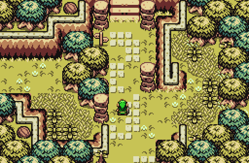
Gorgeous scenery from an incomplete quest.
Sheik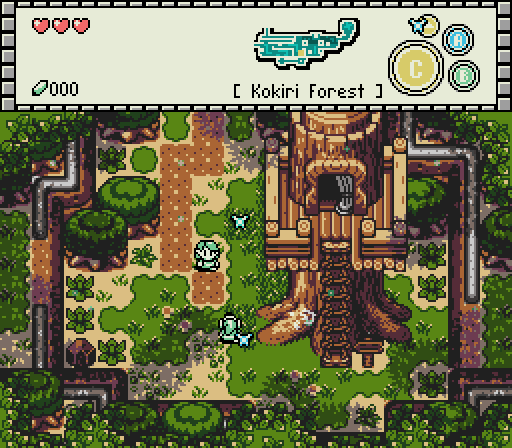
Hello!
Russ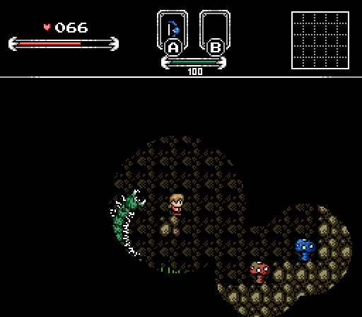
Beware what hides in the shadows...

-
 This topic is locked
11 replies to this topic
#1

Neppy
-

- Members
-

Grand Overlord Empress
- Real Name:It's dangerous to go alone. Take Nep!
- Location:Minnesota
Posted 16 July 2017 - 10:50 PM
- Joelmacool likes this
#2
Naru
-

- Members
-

Magus
Posted 17 July 2017 - 01:40 AM
Jared - some tile-errors with blue grass next to some trees and I don't exactly like how you use the mountains at some points. Overall the screen is beautiful though. I like it a lot.
Sheik - great screen, love it, though Saria (was that her name?) looks a bit plain compared to an improved GBC-tileset.
Russ - ewww, I seriously will hate that part (but it will add to the thrill )
Had to vote for Marin in space, the buttons forced me to do so.
Sheik - great screen, love it, though Saria (was that her name?) looks a bit plain compared to an improved GBC-tileset.
Russ - ewww, I seriously will hate that part (but it will add to the thrill )
Had to vote for Marin in space, the buttons forced me to do so.
- Avaro and Jared like this
#3
Eddy
-

- Moderators
-

ringle
- Real Name:Edward
- Pronouns:He / Him
- Location:London, United Kingdom
Posted 17 July 2017 - 08:56 AM
Avataro - Really like the space setting you got here. I also love the "A Boy and His Cursor" design style too, which really makes the screen look unique. Awesome job here.
Jared - Beautiful Firebird shot, haven't seen people use this in a little while. The overall structure is really good and the screen itself doesn't look overcrowded or too empty. I guess gorgeous scenery fits this screen very well ![]()
Sheik - Once again, doing great with the OoT demake. The attention to detail is spot on overall and I'm a really huge fan of that subscreen. I love the level of detail you have in that mini-map, it's pretty much as detailed as it was in OoT.
Russ - Pretty nice dark room effect you got here with the mushrooms and stuff, and that worm thing on the left side looks like fun ![]() Other than that though, I probably would've preferred seeing the full screen since it's pretty hard to judge overall when most of the screen is covered in darkness lol. From what is shown though, it looks like the area might be a neat cave-like setting.
Other than that though, I probably would've preferred seeing the full screen since it's pretty hard to judge overall when most of the screen is covered in darkness lol. From what is shown though, it looks like the area might be a neat cave-like setting.
Very tough between the first 3 this week, but I think I might go for Jared. Not sure what it is about it, but it just looks really nicely made.
- Shane, Avaro and Jared like this
#4
strike
-

- Members
-

life is fragile, temporary, and precious
- Real Name:Olórin
Posted 17 July 2017 - 11:23 AM
This is a really good screenshot of the week :0 Every shot is intriguing.
-Strike
#5
Moosh
-

- ZC Developers
-

Tiny Little Questmaker
Posted 17 July 2017 - 11:55 AM
Avataro's screen has me hype as heck.
- Avaro and Cukeman like this
#6
Cukeman
-

- Banned
-

"Tra la la, look for Sahasrahla. ... ... ..."
- Location:Hyrule/USA
Posted 17 July 2017 - 02:20 PM
Avataro- The visuals remind me of Fire 'n' Ice
Jared- It's all good minus the one tree sitting on top of the mountain wall/border, that bothers me
Sheik- Took me years to notice it even has the carved art on the trunk, which looks great. Very detailed for GB. The map is also very interesting.
Russ- Looks cool in terms of creature design and gameplay. Looks like he doesn't have mushroom to maneuver though.
- Russ and Avaro like this
#7
Titanium Justice
-

- Members
-

Justice is served!
- Real Name:Jared
- Location:Ontario
Posted 19 July 2017 - 10:38 AM
Voted for Sheik's cool Oot demake screenshot, and Jared was a close second. Real good shots this week.
- Jared likes this
#8
Anthus
-

- Members
-
Lord of Liquids
- Location:Ohio
Posted 19 July 2017 - 03:16 PM
Avataro: Looking good. Simple and clean (not to be confused with the KH theme). The detail on the floors and walls looks simple at first, but it's actually kind of complex.
Jared: I'd expect nothing less, your GB skills never fail to amaze me. I love it when people take liberties with the GB mountains like you have. It's always amusing to me when people are like "you're using them wrong" when they weren't exactly consistent in the source material either.
Sheik: So when you're not teaching Link a Song, you're making his world? You've been busy these last seven years. But seriously, great stuff here. Your edits and custom work are always a joy to look at.
Russ: Looks like Allowed Descent or whatever it's called is shaping up quite nicely. This screen is actually pretty creepy. Unfortunately, there's little of the screen visible.
It's too hard to pick between Jared and Sheik. I null'd. Or maybe I voted for Avataro. The world will never know!
- Avaro, Jared and Naru like this
#9
Rambly
-

- Members
-

Hero of Time
Posted 20 July 2017 - 04:07 AM
sheik's is absolutely gorgeous. can't think of a single detail that's out-of-place. the drawing on the root of the tree is a super nice touch
jared's is pretty damn good too tho, i like the contrasting tree colors
russ's could stand to have more than like... a quarter of the screen space being used
avataro's is a neat enough concept and the aesthetic is okay but it doesn't make for a super interesting SotW entry (i feel like it has a similar problem as russ's in that a pretty big portion of the screen is just dead space)
- Jared and Naru like this
#10
Shane
-

- Moderators
-
💙
- Pronouns:He / Him
- Location:South Australia
Posted 20 July 2017 - 04:28 AM
Avataro: It's definitely an interesting screen. I mean, it's a Marin lookalike in space! Doesn't get any more interesting than that. As for the screen, I like the style which is nice and simplistic. I question the pink dots on the blocks though, they look weird. All in all, your screenshot is nothing special*.
Jared: I absolutely adore the colours here, makes the scenery look surreal. It's been a while since I seen a nice Firebird shot and you delivered! My vote went here but if I had to comment on something, I think I'm in agreement with Cukeman in regards to the tree. But aside from all that, your screenshot is nothing special*.
Sheik: I like the design a lot and the little details are impressive (like the drawing) but I'll admit I'm still kind of so-so on the transparency and palette. To me, the palette just doesn't scream "Kokiri Forest". The transparency is just a simple preference however. Great screen otherwise (I hope to see more brilliant OoT screens other than Kokiri Forest from your project!), but nothing special*.
Russ: I feel the darkness adds to the screen in a strange way. Sure, we can't see much but that's the point, right? It makes me excited to explore in game and find out what's out of sight. If this screen did anything, it made me want to play it and that's a pretty good thing to shoot for. But there is a part of me that wishes to see the rest regardless, nice shot but also nothing special*.
(* All your screenshots are actually quite special. I lied.)
- Rambly, Eddy and Jared like this
#11
symbiote01
-

- Members
-

Doyen(ne)
- Real Name:Doug
- Location:WA
Posted 20 July 2017 - 01:13 PM
Great job all around this week!
Avataro: This has a great old-school vibe, even if isn't Zelda-related. Or maybe it is? The cow-stealing aliens could have taken her prisoner...
Jared: The somewhat muted colors contrast brilliantly to the vibrant colors of Link's tunic- and that's a good thing. There's a secret path off to the right, amiright?
Sheik: I love the dichotomy between the relatively-high-detail background and the simplified people, looking almost like stickers. It accomplishes the goal of drawing attention to the people and not the lush background, while still wowing the eyes. Had the Oracles games been more like this style, I might not hate them so vehemently. This was my pick for the week.
Russ: A good side-scroller look with coherent elements. Are the mushrooms supposed to be glowing (and thus visible in the dark)? And an enemy that seemingly jumps in an arc is always nice (or maybe there's a wall just out of sight that the centipede-monster is peeling off of? We'll never know...
Edited by symbiote01, 20 July 2017 - 01:13 PM.
- Sheik, Jared and Naru like this
#12
Neppy
-
- Members
-
Grand Overlord Empress
- Real Name:It's dangerous to go alone. Take Nep!
- Location:Minnesota
Posted 23 July 2017 - 10:47 PM
With 53.45% of the vote, the winner of Screenshot of the Week 620 is Sheik!
Hello!
Congrats!!
Voting totals:
- Avataro - 6 votes [10.34%]
- Jared - 16 votes [27.59%]
- Sheik - 31 votes [53.45%]
- Russ - 5 votes [8.62%]
Also tagged with one or more of these keywords: Sheik, Avataro, Jared, Russ


1 user(s) are reading this topic
0 members, 1 guests, 0 anonymous users

