Welcome to the very first of the rebooted Screen Rebirth. Below we have seven beautiful entries! The order in which they appear was chosen randomly by a random line picker, except for me and Mitchfork, which are placed at the very bottom.
As with Screenshot of the Week, the goal is to vote for the screen you think has best re-interpreted the base screen. What that means is up to you!
As a reminder, this is the base screen: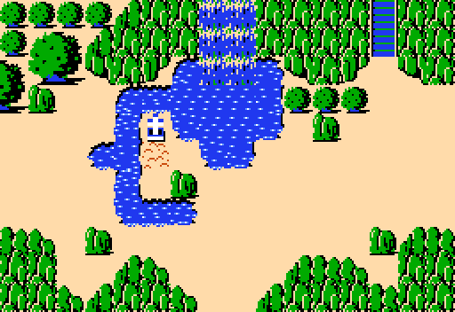
And here are our entries!:
Russ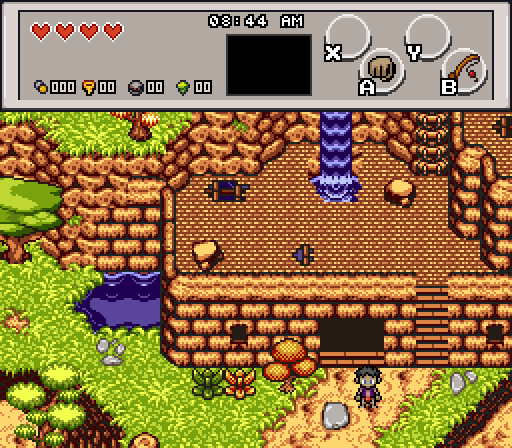
However long you think this took to make, I can assure you, it took longer.
Colin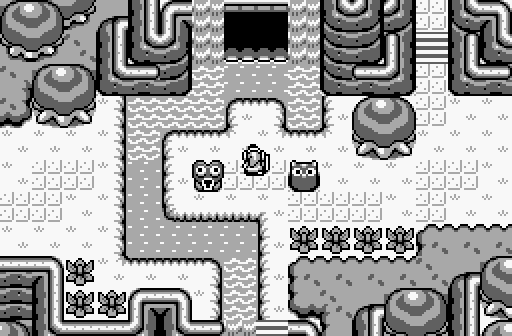
Feenicks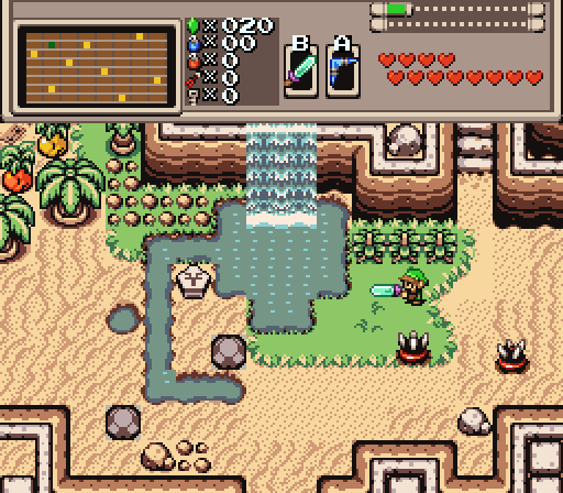
obligatory desert oasis
Bagel Meister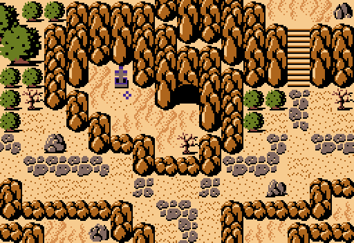
Orithan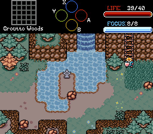
Comment: Wow, can't you imagine making a mockup screen to test your tiles while also participating in a contest? I sure can't ![]()
Mitchfork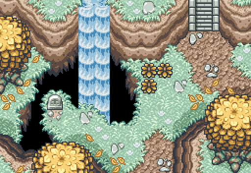
yellow
Huge Bedwetter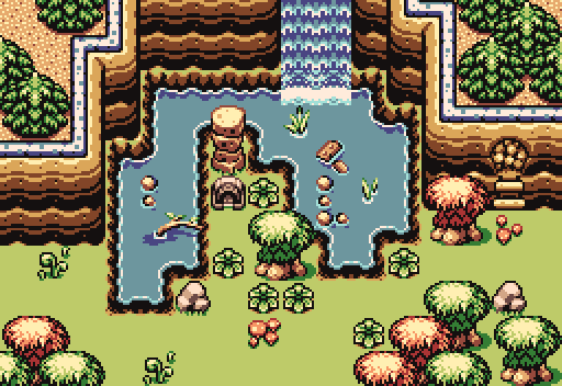
Man, I was in a place
Called Keeprunnin', Mississippi one time
And I heard someone on my way back
Sounded a little something like raw funk to me
So I slowed down and took a listen
And this is all I could hear, baby

Screen Rebirth 1! The Contest!
-
 This topic is locked
#1

-
- Members
-

Strangers when we meet
- Real Name:Zack Zack Zack Zack Zack Zack Zack Zack Zack Zack
Posted 22 May 2023 - 08:46 PM
- Anthus, Mitchfork, Shane and 3 others like this
#2
-

- Members
-

Initiate
Posted 22 May 2023 - 08:51 PM
I obviously shouldnt vote here, but damn Mitchfork that's awesome. It really has depth to it
#3
-
- Members
-
Strangers when we meet
- Real Name:Zack Zack Zack Zack Zack Zack Zack Zack Zack Zack
Posted 22 May 2023 - 09:30 PM
Everyone has such great and creative screens. Thank you so much for entering
Russ - This is a really cool screen, I like how it carries the shape of the base screen through what are ultimately two different screens.
Colin - I have enjoyed watching your experiments with the base LA tilesets and I am glad you did one for this contest. I like how you forewent the shape of the water.
Feenicks - A fellow firebird screen! I like the sandy beachy adventure vibe I get from this screen.
Bagel Meister - I like how this screen foregoes the water completely, leading to what I think is a dry lake bed.
Orithan - This screen gives off a moody, isolated vibe which I like a lot. I like the custom rocks and I assume the grave is custom too, which I also like.
Mitchfork - dor
Huge Bedwetter - Why didnt you put in any grass detail you idiot
- Anthus likes this
#4
-

- Members
-

End Fascism
- Real Name:Ryan
- Location:Plug One's spectacles
Posted 22 May 2023 - 10:06 PM
Russ - TWO screens???? unprecedented madman
The concept is really cool, I love the palette and the outside portion, but something about the interior just kinda irks me and I can't really put my finger on it? Really cool though and I love the creativity
Colin - really really love this and you used all the cheat codes that make me like a screen a whole lot. I don't really have anything to say about this other than how much I like it.
Feenicks - I think it's a bit too literal of a recreation for my tastes. Also some minor tile errors like the water edges and rocks not matching the ground they're placed on.
Bagel Meister - Voted here. The layout/composition is fantastic and the colors are great too. Also love the spin of omitting the waterfall and having the water dried up.
Orithan - Also very good. The boulder by the gravestone look a little weird to me, it really sticks out compared to a lot of the other details and kind of becomes the focal point of the screen. I think a less muted palette would be really nice too. Love the tiles though in general and good screen! Would love to see that water animated
Mitch - dor screen zzzzzz
rhubarbdoier = I think the grass could really use some variation and it looks unnatural how the water ends perfectly around the mountain instead of flowing into it, the tree bunch in the lower right corner should be brought in a little bit too I think, it's very claustrophobic in that area
- Bagel Meister likes this
#5
-

- Moderators
-

Bug Frog Dragon Girl
- Real Name:Deedee
- Pronouns:She / Her, They / Them
- Location:Canada
Posted 22 May 2023 - 10:28 PM
Russ - TWO screens???? unprecedented madman
Oh you sweet summer soul, that's actually the same screen. Jesus christ Russ.
#6
-
- Members
-
Strangers when we meet
- Real Name:Zack Zack Zack Zack Zack Zack Zack Zack Zack Zack
Posted 22 May 2023 - 10:56 PM
rhubarbdoier = I think the grass could really use some variation and it looks unnatural how the water ends perfectly around the mountain instead of flowing into it, the tree bunch in the lower right corner should be brought in a little bit too I think, it's very claustrophobic in that area
cry about it
#7
-
- Moderators
-
Bug Frog Dragon Girl
- Real Name:Deedee
- Pronouns:She / Her, They / Them
- Location:Canada
Posted 22 May 2023 - 10:58 PM
rhubarbdoier = I think the grass could really use some variation and it looks unnatural how the water ends perfectly around the mountain instead of flowing into it, the tree bunch in the lower right corner should be brought in a little bit too I think, it's very claustrophobic in that area
cry about it
Mods? there's FLAMING in my screen rebirth!1!
- Taco Chopper likes this
#8
-
- Administrators
-

protector of the darn forum
- Pronouns:He / Him
- Location:South Australia
Posted 22 May 2023 - 11:55 PM
These interpretations are amazing! Well done to everyone who entered. My vote went to Colin; it's the monochrome GB that does it for me.
In saying that, Mitch's screen gives me early area Chrono Trigger vibes and was a very close second. Russ, you're insane for doing two screens in one, but I fully support this endeavor.
rhubarbdoier = I think the grass could really use some variation and it looks unnatural how the water ends perfectly around the mountain instead of flowing into it, the tree bunch in the lower right corner should be brought in a little bit too I think, it's very claustrophobic in that area
cry about it
he isnt wrong though about the grass......................................................................... bro..............................................................................
#9
-

- Members
-
Coblin the Goblin
Posted 23 May 2023 - 12:22 AM
Feenicks - Pretty good, I like the orange and yellow things in the corner. The waterfall kind of looks overly square among everything else.
Bagel Meister - Nice. I like how the grave is down low after a cave making it seem evident that the grave is some type of objective. Also considering the source screen, I like how this shot implies the player may have dried up the area to make that lower zone accessible; maybe if there are some graphics that could give the impression of a dried out waterfall that could help increase that effect.
Orithan - your tileset is coming along nicely, I like the various textures like the grass, dirt and water. I think once again maybe the palette is a bit dreary but it's looking pretty good overall.
Mithfork - nice; not super into the palette (greens are too blue) but the waterfall and the pit are definite home-runs.
Huge Bedwetter - decent. I think too many differing objects near the middle of the screen remove from the significance of the gravestone which makes the screen a bit confused in terms of focal points.
Russ - I have the most comments here but I also commend the effort. I like that you went quite ambitious with it and showcased both portions. A lot of aspects of the screen are nice. Evidently quite a bit of time and care went into rock/brick transitions to be able to mix the various textures. There are a few flaws and if addressed I think could level up the screen a ton:
- the water to ground transitions inside the building do not fit very well at all, I think you ought to do water to sand to brick and maybe do a gentler water boundary animation that is less animated. That or have the water carve out more of the floor such that there is elevation descending into a pond inside instead. If you go gentler on the water animation, I'd use a waterfall animation that is split into two small flows or obviously more likely a trickling waterfall instead of a raging flow.
- The floor on the inside of the building is one tile too high. I notice there is a small step up into the building from the outside, but I don't think that vertically climbs high enough to make the interior walls only one tile high. I'd make the back wall of the building inside one tile taller (i.e. add one more tile of height to the bottom of the current wall)
- The broken ceiling looks like torn paper where the waterfall punches through it, the hole graphics in the ceiling need a couple of pixels of depth to imply the ceiling isn't 2-dimensional. The wood frame in the left hole looks more like a ladder that sort of disappears when you get to see from the inside.
- The back-left wall tile on the inside shouldn't have that grass bit on it.
- I don't like how the green thing sits right in front of the grave, it sort of looks like an obstruction to the grave. I'm guessing it's supposed to be a sword or something given by the grave.
Anyway, I actually like your screen a lot, Russ. I appreciate how bold you went with it so I won't be nulling due to participation, I'll be voting your way.
Edited by Colin, 23 May 2023 - 12:25 AM.
#10
-

- Members
-

no fun. not ever.
- Real Name:Mitch
- Location:Alabama
Posted 23 May 2023 - 04:59 PM
Yeah, I'm not normally a fan of animated gif entries to contests, but I did really appreciate Russ's entry. Very experimental and it was fun to see different elements of the base screen make their way into the exterior/interior respectively.
I also wanted to shout out Orithan's entry - I like seeing the tiles come along from the SotW entry a contest back or so.
Mithfork - nice; not super into the palette (greens are too blue) but the waterfall and the pit are definite home-runs.
I think if I had more time I would have taken some edits to this. This is one of the better base DoR palettes (Purity) but I struggle with how DoR has non-black outlines for its level palettes but ALSO uses pure black for things like cave entrances and pits... I might have played around here and tried to unify these somewhat. I also think there's a color balance problem here where the top of the screen really wants some additional yellow, but I couldn't figure out how to do it without restructuring the screen significantly or using GB trees which I didn't want to do.
#11
-

- Members
-

Tell all with glee, Argon's on PureZC
- Real Name:Sven
- Location:Rotterdam, NL
Posted 24 May 2023 - 03:19 AM
Dance of Remembrance is back baby!!!
I love all these screens, but I especially love DoR (as you may know). Mitchfork's screen is super awesome, but Russ's screen(s) is even more super awesome.
I also love how you are incorporating some of my most favourite trees (by Jupiter in the tile database) and that way of handling interiors is amazing. Also guessing how long it took you to make: 4 hours including the custom graphics.
All I have for feedback is that the palette is maybe a bit too saturated and yellow-ish.
As for Mitchfork's screen I hope I can skydive into that chasm :-)
And regarding the other screens I think they are all very solid! Good efforts and happy to see so many submissions. I should join next time too
#12
-

- Members
-

The Sun Is in Your Hand!
- Location:Germany
Posted 25 May 2023 - 05:29 AM
Of course all screen look great once more. I had anything to pick out, the waterfall in mitchfork's screen looks out of pkace to me with how gradual (?) the water falls down.
#13
-

- Administrators
-
Caelan, the Encouraging
- Location:Washington
Posted 25 May 2023 - 04:51 PM
Colin: I really like what you're doing with the mountains. I don't usually see GB mountains worked like that, but man it adds a lot of character. Like others have said, it's impressive that this is just using LA tiles.
Feenicks: It feels slightly empty, and yet I can't put my finger on why. Which I know makes this not the must useful feedback, so I apologize. It's not bad by any means though.
Bagel Meister: I really dig your take on this screen, with the water completely dried up. At first, I almost wanted to complain that it's too one-note, but the more I like, the more it hits me that that's the point. Really drives home the dry/arid nature of it. Big props for creative reimagining.
Orithan: I really like all your custom tiles, and the whole screen had a weird mix of melancholy and mystery that I appreciate.
Mitch: This screen is almost perfect. I love basically everything about it. So with that said, here's my nitpick. The waterfall. It feels... too flat? Like, the cliffs all taper off as they descend into the chasm, but the waterfall keeps going unchanged. The more I stare at it, the more it seems like a flat thing going vertically down the screen's Y axis instead of into the pit, and I wonder if making it grow darker as it goes deeper down might help. Ultimately though, it's a nitpick. The rest of the screen is beautiful, and I adore the chasm on the whole. It's probably where my vote would've gone.
Zack: I really like the pillar by the grave. Gives the sense of it being some kind of monument. The water detailing is also great.
Now to turn to my own screen. The first thing I wanna address is several comments on it being two screens. It is just a single screen, and not set up with secrets either like Chris suggested, just some layer Hell. The scripts hides layer 2 and 3 when you enter the building, and draws a black box, while a different script changes the scripted elevation when you climb the stairs and swaps some solidities around to let you walk over it.


Incidentally, this whole thing's based off an area in Stellar Seas, so obligatory plug to play my quest. Colin in particular left a lot really good feedback, so I wanna address some of that.
This is actually a really good point. I threw the screen together somewhat last minute, but having a more definite elevation change for the water would've looked better. Screen real estate being at a premium though would make it hard to fit all in one screens.the water to ground transitions inside the building do not fit very well at all, I think you ought to do water to sand to brick and maybe do a gentler water boundary animation that is less animated. That or have the water carve out more of the floor such that there is elevation descending into a pond inside instead. If you go gentler on the water animation, I'd use a waterfall animation that is split into two small flows or obviously more likely a trickling waterfall instead of a raging flow.
With this one, I don't mean to imply that the interior wall is only one high so much as imply that the interior wall isn't being shown for gameplay purposes. Like how some RPGs will cut away walls when entering houses. I worry making the bottom wall a tile higher would really cut down on the amount of space I can use, which is already a problem with ZC's screen size and more complex setups like this.The floor on the inside of the building is one tile too high. I notice there is a small step up into the building from the outside, but I don't think that vertically climbs high enough to make the interior walls only one tile high. I'd make the back wall of the building inside one tile taller (i.e. add one more tile of height to the bottom of the current wall)
Now that you say it, I definitely see it. I'll have to work on that a bit.The broken ceiling looks like torn paper where the waterfall punches through it, the hole graphics in the ceiling need a couple of pixels of depth to imply the ceiling isn't 2-dimensional. The wood frame in the left hole looks more like a ladder that sort of disappears when you get to see from the inside.
The back-left wall tile on the inside shouldn't have that grass bit on it.
That particular object's a common collectible in Stellar Seas. When I was designing the screen, it just felt right to put it there. I do see what you mean though, and especially without context, it does look a bit noisy.I don't like how the green thing sits right in front of the grave, it sort of looks like an obstruction to the grave. I'm guessing it's supposed to be a sword or something given by the grave.
And then to quickly respond to TK
I also love how you are incorporating some of my most favourite trees (by Jupiter in the tile database)
Massive shoutouts to Jupiter! His trees are a cornerstone of any of my DoR work.
- Twilight Knight likes this
#14
-
- Members
-
Strangers when we meet
- Real Name:Zack Zack Zack Zack Zack Zack Zack Zack Zack Zack
Posted 05 June 2023 - 09:24 PM
Thanks everyone for participating in the first Screen Rebirth Rebirth. The winner is Mitchfork, which I believe points to some obvious rigging,
- Taco Chopper likes this
Also tagged with one or more of these keywords: Mitchfork, Russ, Colin, Feenicks, Bagel Meister, Orithan, Huge Bedwetter


1 user(s) are reading this topic
0 members, 1 guests, 0 anonymous users

