 This topic is locked
Makes things interesting, I'd vote to restart this SOTW 152 if someone sent in another competative screenshot, but that's wishful thinking.

Screenshot of the Week 152
Started by
Neppy
, Jan 16 2007 01:30 AM
112 replies to this topic
#32

Linkus
-

- Members
-

.
- Real Name:Adam
Posted 16 January 2007 - 05:51 PM
I'd send something in, but I am in a ZC slump as well; I'd rather make something RPG-related right now and I have a few ideas...
However, I do have an idea with a town scene with some cliffs and a water wheel in my head...
However, I do have an idea with a town scene with some cliffs and a water wheel in my head...
#33
Revfan9
-

- Banned
-

Hero of Time
- Real Name:Dr. Pajamas
- Location:In front of a screen
Posted 16 January 2007 - 06:14 PM
QUOTE(DarkFlameWolf @ Jan 16 2007, 05:42 PM) 
Makes things interesting, I'd vote to restart this SOTW 152 if someone sent in another competative screenshot, but that's wishful thinking.
DFW, will this do?
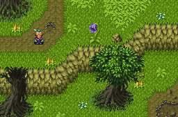
It's a tad incomplete, but I just threw it together. Since the forest stuff is done, I can easily make lots of detail. Although I would probably add more and fudge in some enemies (I'm awaiting Big Enemies to start, but I can just fake them on a layer) before I would call it a submission. I would also clean up the shot (as in, add a stream or something to get rid of all of those flowers I spammed everywhere, and fix that error in the treetop, although they are quite difficult to use...)
#34
/M/
-

- Members
-

6♣7♠8♥9♥10♥
- Location:Gotham City
Posted 16 January 2007 - 06:41 PM
*Lol* Revfan9, please avoid posting what your going to submit to SoTW, the next week. Most of us like it to be a surprise, like me. Though I must say, that forest shot looks good. Try to make a unique subscreen and some enemies to actually demonstrate game play, and you'll get a definite win.
#35
Revfan9
-
- Banned
-
Hero of Time
- Real Name:Dr. Pajamas
- Location:In front of a screen
Posted 16 January 2007 - 06:44 PM
That's not what I am going to submit to SotW, I'm probably going to duck out for a few weeks until I can get an amazing shot of the Temple of Verdandi...
And, /M/, I was told "Definite win" for this weeks shot as well...
And, /M/, I was told "Definite win" for this weeks shot as well...
#36
/M/
-
- Members
-
6♣7♠8♥9♥10♥
- Location:Gotham City
Posted 16 January 2007 - 06:49 PM
QUOTE(Revfan9 @ Jan 16 2007, 06:44 PM)
And, /M/, I was told "Definite win" for this weeks shot as well...
What can I say? I'm not always right. You also did some wrong things, such as saving the image as a .JPG format. Why would you even do that, when you see every week, people complaining how ugly a JPG is?
#37
Revfan9
-
- Banned
-
Hero of Time
- Real Name:Dr. Pajamas
- Location:In front of a screen
Posted 16 January 2007 - 06:52 PM
I used a loseless JPG saving, and .TakaM (and now, you) is the only one that noticed, and that's only because he checked the filename.
#38
/M/
-
- Members
-
6♣7♠8♥9♥10♥
- Location:Gotham City
Posted 16 January 2007 - 07:03 PM
Let me give you some suggestions then...
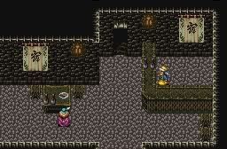
1. The man on the counter has nothing around him, makes it look like an empty counter. Since this appears to be a Cafe/Bar, add some stuff on the wall.
2. You've use the same floor tile all over the room, trying adding more floor tiles.
3. Floor borders. Try to add some. It bothers me even looking at it without it.
4. Add more people. Looks deserted. If this is a shop/cafe/bar whatever it is, it should at least have lots of people.
5. The palette you've used bothers me. Your brown for the boxes and table, looks dirty and disgusting. Fix it.
That is all I can think of right now.
#39
Anthus
-

- Members
-

Lord of Liquids
- Location:Ohio
Posted 16 January 2007 - 08:26 PM
I'm going to vote for Revfan here. His shot is the most original out of the three. Though, that floor could benefit from some more detail.
Animus' is nice, but when I think of an icy area, I picture something bright like AlttP's Ice Palace, or the Temple of Droplets in MC.
Wolfie's has some great design, as always, but I hate the orange, default Pure lava. There is so much more better lava out there. Try some DoR/ SD3 stuff. I would have voted for this one but the lava kills it for me.
Good show, peeps.
#40
Revfan9
-
- Banned
-
Hero of Time
- Real Name:Dr. Pajamas
- Location:In front of a screen
Posted 16 January 2007 - 08:50 PM
Yay! So from the last time I recorded, I was losing by 14 votes. Now, I am losing by....
15 -_- (me 11,DFW 26)
15 -_- (me 11,DFW 26)
#41
.TakaM
-

- Members
-

Junior
Posted 16 January 2007 - 09:17 PM
QUOTE(Revfan9 @ Jan 16 2007, 05:52 PM)
I used a loseless JPG saving, and .TakaM (and now, you) is the only one that noticed, and that's only because he checked the filename.
plus your shot isnt even close to being called the sham that is lossless, all I have to do is enlarge the image to confirm how ****ed up the colours are.
and as for the people complaining of my votes regarding jpg's- its my vote, I get to choose how I use it.
#42
/M/
-
- Members
-
6♣7♠8♥9♥10♥
- Location:Gotham City
Posted 16 January 2007 - 09:23 PM
.TaKaM is correct. Look at the image closely, it is corrupted. I still don't understand why you would use a JPG after so many complains... Makes so sense whatsoever. X_X
#43
Revfan9
-
- Banned
-
Hero of Time
- Real Name:Dr. Pajamas
- Location:In front of a screen
Posted 16 January 2007 - 09:27 PM
Heh...
One of them is a PNG, the other a max quality JPG. Can you tell the difference?
One of them is a PNG, the other a max quality JPG. Can you tell the difference?
#44
Animus01
-

- Members
-
Spirit Warrior
- Real Name:Keith
- Location:My own imagination
Posted 16 January 2007 - 09:28 PM
What makes no sense is why the heck does a JPG file even matter when not even I can notice it (and believe me, in my Gunbound days, I had to convert A LOT of pics into JPG to post them). The only reason I would see why JPG is considered so bad is that you can't rip someone else's tiles in a JPG, because there are too many colors displayed.
#45
/M/
-
- Members
-
6♣7♠8♥9♥10♥
- Location:Gotham City
Posted 16 January 2007 - 09:30 PM
...
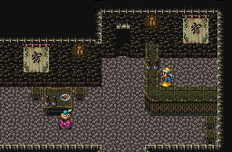
How can you not? Seriously, there is such a big difference between them two. The .PNG has much better colors, it shows more shading on the brown table and desk, while .JPG makes it look crappy.
This is pointless to argue about it. It won't change the votes. Just avoid using JPGs unless you want ugly colors.
0 user(s) are reading this topic
0 members, 0 guests, 0 anonymous users

