QUOTE(Peteo @ Jan 9 2007, 02:45 AM)

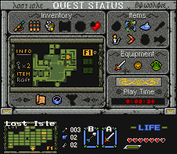
Yeah Radien, I understand that most people don't want to vote for subscreens or title screens because "there's nothing going on". But it's a good screenshot anyways so I thought I'd give it a go anyways. It is a ZC shot after all, and from a real quest unber work too.
And I notice that every time people are irritated by the jpegginess of the shots, and this time it really made the shot worse... But I made a deal with DFW that all Lost Isle shots will be sent in .jpg format. Though now that the quest starts to be finished in a few months I think we could start sending the shots in a clearer format.

I am operating under the opinion that since real games never use subscreens as screenshots for advertising their game, they don't make good quest screenshots, either. But I'm not beyond being convinced otherwise, and you are definitely putting up a fight with that fine example.
Let me guess: DFW wants screenshots that won't allow the graphics to be stolen, eh?
Well, unless DFW insists that a bit of quality loss is the only way to guarantee that ripping is 100% impossible, I may be able to suggest a few other methods that would make it about 99% impossible to rip, instead.
I can understand protecting your custom work, but what JPEGs do to 256-color video game graphics is pretty brutal...

QUOTE(Sharon Daniel @ Jan 9 2007, 02:55 AM)
Radien, I don't like those mountains, or any mountains in Pure, but I'm using them just because this quest will use Gameboy-style graphics. I'm getting rid of that big tree too, because it clashes with the style.
Gotcha.
What about Sun Tower's "cake layer" mountains? Those are Gameboy-style, but they are more detailed, which would match the rest of your shot. Even without the large palm tree, everything besides the mountains is more detailed than Gameboy graphics.

QUOTE(Sharon Daniel @ Jan 9 2007, 02:55 AM)
Yes I did, and submitted them to PureZC, too. They were just added yesterday, go grab 'em, use 'em, love 'em.

No need. I already ripped and recolored them directly from a FSA sprite I found in Google image search, probably just like you did. I edited the trunk, as well.
...We're both pretty anal, aren't we?


 This topic is locked