Jump to content

Photo

Screenshot of the Week 769

Twilight Knight Blackpaintbowser Hergiswi Jenny Joelmacool Nightmare Orithan

  • This topic is locked This topic is locked
4 replies to this topic

Poll: Screenshot of the Week 769 (51 member(s) have cast votes)

Cast your vote!

You cannot see the results of the poll until you have voted. Please login and cast your vote to see the results of this poll.
Vote

#1 David

David

    Fallen leaves... adorn my night.

  • Administrators
  • Real Name:David
  • Pronouns:He / Him

Posted 02 April 2022 - 10:20 PM

Blackpaintbowser

Blackpaintbowser.png

The deep depths of Floreal


Hergiswi

Hergiswi.png

sus


Jenny

Jenny.png

Deep within Critters Nest...


Joelmacool

Joelmacool.png

'Picaroon's Wreck' from my upcoming quest!


Nightmare

Nightmare.png

Those who like crossovers, just a wee little bit of SMB 2 action?


Orithan

Orithan.png

Cambria be all the rage nowadays. Cambria this, Cambria that, Cambria everywhere.


Twilight Knight

Twilight%20Knight.png

This water sure doesn't look too fresh


#2 Ether

Ether

    Pale Stranger

  • Contributors
  • Pronouns:She / Her

Posted 03 April 2022 - 12:30 AM

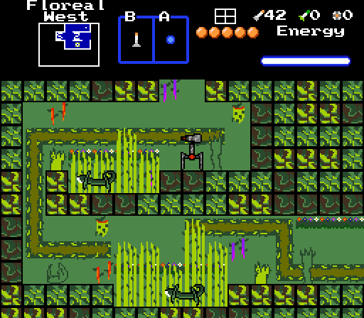
It's very hard for me to parse what's going on in Blackpaintbowser's screen. The wall-blocks are individually pretty--not super realistic, sure, but Yuureikon shows that that kind of abstraction can definitely work. But...nothing else about this screen does it for me, unfortunately. The flat green background is bland, and what decorations are there just look scribbled in. The vines are too bright and contrasted to work well as background, which is...I think that's what they are? Even at the best of times, I'm not really a believer in ZC sideview, and this has a long way to go before it comes close to the best of times.
 
no
 
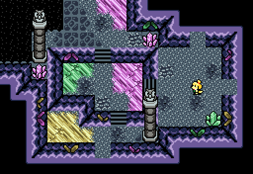
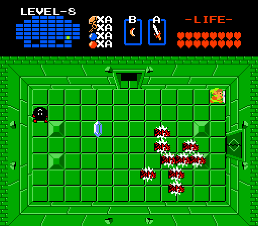
I've seen a bunch of 1 Screen Gollab stuff lately, and a lot of it is really promising! Unfortunately, I'm not a huge fan of the dungeon that Jenny's screen is from. The green and yellow and fuschia just clash really badly for me. (Maybe green to teal, or pink to red would improve it? I'm not sure.) I do want to take a second to appreciate the transition tiles between the floor crystals and the ground, they work really well. I like the wall-to-black transition tiles too. In conclusion: owls can't have googly eyes, they have to swivel their whole head around to change what they're looking at, therefore 0/10.
 
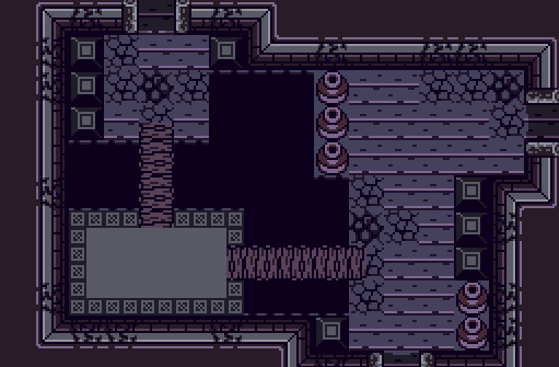
Joel's screen is...fine. I do like the general structure of the room, and his wall to black tiles also look quite nice! I think mostly I just find this screen a little bland. The palette does its job but also leaves the whole screen a little samey. The thicker cracks, including the ones on the walls, are a bit awkward, like they're taking what was supposed to be antialiasing but darkening the color of the antialiasing so much that it just looks like an extra coating of black.
 
Nightmare's screen is very green and I am not really a Mario person and I'm not really sure what else to say!
 
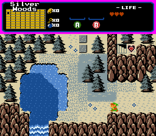
Orithan's screen is my second favorite. The mountaintops confuse me a little, they look more like fencing than like this screen or the heart piece are on elevated ground? I'm not sure if this is Cambria's fault or if there's a fix and I just don't know it. The mountain with the enclosed heart piece also bothers me a little because of the sheer vertical line on its west side. The grayish trees and grass and blue lake look nice together.
 
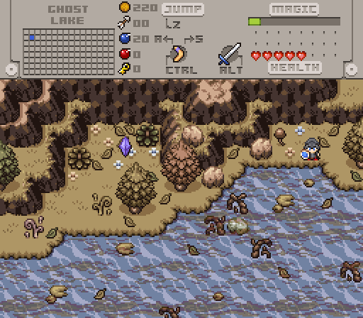
I like Twilight Knight's screen, which is such a relief, because I was worried I was being too negative up there. The lake is pretty and I appreciate how natural it looks without being blue. I like the brown grass but I can't decide if the land as a whole is stronger or weaker for being kind of...monochrome. (If it's the second one, I still wouldn't use vibrant colors, but maybe the trees and plants could benefit from being a different shade of yellow with more contrast? I'm not sure.) Ultimately I think this is a pretty solid image of a sickly lake. I voted here.

  • Twilight Knight and Jenny like this

#3 Shane

Shane

    💙

  • Moderators
  • Pronouns:He / Him
  • Location:South Australia

Posted 03 April 2022 - 05:37 AM

Was a tough choice between Jenny and Joel, but I love the shape and depth of Jenny's screen a little more. In hindsight, I prefer the darker slashable crystals we had before.


Blackpaintbowser - I want to like your screen a lot. I appreciate the level of effort you're putting into your graphics but I think there's a lot going on in the playable space. I'd invest more detailing on the solid walls and more empty space in the places you can play. Have the vines and flowers on the walls instead, and keep the tall grass(?) where they are. Keep up the good work!


  • Twilight Knight likes this

#4 Nathaniel

Nathaniel

    Deified

  • Members

Posted 03 April 2022 - 09:23 AM

Hergiswi's screen has a lot going for it.  Where do I even begin?  I'm going to have to try my best to summarize my thoughts on this, for it's quite easy for me to go off on a tangent here.  First off you have the improved version of the standard subscreen, which not only is a good fit for the main part of the screen, matching the black background, but it also captures an idea of just how much this adventure needs to get through it all.  This is just the very beginning, as you see that you have no items currently, but we can clearly see that the adventure begins in the northwest corner, as is indicated by the map in the upper left, which also appeals very well visually with the main screen.
 
Finally, the main screen.  You see the classic Link sprite at the bottom.  Being the classic tileset, this is a smart move on Chris's part.  Don't make your character more complicated than he needs to be.  The two fires help bring a great sense of symmetry to the screen, so nothing awkward is going on here.  Those fires provide light, but not too much to the point of still preserving the darkness of the majority of the screen.  This helps focus attention to the center of the screen, while still giving a sense of the mysteriousness of this quest.  The "amogus" message uses the standard lettering.  That's also a smart move, because you want to make sure that you catch the player by surprise, making them enter the screen as if everything is normal, and then throw them with that "gotcha" moment.
 
And finally you put the cherry on top with that sprite in the center of the screen.  With the rest of the screen being fairly standard in design, you want to bring as much attention as possible to the most creative element of the screen.  Great job, and best of luck out there!

Edited by Nathaniel, 03 April 2022 - 12:22 PM.

  • Hergiswi, Twilight Knight, Taco Chopper and 1 other like this

#5 David

David

    Fallen leaves... adorn my night.

  • Administrators
  • Real Name:David
  • Pronouns:He / Him

Posted 19 June 2022 - 09:13 PM

With 30.95% of the vote, the winner of Screenshot of the Week 769 is Twilight Knight!

Twilight%20Knight.png

This water sure doesn't look too fresh


Congrats!

Voting totals:

- Blackpaintbowser - 3 votes [7.14%]

- Hergiswi - 3 votes [7.14%]

- Jenny - 10 votes [23.81%]

- Joelmacool - 6 votes [14.29%]

- Nightmare - 1 vote [2.38%]
- Orithan - 6 votes [14.29%]

Twilight Knight - 13 votes [30.95%]


Also tagged with one or more of these keywords: Twilight Knight, Blackpaintbowser, Hergiswi, Jenny, Joelmacool, Nightmare, Orithan

1 user(s) are reading this topic

0 members, 1 guests, 0 anonymous users