My screenshot is in the pyramide on a desert...

Screenshot of the Week 71
Started by
PrinceMSC
, Nov 21 2004 04:06 PM
-
 This topic is locked
30 replies to this topic
#17

CrystalBlade
-

- Members
-

Apprentice
- Real Name:Colin
- Location:Oregon
Posted 22 November 2004 - 11:45 AM
/me votes IaN
/me tells Link128 that he spelled "pyramid" wrong
/me will rate later
/me tells Link128 that he spelled "pyramid" wrong
/me will rate later
#18
IaN
-

- Members
-

Warrior
- Real Name:Ian
- Location:The frozen north
Posted 22 November 2004 - 01:26 PM
QUOTE(Radien @ Nov 22 2004, 02:07 AM)
Ian:
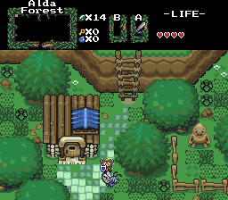
This week isn't a very good week for shots, IMO, so I somehow felt one screen would run away with the votes... well, for once, I'm sorry, but I really don't think this one deserves it. The house tiles are cool, the ladder tiles are cool, the fence tiles are cool. But I hate this layout. The grass is placed randomly and looks like a mess, the tree graphics clash with the rest of the tiles and look very flat, and well... there's not much going on here, either.
  All the good content is in the tiles.
This week isn't a very good week for shots, IMO, so I somehow felt one screen would run away with the votes... well, for once, I'm sorry, but I really don't think this one deserves it.
I'm glad someone said something. Okay, first I'll start with the grass. It is placed randomly, and I do that on purpose. Its in the middle of the forest, first of all, so it's not going to be nice and trimmed like at a gold course. But I didn't want to make it all the exct same tile, or it'd just look too repetitive, so I add cut grass tiles, and the other standard grass details.
Now, the tree tiles, I agree, they do clash, but moreso in that shot than what they normally look like. If I see fit, I'll add some kind of darker border around the edges so it doesn't look so "cut-off" like.
As for not much gonig on, well, the butterfly (which i did in fact get from Pokemon) flys back and for over three tiles, and flaps and stuff. It uses about 21 frames over 6 tiles, and some other small things are animated in the shot too, so it's not compltely lifeless.
But thanks Rad, I appreciate your honesty.
#19
Link128
-

- Members
-

Initiate
- Location:Quebec
Posted 22 November 2004 - 08:44 PM
QUOTE(CrystalBlade @ Nov 22 2004, 08:45 AM)
/me votes IaN
/me tells Link128 that he spelled "pyramid" wrong
/me will rate later
/me tells Link128 that he spelled "pyramid" wrong
/me will rate later
oops!
s'cuse for my language...I'm french!(don't speak to me french!
#20
phil
-

- Members
-

Master
- Real Name:Phil
- Location:Strasburg, Virginia
Posted 22 November 2004 - 09:46 PM
Most definitely Ian...
#21
skateboarder11
-

- Members
-

Adept
Posted 22 November 2004 - 10:18 PM
Link128: This shot is on the edge of the pyramid, like there was in DWTLC(Well-known SMW hack). You could see outside in that, and this is near a cliff. Not the best shot, but it's sure unique. 
Ian: Meh, TMC tiles. The Goron sprite is pretty nice, as is the house. Definitely decent, but not getting my vote.
masterlink3000: TOO many vines on the walls.
Snort: A pure TMC tiles screen. Ugh. Nice walls, but that's it.
Shoelace: This is a pretty standard screen. Nothing great or horrible here.
Mr. Z: Easily the best. Clouds in a dungeon? Unique. Plus, with your amazing level design I'm NOT passing this up.
Mr. Z got the vote from me.
#22
NoeL
-

- Members
-

Legend
- Real Name:Jerram
Posted 23 November 2004 - 06:16 PM
Hmm... seem's something went awry when these shots were posted, looks like at least 2 were wrecked... or at least look worse than they should.
Link128: Obviously a newcomer, but I remember making dungeons that looked like this back in the day. I'm sure once you get pretty familiar with what you can and can't do regarding ZC your imagination and "artistic" skill (by that I mean being able to make great screenshots) will blossom.
IaN: The house looks great. Can't say much for the rest of the shot. If it's a forest, shouldn't there be more trees and shadows and stuff? Or is this like the forest outskirts? And one more thing... what the hell is a Goron doing in the forest?
masterlink3000: I don't think this shot is too cramped, but there are a fair few problems with it. Like Rad said, the entrance light looks pretty dodgy, also theres too many vines. It looks like you've put the vines over every piece of wall you could...
Snort: .. ripped tiles... boring layout... Maybe if it was an in game shot with some enemies etc, it might have won.
Shoelace: Pretty average layout, but I love the little guys, they remind me of the demons in the South Park movie.
Mr. Z: Yeah, definatly gets my vote. Boring tiles, nothing new at all, but a pretty good layout. Also, he used my sword from Prophecies
#23
/M/
-

- Members
-

6♣7♠8♥9♥10♥
- Location:Gotham City
Posted 23 November 2004 - 10:20 PM
I vote for Ian.
And welcome back Noel I haven't seen you post for a long time.
And welcome back Noel I haven't seen you post for a long time.
#24
Shoelace
-

- Members
-
The Shaman of Sexy!
- Real Name:Michael
- Pronouns:He / Him
- Location:Arizona
Posted 23 November 2004 - 10:35 PM
QUOTE
Shoelace: Looking interesting. Improve the little impy forest things' graphics, and add a bit more detail, (I.e. a forest canopy, like everyone else has by now.� ) and it'll be really cool.
It seems that a lot of people didn't see my original picture. I am still very sadden that the picture screwed up in the transmission, but oh well. As for the forest canopy, I don't think I will be using it. I think it looks fine the way it is. Maybe in my next game. Thanks for the comments everyone, now here is my two cents:
Link128: I love side scrolling, though this picture doesn't do it for me. Maybe put spider webs in the level. Because the room feels plain.
Ian: I like this picture! However, it doesn't look like a forest to me. I love the butterfree though.
ML3K: I like this picture too. I really want to play your game. You keep on coming up with more and more great pictures.
Snort: I like the tiles however, I argee with everyone else. It is very plain.
Mr. Z: This one is great. I like the smoke/fog thing. I am planning on adding smoke to my level 3, because it looks a little plain in my game. Great job. When is this bad boy coming out?
Edited by Shoelace, 23 November 2004 - 10:44 PM.
#25
Dart Zaidyer
-

- Members
-

Mystic Beard of Truth
- Location:Somewhere fun
Posted 24 November 2004 - 03:28 AM
According to my readings, it looks like whatever Prince used to re-save the shots not only smashed the filesize, but also the palette. For shame!
#26
Neppy
-

- Members
-

Grand Overlord Empress
- Real Name:It's dangerous to go alone. Take Nep!
- Location:Minnesota
Posted 24 November 2004 - 04:48 AM
Time to submit some comments, since I haven't made any comments for the past 2 SOTW's... Alrighty, here I go.
Link128-Interesting screen. I like the rain, because it honestly looks like the outside. The bottom row of rain should be the contact rain, where it makes a splash. That might look ok, it might not. I'm not sure.
IaN-Super looking screen IaN. I voted for this one. It is very good look, especially with them MC trees. Awesome work.
masterlink3000-Cool looking shot ml3000. I love overworld objects inside of dungeons. It makes them really cool. Super setup too.
Snort-Are these from tMC? How about the colors? I think this screen looks great though. I just totally love the tiles.
Shoelace-*looks at the one posted in Shoelaces post* This is a good looking shot, and those little evil looking things scare the bejeebers out of me. *reminded of a dream series...* Keep up the good work.
Mr. Z-YAY!!! It's the Easter Palace. Cool cloud effects, and love the enemy setup. Very evil. 
Very good shots people. I will try to submit something to get smashed by someone else soon.
Link128-Interesting screen. I like the rain, because it honestly looks like the outside. The bottom row of rain should be the contact rain, where it makes a splash. That might look ok, it might not. I'm not sure.
IaN-Super looking screen IaN. I voted for this one. It is very good look, especially with them MC trees. Awesome work.
masterlink3000-Cool looking shot ml3000. I love overworld objects inside of dungeons. It makes them really cool. Super setup too.
Snort-Are these from tMC? How about the colors? I think this screen looks great though. I just totally love the tiles.
Shoelace-*looks at the one posted in Shoelaces post* This is a good looking shot, and those little evil looking things scare the bejeebers out of me. *reminded of a dream series...* Keep up the good work.
Mr. Z-YAY!!! It's the Easter Palace.
Very good shots people. I will try to submit something to get smashed by someone else soon.
#27
Link128
-
- Members
-
Initiate
- Location:Quebec
Posted 24 November 2004 - 12:04 PM
My next screenshot will be more beautifull ^^
#28
Shoelace
-
- Members
-
The Shaman of Sexy!
- Real Name:Michael
- Pronouns:He / Him
- Location:Arizona
Posted 24 November 2004 - 01:08 PM
We will look forward to it Link128!
Is it SotM next week, because it is the end of the month. So I guess I won't send one.
Is it SotM next week, because it is the end of the month. So I guess I won't send one.
#29
LinktheMaster
-

- Members
-
Hey Listen, Kid
- Real Name:Matt
- Location:United States
Posted 24 November 2004 - 01:59 PM
Link128: This is nice, but there needs to be more detail. However, there isn't too much you can do, as the Pureset has limited side view tiles. But, still, there are torches, cobwebs and other stuff to add.
IaN: There are some major problems with this, like in the trees, all the colors seem to blend together and look like... bleh..
masterlink3000: This one wins it for me. I think the setup is fabulous, and the screen just looks good.
Snort: This looks good, but the purple area at the bottom, really needs a border with the green floor. It looks funky.
Shoelace: This is pretty good. It deserves a good 2nd place. There's a lot of detail in there, but a variety in the trees would make the shot look even better.
Mr. Z: This looks really good.... but it's missing something. I can't tell what though. :\ Sorry I can't be of more help.
IaN: There are some major problems with this, like in the trees, all the colors seem to blend together and look like... bleh..
masterlink3000: This one wins it for me.
Snort: This looks good, but the purple area at the bottom, really needs a border with the green floor. It looks funky.
Shoelace: This is pretty good. It deserves a good 2nd place. There's a lot of detail in there, but a variety in the trees would make the shot look even better.
Mr. Z: This looks really good.... but it's missing something. I can't tell what though. :\ Sorry I can't be of more help.
#30
PrinceMSC
-

- Members
-

Remember the Name
- Real Name:Michael
- Location:Oklahoma
Posted 27 November 2004 - 12:29 PM
IaN wins SotW 71. Congratulations. SotW 72 starts tomorrow morning.
 PrinceMSC
0 user(s) are reading this topic
0 members, 0 guests, 0 anonymous users

