Jump to content

Photo

Screenshot of the Week 71


  • This topic is locked This topic is locked
30 replies to this topic

Poll: Pick your favorite screenshot. (49 member(s) have cast votes)

Pick your favorite screenshot.

You cannot see the results of the poll until you have voted. Please login and cast your vote to see the results of this poll.
Vote

#1 PrinceMSC

PrinceMSC

    Remember the Name

  • Members
  • Real Name:Michael
  • Location:Oklahoma

Posted 21 November 2004 - 04:06 PM

Link128
user posted image

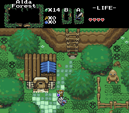
IaN
user posted image

masterlink3000
user posted image

Snort
user posted image
Preview of new dungeon tiles.

Shoelace
user posted image
This is why they tell you not to walk through the forest at night!

Mr. Z
user posted image
The Eastern Palace... the place to get a shiny new sword.

Yeah, yeah, I know I'm late but work called and they was short on staff so I went in to help out.

icon_king.gif PrinceMSC icon_king.gif

#2 Shoelace

Shoelace

    The Shaman of Sexy!

  • Members
  • Real Name:Michael
  • Pronouns:He / Him
  • Location:Arizona

Posted 21 November 2004 - 04:12 PM

???? Did my picture change? You can't see anything on my picture.. That is weird.... I just checked on my filespace and this is the way the picture looks
user posted image

In the shot in the thread, it looks like it lost major detail, that sucks. icon_cry.gif

Edit: Dang it, I can't figure out why it turned out that way. It didn't look like that when I sent it. The picture right here is my orginal one, I didn't change it. sigh....

Edited by Shoelace, 21 November 2004 - 04:21 PM.


#3 Sephiroth

Sephiroth

    The Legendary Sephiroth

  • Members
  • Location:Somewhere... Lemme know if you find me :)

Posted 21 November 2004 - 04:14 PM

*null voted since I entered*

#4 IaN

IaN

    Warrior

  • Members
  • Real Name:Ian
  • Location:The frozen north

Posted 21 November 2004 - 04:22 PM

*also null voted* Looks good this week. I have'nt entered in a while.

OH, happy 500th post Prince!

Edited by IaN, 21 November 2004 - 04:25 PM.


#5 ShadowTiger

ShadowTiger

    The Doctor Is In

  • Members

Posted 21 November 2004 - 04:22 PM

Link128: Okay, looking interesting. The rainy bit is a little strange, but I can see reasons for that. If the area in which this is played is quite expansive, and more detail (I.e. torches and keese) are added, that could be quite a nice area to explore, I'll bet.

IaN: Okay ... ... Ownage ... No doubt here. icon_razz.gif Perhaps you could add a bit more on the trees? There doesn't appear to be as much shading as I think could be done. Could you make the darkness kind of creep higher up the tree? Otherwise, I definitely voted for your screenshot. The Butterfree is very well shaded. icon_smile.gif And that house, .. oh man.. That house has "shizzle" written all over it! icon_eek.gif

masterlink3000: Well, I've seen this before, and again, I must recommend that you make the spots of light shift a few pixels in random directions to make it interesting.

Snort: Very nice walls, man. Looks like something either NoeL or Prince would do. Did you draw those?

Shoelace: Looking interesting. Improve the little impy forest things' graphics, and add a bit more detail, (I.e. a forest canopy, like everyone else has by now. icon_razz.gif icon_rolleyes.gif ) and it'll be really cool.

Mr. Z: Ah, nice tower thing. It's fairly standard, what can I say? icon_shrug.gif

#6 IaN

IaN

    Warrior

  • Members
  • Real Name:Ian
  • Location:The frozen north

Posted 21 November 2004 - 04:26 PM

QUOTE(BH4 @ Nov 21 2004, 05:52 PM)

IaN:  Okay ... ... Ownage ... No doubt here. icon_razz.gif  Perhaps you could add a bit more on the trees?  There doesn't appear to be as much shading as I think could be done.  Could you make the darkness kind of creep higher up the tree?  Otherwise, I definitely voted for your screenshot.  The Butterfree is very well shaded. icon_smile.gif  And that house, .. oh man.. That house has "shizzle" written all over it! icon_eek.gif

user posted image

Liek that? Some screenies get chnaged apperently when they're uplaoded to PZC?

#7 Sephiroth

Sephiroth

    The Legendary Sephiroth

  • Members
  • Location:Somewhere... Lemme know if you find me :)

Posted 21 November 2004 - 04:26 PM

QUOTE(BH4 @ Nov 21 2004, 03:22 PM)
Snort:  Very nice walls, man.  Looks like something either NoeL or Prince would do.  Did you draw those?

No, I got these from *cough*TMC*cough*

(Note: Here's the shot in it's original location.)

user posted image

Edited by Snort, 21 November 2004 - 04:30 PM.


#8 Highsight

Highsight

    Jake Wins

  • Members
  • Real Name:Kevin

Posted 21 November 2004 - 04:35 PM

Snort: Nice tiles but it is easier to rip tiles then make them. :/
IaN: Pwnage man, awsome tiles can't wait to see them in a quest. icon_smile.gif

#9 Exate

Exate

    Deified

  • Members

Posted 21 November 2004 - 05:04 PM

I voted for IaN, because I think it's the best one.

#10 Peteo

Peteo

    Back in Business!

  • Members
  • Real Name:Pete
  • Location:Finland

Posted 21 November 2004 - 05:41 PM

Looks like both IaN and Snort are already using The Minish Cap tiles. Looks pretty cool.

I voted IaN's shot since his is simply the best. But the trees should definitely have black borders around them.

#11 Link128

Link128

    Initiate

  • Members
  • Location:Quebec

Posted 21 November 2004 - 07:49 PM

IAN : Very beautiful o.o I don't know that it canned do too nice like map! icon_thumbsup.gif 1

masterlink3000: Very cool...It's Light on icon_smile.gif 3

Snort : It's good for a test icon_wink.gif 2

Shoelace : Woah!Many deku! ^^ 5

MrZ : Nice effect of cloud icon_biggrin.gif 4

#12 link3505

link3505

    Ancient

  • Members
  • Real Name:Ben
  • Location:The Edge of Infinity

Posted 21 November 2004 - 10:22 PM

Link128
kinda bland. it needs more going on, like torches, or trees outside

IaN
woo, minish cap tiles. is that a pokemon?

masterlink3000
it's to hard to tel what's going on. it looks nice, though, but it needs to be brighter

Snort
eheh, more minish cap tiles. pretty good with ripping, but it should be an in-game screenshot

Shoelace
I really like this one. those little black soldiers are awsome

Mr. Z
very nice shot. not really much to comment on

I haven't voted yet. It's a tough decision

Edited by link3505, 21 November 2004 - 10:22 PM.


#13 Neppy

Neppy

    Grand Overlord Empress

  • Members
  • Real Name:It's dangerous to go alone. Take Nep!
  • Location:Minnesota

Posted 21 November 2004 - 10:41 PM

I voted for IaN's. It was a very good shot, and I like that you put them fancy shmancy trees in.

#14 Ielen

Ielen

    Adept

  • Members
  • Real Name:Ielen
  • Location:Taoland

Posted 21 November 2004 - 11:56 PM

I voted for Ian, he's is the only screenshot that is pleasant looking & that butterfly is fabulous icon_smile.gif It's also the one that has put in the most effort amongst all the screenshots presented.

Shoelace & Masterlink's screenshots are too dark to see clearly. I had to strain my eyes alot...but still they look good icon_wink.gif

Snort's screenshot looks very empty despite the nice looking Minish Cup walls.

Mr Z's screenshot looks like something we've seen before & kinda boring even if you take off the clouds layer.

Link128, why is there rain in a passageway? It looks weird & strange. Nothing impressive about the screenshot though.

#15 Radien

Radien

    Courage

  • Members
  • Real Name:Steve
  • Location:Oregon

Posted 22 November 2004 - 12:37 AM

Link128:

Side view, eh? Hmm, interesting... but it'd be nice if it used a greater variety of tiles. Why is the rain purplish? I think you should recolor it, if your problem is the dungeon palette.

Ian:

This week isn't a very good week for shots, IMO, so I somehow felt one screen would run away with the votes... well, for once, I'm sorry, but I really don't think this one deserves it. icon_confused.gif The house tiles are cool, the ladder tiles are cool, the fence tiles are cool. But I hate this layout. The grass is placed randomly and looks like a mess, the tree graphics clash with the rest of the tiles and look very flat, and well... there's not much going on here, either. icon_shrug.gif All the good content is in the tiles.

ML3K:

This room is way too cluttered...

Edit: One other thing. You shouldn't have a dark translucency over that "entrance" passageway. If you're going to use those tiles, you have to treat it as a light source, and make a new shape of "light" to shine from it (the circle-shaped ones you already have are good for torches and skylights, but not doorways).

Snort:

Hey, cool. Where did you get those wall tiles? They're very nice.

Unfortunately, I don't like the rest of this shot, due to the way-too-bright green and the unappealing floor pattern.

Shoelace:

Fun scene... looks good. icon_smile.gif However, the color is being leached out by whatever palette or translucency you're using. It looks like one whole shade of green is missing.

Mr. Z

This shot defines the difference between fancy tiles and good layout. There's nothing new here, yet I like it already. icon_thumbsup.gif My vote goes here!


EDIT:

....WAITASECOND!!

Shoelace! Crap! What happened to your picture?! The one we SHOULD have seen looks 10x better... Sorry, Shoelace, my vote WOULD have gone to yours if I'd seen that in time. icon_frown.gif But regardless, good job. icon_smile.gif icon_thumbsup.gif I'm sorry it got screwed up during transmission. :\

Edited by Radien, 22 November 2004 - 04:20 PM.


0 user(s) are reading this topic

0 members, 0 guests, 0 anonymous users