Demonlink
Twilight For- oh wait, this isn't Hylian Legacy XD
DragonDePlatino
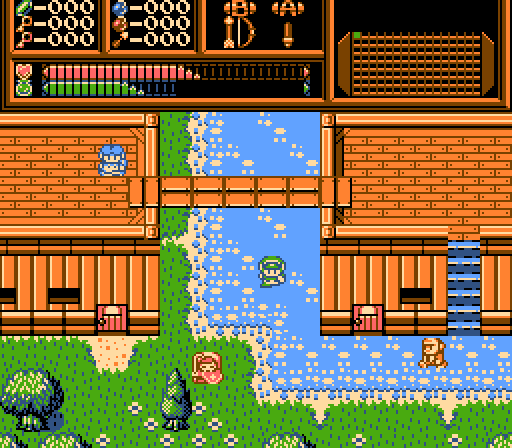
Only four 4-color palettes were used in this mockup for Koten Advanced.
Avataro
![]()
I would like to make a quest.

 This topic is locked
May the way of the Hero lead to the Triforce.

Posted 31 August 2014 - 03:48 PM
Demonlink
Twilight For- oh wait, this isn't Hylian Legacy XD
DragonDePlatino
Only four 4-color palettes were used in this mockup for Koten Advanced.
Avataro
![]()
I would like to make a quest.
o_o

Posted 31 August 2014 - 03:55 PM
Damn it! These are fantastic shots guys.
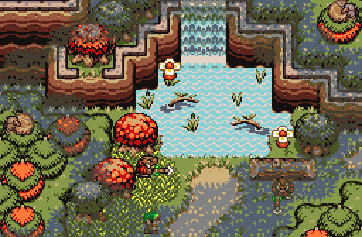
I don't have a chance. Also, Demonlink, that's the best forest shot I've seen in the Firebird tileset so far. ![]()
What's up my playas

Posted 31 August 2014 - 03:57 PM
These were awesome shots! I voted for Demonlink. Everybody did great! ![]()
Fallen leaves... adorn my night.

Posted 31 August 2014 - 03:58 PM
WOAH! This is definitely one of the best SotWs in a while. Extremely well made screens this week! I voted for Demonlink yet again, his screen blows everyone away even though the other screenshots are also amazing. Spectacular job! ![]()
Trofessional Pransposer

Posted 31 August 2014 - 04:00 PM
Lurking in the shadows...

Posted 31 August 2014 - 05:11 PM
Demonlink: ... That's damn ugly man. You should try better. I mean, who in heck appreciates water??? And sticks in the water??? You suck, -10/100
DragondePlatino: I see you're going for a GB styled Koten Advance! ![]() It seems really cool this way! My only "but" is to swap the Blue Color, it looks like it's water, but it's not that big of a deal! As always, your work is outstanding!
It seems really cool this way! My only "but" is to swap the Blue Color, it looks like it's water, but it's not that big of a deal! As always, your work is outstanding!
Avatar: The Last Airbender: I sense that you tried to pull off a "Nearby ruins" screen in classic, like a giant building has been carved in by the nearby mountains. Pretty good use of classic my dear buddy! So, is there treasure in there or what?
~ Hope of Energy Nede ~

Posted 31 August 2014 - 10:03 PM
Good line-up this week. I ended up voting for DragonDePlatino. That updated Koten shot essentially fixes all the previous problems I had with Koten. SLight nitpicky detail is the path, which, imo, I can't really think of a good description for it, I just don't think it looks "right", though.
Edited by Nexas, 31 August 2014 - 10:04 PM.
💙

Posted 31 August 2014 - 10:17 PM
I had to vote for DragonDePlatino; the design, tiles and palette all fit together to make one outstanding screen. My only complaint is the blue path tiles. I think they look a bit... well, they don't look like someone as professional as you made them in all honesty. Maybe give the bricks a more rectangle texture rather than circles/ovals/squares?
Pixel Dragon

Posted 31 August 2014 - 10:36 PM
Wow! I'm surprised to see how well my screenshot was recieved! And as for myself, I voted for Demonlink. I'm loving how he went all-out with the details. Some might say it's a little cluttered but as long as I can see what's walkable and what's not I'm happy. But sorry, Avataro, Classic screenshots with non-NES colors always irked me a bit. ![]() The atmosphere is great for it's simplicity, though, and I can just imagine all kinds of awesome screens that would be to the west or east.
The atmosphere is great for it's simplicity, though, and I can just imagine all kinds of awesome screens that would be to the west or east.
And as for the ground texture on my shot, I can fully understand. As a matter of fact, I threw out the cobblestone texture and started from scratch a few minutes after submitting this shot. You can see the newest version of the town on my Koten thread here.
Edited by DragonDePlatino, 31 August 2014 - 10:38 PM.
May the way of the Hero lead to the Triforce.
Posted 31 August 2014 - 10:41 PM
That looks a ton better! The blue still kinda stands out in the overworld shot, though it looks nice in the dungeon shot. Otherwise, it's a massive improvement over an otherwise excellent shot. ![]()
ringle

Posted 01 September 2014 - 05:50 AM
I was torn between DragonDePlatino and Demonlink this week. I ended up going for DDP since that all looks much better than the old Koten shots. Demonlink would be a runner-up, but I dunno the water beeing too bright and all killed it for me, it's just too bright for my tastes (unless that was intentional glow-in-the-dark water like over in the screenshot thread, I have no idea).
Either way, great competition this week!
o_o
Posted 02 September 2014 - 02:09 PM
Demonlink's shot is mysterious and well detailed, but I find the palette a bit murky for my tastes. Instead of the area looking like it's covered in shadow, it looks somewhat muddy.
I'm not sure that's even Demonlink's fault (except if he made the palette I guess). Also, maybe the place is supposed to be murky. ![]()
Avatar: The Last Airbender:
Nooo :O This joke is getting old xD Just call me Robin.
Lurking in the shadows...
Posted 02 September 2014 - 04:26 PM
1.- I'm not sure that's even Demonlink's fault (except if he made the palette I guess). Also, maybe the place is supposed to be murky.
2.- Nooo :O This joke is getting old xD Just call me Robin.
1.- Actually, it's a default palette in Firebird, and yes, it's supposed to be a bit murky ![]()
2.-No problem Korra Robin! ![]()
Wind Magic User

Posted 02 September 2014 - 04:52 PM
2.-No problem
KorraRobin!
Anyone who hasn't watched the show won't get all of these jokes. They're simply out of their element, eh? ![]()
As for the competition, I enjoyed all three shots. I voted for DragonDePlatino's shot this week. My only nitpick is that the windows are a bit tall on the building. Most of the characters will need a stepladder to use them ![]() But other than that, I really like the Koten Advanced stuff
But other than that, I really like the Koten Advanced stuff ![]()
Initiate

Posted 03 September 2014 - 03:49 AM
Demonlink: Firebird is a wonderful tileset and you've put it to good use here, but the shadows kind of obscure your map work. They clash pretty badly and make the screen a lot murkier than it needs to be.
DragonDePlatino: Nice, clean, pretty, nostalgic. You've put a lot of effort into this tileset. It must have been a lot of hard work to make, and it's paid off in kind. [my vote]
Avataro: Good for what it is. A classic screen. No more, no less.
0 members, 0 guests, 0 anonymous users