Jump to content

Photo

Screenshot of the Week 182


  • This topic is locked This topic is locked
49 replies to this topic

Poll: SotW 182 (54 member(s) have cast votes)

Contestants

You cannot see the results of the poll until you have voted. Please login and cast your vote to see the results of this poll.
Vote

#1 Teilyr

Teilyr

  • Members
  • Real Name:Adam
  • Location:Louisiana

Posted 27 October 2007 - 07:44 PM

Nuvo
IPB Image
No caption provided.

Evan the great
IPB Image
Link explores Faruhn woods.

CastChaos
IPB Image
What a mess... Vaati will pay for this!

Joe123
IPB Image
Just what do you think you're doing with that sword?!

Aribar
IPB Image
Once a beautiful forest, Link sees what Ganon's toxic touch does to Hyrule.

Plissken
IPB Image
New graphics I'm playing around with..

TriMaster001
IPB Image
Link really needs the dungeon map to get through this fortress

#2 CastChaos

CastChaos

    Deified

  • Members

Posted 28 October 2007 - 01:38 PM

Nuvo: I'm a fan of those fans. Beautiful mountains, beautiful palette... I feel like playing it now...

Evan the great: Nice MC-ish screen. I like everything, even the light, altough it rather looks like paperthin glass or such.

CastChaos: Oh, it's-a me!

Joe123: Nice DoR forest, I like the overfoliage and the scene.

Aribar: I like the gap. It will surely be good gameplay screen, the Dark World feeling really ups it.

Plissken: I take it you work for Nintendo. That boss you made for TP was great. But next time don't submit SNES game screenshots. I'd vote this if I voted. You are too great. I wonder how many tiles are ripped and how many are drawn or at least heavily modified. Simply too good. It makes me remember Alundra.

TriMaster001: I love the thick walls or whatyacalls there and the sealed water pond feeling is great. No tileset induced detail loss this time.

EDIT: First reply! W00t!

Edited by CastChaos, 28 October 2007 - 01:38 PM.


#3 Plissken

Plissken

    What's with these homies dissing our girls?

  • Members

Posted 28 October 2007 - 01:43 PM

QUOTE(CastChaos @ Oct 28 2007, 02:38 PM) View Post
Plissken: I take it you work for Nintendo. That boss you made for TP was great. But next time don't submit SNES game screenshots. I'd vote this if I voted. You are too great. I wonder how many tiles are ripped and how many are drawn or at least heavily modified. Simply too good. It makes me remember Alundra.


Wait what? I work for nintendo? Yes, I ripped these from ToP and edited them a lot and am working on ripping more stuff from there. Not really sure what you are getting at with this response though...

#4 Joe123

Joe123

    Retired

  • Members

Posted 28 October 2007 - 01:52 PM

Nulled of course, although it doesn't look like I have much chance here when compared to some of the flashier shots...
I should've left my subscreen in...
Anyway, I'dve probably voted Evan if I was participating.

#5 Evile

Evile

    Dolphinslayer

  • Members

Posted 28 October 2007 - 01:56 PM

Nulled of course.
Would've voted Plissken if I did vote though.

#6 Colin

Colin

    Coblin the Goblin

  • Members

Posted 28 October 2007 - 01:57 PM

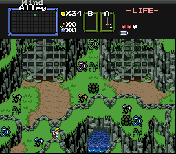
Me: I drew the fans all on my own... one of them isn't running, and that's the one with all of the ivy in front, the other is blowing away...

Evan: The light effect is really nice, I still think, as I've stated before, that you should make your darkest green/blue slightly more green.

CastChaos: Hey!!! I've seen this screen before, but now it's different icon_blink.gif nice job, I like the spring palette.

Joe123: I really like how you managed to use a ton of overhead foliage and still make it look good.

Aribar: This screen looks like it would have been AWESOME while it was still alive... it looks cool now too... but you should really put solid objects in all 4 corners of the screen, it looks better somehow.

Plissiken: I feel this screen is probably going to win. I've seen those octopus things before, I think... did you rip them? I don't, however, like the squareness of your cliffs in the upper left corner. The grass is pretty nice though. I like the tree too...

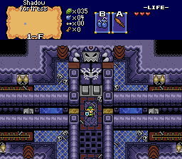
Trimaster001: You are the master at making good looking pure dungeons... I understand the symmetricity at this point since it's a temple like place. Looks like a dungeon I'd play...

Edited by Nuvo, 28 October 2007 - 01:58 PM.


#7 Plissken

Plissken

    What's with these homies dissing our girls?

  • Members

Posted 28 October 2007 - 02:00 PM

Yes, those were ripped and recolored Nuvo. From Chrono Trigger, they fit perfectly for octoroks with ToP graphics.

#8 CastChaos

CastChaos

    Deified

  • Members

Posted 28 October 2007 - 02:16 PM

QUOTE(Plissken)

Not really sure what you are getting at with this response though...

Uhm... I'm just expressed how I LOVE that screen. I suspected people won't understand it... But still... I LOVE it.
EDIT: What is "ToP"?

QUOTE(Nuvo)

CastChaos: Hey!!! I've seen this screen before, but now it's different nice job, I like the spring palette.

Whaaaaat?! icon_eek.gif
This is a Dark World palette! icon_eek.gif
I admit it's not like the aLttP Dark World, but I didn't inted to copy that. It's in fact an Inverted World palette. The "inverted" things aren't always dark, so I inserted some non-evil shades. In fact, I took the regular palette, darkened the colours, then made them more creamy (cartoony, you'd say) and then put some green in them. Some shades are not modifications, rather completely custom. CSet9 isn't modified yet.
Oh, and the dark azure blue bush is a hint that there will be really non-darkworld-ish parts, too.

Edited by CastChaos, 28 October 2007 - 02:18 PM.


#9 Plissken

Plissken

    What's with these homies dissing our girls?

  • Members

Posted 28 October 2007 - 02:21 PM

QUOTE(CastChaos @ Oct 28 2007, 03:16 PM) View Post

Uhm... I'm just expressed how I LOVE that screen. I suspected people won't understand it... But still... I LOVE it.
EDIT: What is "ToP"?


Oh, I thought you were saying I was ripping off of nintendo. And when you said TP I thought you meant ToP which is what I got the stuff from. It's Tales of Phantasia.


#10 DarkFlameWolf

DarkFlameWolf

    Murana Wolford

  • Members

Posted 28 October 2007 - 02:40 PM

Nuvo, hands down, the fans could use more work to blend better into the mountainside, but regardless, beautiful shot!

#11 The Satellite

The Satellite

    May the way of the Hero lead to the Triforce.

  • Members
  • Real Name:Michael
  • Pronouns:He / Him

Posted 28 October 2007 - 03:15 PM

This is a real tough choice. >_<

Evan and Plissken are my home skillet dog biscuits (*shot*) when it comes to quest-making, as I love both of their works. Plissken for his screen-design and graphics editing, and Evan for his tileset, palettes, and screen-design. The choice is tough, but...

Evan.

#12 Dawnlight

Dawnlight

    My name is NOT Jason!

  • Members
  • Real Name:Justin
  • Location:Chicago, IL

Posted 28 October 2007 - 03:30 PM

Evan the Great gets my vote. I'm drolling over his palettes.

2nd: Nuvo
3rd: Plissken

#13 Evile

Evile

    Dolphinslayer

  • Members

Posted 28 October 2007 - 03:35 PM

QUOTE
Evan: The light effect is really nice, I still think, as I've stated before, that you should make your darkest green/blue slightly more green.

I did make it a bit more green, just not very much so. I like it the way it is, too much green made it look bad. icon_unsettled.gif

#14 Teilyr

Teilyr

  • Members
  • Real Name:Adam
  • Location:Louisiana

Posted 28 October 2007 - 09:55 PM

Oh. So those are fans. I was wondering what they were when you sent them to me. I imagine they look better animated. Still, they look kinda oddish. Couldn't recommend anything to make them better, though. Also, you should release that Link palette. It's simple enough but, still really pops.

Plus, you said Link isn't the main character of Incendia so.. . icon_smile.gif

As for my vote, Joe123. Superb use of the DoR set here. Plus, I've seen the video this shot is in, and the whole of it really blew me away.

Good job sir.

#15 Aaron1046

Aaron1046

    Apprentice

  • Members
  • Real Name:Link
  • Location:Canada, Ontario

Posted 28 October 2007 - 10:12 PM

Nuvo: looks cool, and weird XD
Evan the great: Looks rely nice! keep it up!(voted)
CastChaos: looks nice, but the light brown grass things looks weird on the green ground to me
Joe123: Looks rely cool!!! BUT on the over head pushes, somthings on it that dosnt normaly go on it looks weird XD
Aribar: Looks nice, but plain kinda
Plissken: LOL chrono triger! cool!
TriMaster001: nice nice, hope i can make things like that some day!
You all have nice screen shots!


0 user(s) are reading this topic

0 members, 0 guests, 0 anonymous users