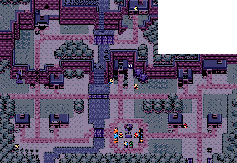
Freya
And that's just the tip of the iceberg.
FlameCursed
Link's very own island retreat and girlfriend have been captured by Ganon!
Cast your ballot before Halloween. Good luck, everybody.

 This topic is locked
Trofessional Pransposer

Posted 01 October 2014 - 03:30 AM

Posted 01 October 2014 - 05:12 AM
Has more posts in Doomworld than in PureZC

Posted 01 October 2014 - 07:37 AM
Don't give up yet! There's still hope for you...Uh oh, I'm gonna get creamed. Oh well, there's always next month!
(Vote nulled)
Edited by HavoX, 01 October 2014 - 07:39 AM.
ringle

Posted 01 October 2014 - 10:44 AM
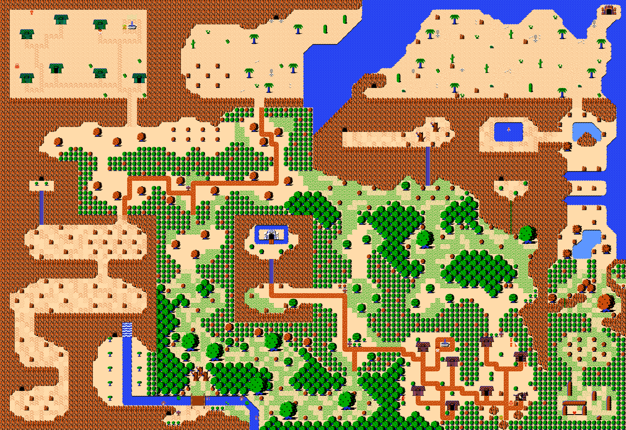
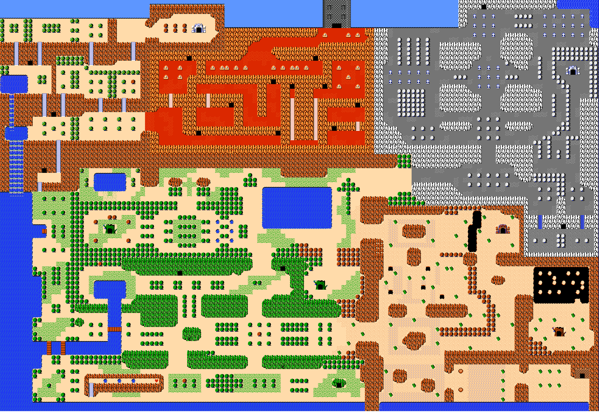
Very difficult choice this month... I went for Orithan at the end. The GB use is pretty amazing and it looks as if it's from the OoX games. FlameCursed or Freya would've come in second, they're maps are pretty nice too!
Addicted to Overwatch

Posted 01 October 2014 - 10:46 AM
I went for Freya.
reason is, I love the detail and how you used the classic tileset!
Orithan: Yours is cool but it just does not hit me. I like the palette used and the river going through the middle.
FlameCursed: I like the tower at the top and how you used the classic tileset. but the problem is that it looks a bit bland.
RESPECT DA OBOE SOLO

Posted 01 October 2014 - 11:45 AM
Posted 01 October 2014 - 01:26 PM
Don't give up yet! There's still hope for you...
And besides, October just got started.
Looks like its time to give up xD
I don't know what I was thinking I suck at ZC haha ![]()
Freya. Amazing use of classic map.
I see zelda ii design concepts.. juicy.
Orithian. Wonderful Halloween looking map but could have used more fitting decorations to the gloomy theme
Flame cursed you have potential to achieve better
Details? I think feedback would help.
ringle
Posted 01 October 2014 - 01:34 PM
I don't know what I was thinking I suck at ZC haha
I would say to be confident in what you make. Sure, you might not be the best ZQuester ever (neither am I), but at the same time, be proud of what you make and don't make yourself feel bad. It's always good to enter these competitions as you'll get constructive feedback most of the time which helps you make something better. Don't give up hope, be confident and keep trying, I'm sure you'll do well in the future ![]()
Besides, the competition just started. You might get a sudden burst of votes in the next few days.
Edited by EddyTheOliveira, 01 October 2014 - 01:35 PM.
Magus

Posted 01 October 2014 - 01:57 PM
I might have voted for Orithan if it weren't for those purple trees in the middle. ![]()
💙

Posted 01 October 2014 - 02:09 PM
waiter there's a purple tree in my map
er
I liked all of them, but I voted for FlameCursed, as he had a little more variety and colour. But they were all nicely designed.
Trofessional Pransposer
Posted 01 October 2014 - 02:39 PM
Uh oh, I'm gonna get creamed. Oh well, there's always next month!
Dude, are you kidding? You have a competent map. Even if you didn't, this contest would be an opportunity to learn what you did well and where you can improve. There's no sense in getting discouraged if your goal is to be a great mapmaker.Looks like its time to give up xD
I don't know what I was thinking I suck at ZC haha
What's up my playas

Posted 01 October 2014 - 02:45 PM
I voted for Freya this month.
Deified

Posted 01 October 2014 - 03:57 PM
Hint: My vote goes to Zelda 2: The Adventure of Link
o_o

Posted 09 October 2014 - 02:51 PM
Nice maps this month. Freya and FlameCursed have got grand classic maps with great design! Orithan has a solid and compact town with a palette that fits it, and that's why I voted for you.
Touch Fluffy Tail

Posted 10 October 2014 - 09:04 AM
Thank you for your compliments and suggestions especially you Ed. I have made the deserts. Their are were beaches in "Zelda 2 my friend." more detailed. And will also be making some cooking up some new tiles in the kitchen to make it less sparse.
PureZC Events →
Screenshot of the Week →
Poll Screenshot of the Week 812Started by Taco Chopper , 15 Apr 2024 |
|

|
||
 |
PureZC Events →
Screen Rebirth →
Poll Screen Rebirth 8! The Contest!Started by Taco Chopper , 25 Mar 2024 |
|

|
|
|
|
Twilight Knight
PureZC Events →
Screenshot of the Week →
Poll Screenshot of the Week 807Started by Taco Chopper , 05 Feb 2024 |
|
|
|
|
|
Twilight Knight
PureZC Events →
Screenshot of the Week →
Poll Screenshot of the Month 198Started by Taco Chopper , 04 Dec 2023 |
|
|
|
|
|
Orithan
PureZC Events →
Screenshot of the Week →
Poll Screenshot of the Week 803Started by Taco Chopper , 27 Nov 2023 |
|
|
0 members, 0 guests, 0 anonymous users

