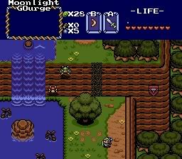
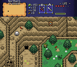
... Billy, let me tell you something. It takes a lot of skill to use any set, even classic. Hell, I sucked with classic when I first used it (3 years ago... huh.) You say that classic shouldn't be better than PTUX. Well, I'm sorry, but in this case, it is. In zmaster's shot, everything is excellently detailed. I'm not saying it's perfect, but it still has more detail than your shot. Thing is, your shot lacks ground detail. I'm not saying it's horrible, but the mountains' grounds need way more detail. And the bushes are way too repetitive. Overall, it does have potential. And let me tell you, PTUX is pretty difficult to use. Even I have trouble with it. That's probably the reason I've only made about 6 screens of Remnants with PTUX. It takes a lot of time to even make one screen. To make the screen that won the only SotW I've ever won, I spent about 20 minutes on. Overall, you can't use PTUX and expect to make amazing screens in a couple minutes. Every little thing needs to be tended to.
QUOTE
How can you say that over classic (if you see my next DS topic ingore it)
Just because it's classic doesn't mean it's going to make you pry your eyes out with a spork. There's more to it than just how great the graphics might seem in the next shot. In SotW, it's how a set is used, too.

 This topic is locked