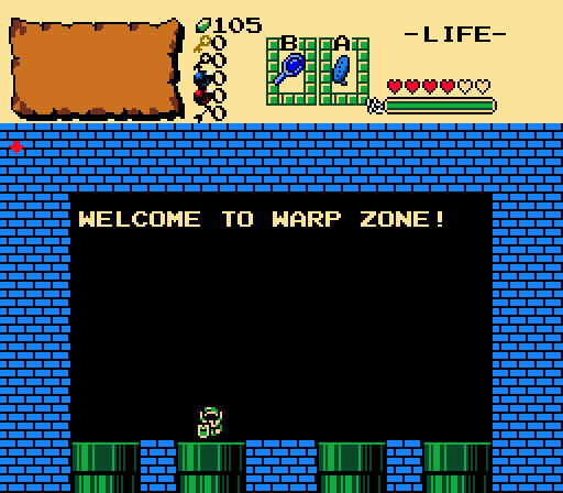
MonopolyRubix - Interesting concept for an area in a quest, but not really a super interesting screen. This certainly makes me curious for how it'd work in a quest (or if it'd just be an easter egg).
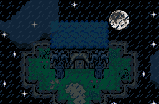
RedTribeLink - A nice establishing shot, perfect for a cutscene, as indicated. However, there's just something about how the cloud looks with the roof of the building that just bugs me. It's very likely that in motion, this screen will look much better than still.
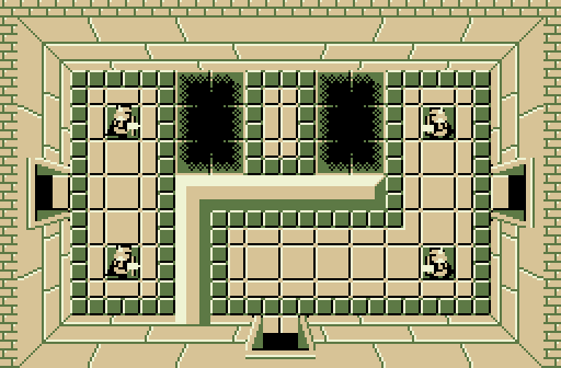
Shane - While I really like what's going on here as far as usage of the classic set, it's a bit hard to differentiate the wall extension from everything else. The colors also make it a bit hard on the eyes, as it took me a few seconds to actually comprehend the layout of the room. I feel that some different color choices would tie everything together much better.
GrantGreif - While the screen is perfectly fine, it comes across as having way too many hard angles. It seems everything is straight lines and hard corners and makes it feel more like a placeholder screen that would be tightened up later. It just feels kind of basic and simple because of that.
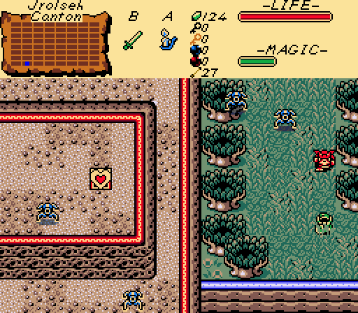
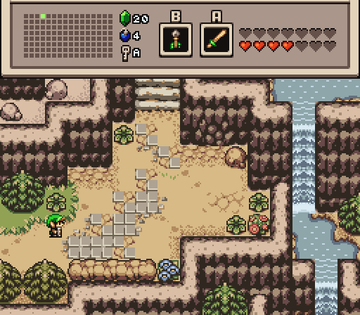
Linkus - Good, simple screen that would work as an approach to an important NPC cave or a dungeon I feel, if it were left without enemies as it is now. It's not a super interesting screen, but it does have a lot of atmosphere to it. The hidden cave is a nice touch as well, being both subtle and visible.
Overall I have to go with Linkus this week, as I feel it's the most complete screen.

 This topic is locked