Welcome to Screenshot of the Week: Beach Edition! You're stuck with me again. I'll be your host!
GrantGreif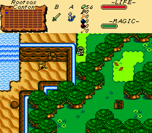
Son of a beach.
EpY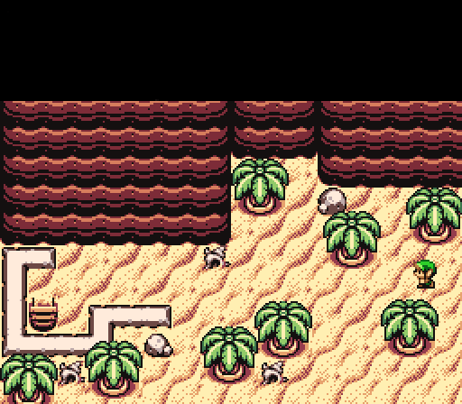
nicklegends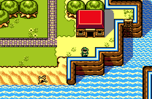
What a big, beautiful, blue ocean! Too bad I'm stuck on this island.

-
 This topic is locked
18 replies to this topic
#1

nicklegends
-

- Contributors
-

Trofessional Pransposer
- Real Name:Ed
- Pronouns:He / Him
Posted 24 August 2014 - 05:38 PM
- The Satellite likes this
#2
David
-

- Administrators
-

Fallen leaves... adorn my night.
- Real Name:David
- Pronouns:He / Him
Posted 24 August 2014 - 05:49 PM
These are decent screens I have to say. I like the theme of beaches that going on here. ![]()
GrantGrief- 8.5/10
Very nicely made screen. It could benefit from a few more details and perhaps a few more enemies to make the screen feel more alive but overall the screen looks good. ![]()
EpY- 8/10
This is a really well made screen. Overall it looks really good even though it could use a few more details. However, the one thing that annoys me a lot is the completely black subscreen; it's really distracting. You should've used the option to not show the subscreen. Other than that, good looking screen. ![]()
nicklegends- 9/10
This is where my vote went this week. The screen design is great and the ocean looks the best out of all the 3 screenshots. Like the other screenshots though it could use a few more details, but overall this is a great screen and I like it a lot. ![]()
#3
Shane
-

- Moderators
-

💙
- Pronouns:He / Him
- Location:South Australia
Posted 24 August 2014 - 09:01 PM
Sun of a beach! What's with all these beach shots? It's driving me coconuts. >_<
- Eddy and EpY like this
#4
Eddy
-

- Moderators
-
ringle
- Real Name:Edward
- Pronouns:He / Him
- Location:London, United Kingdom
Posted 25 August 2014 - 07:39 AM
I voted for nicklegends this week. The shadows are a very nice touch, although the floor on the top-left section looks a bit too empty for my tastes, but nonetheless, still a very good screen!
- nicklegends likes this
#5
Jared
-

- Members
-

Deified
- Real Name:Jared
- Pronouns:He / Him
- Location:New Hampshire
Posted 26 August 2014 - 12:46 PM
I nulled. This was a pretty poor SoTW.
#6
sigtau
-

- Members
-

*sip*
- Real Name:Will
- Location:Spending too much time on this damn thing
Posted 26 August 2014 - 01:23 PM
I don't vote often, but I wanted to praise nicklegends for his use of shadow. Really makes the gameboy tileset pop.
- nicklegends likes this
#7
Moosh
-

- ZC Developers
-

Tiny Little Questmaker
Posted 26 August 2014 - 01:36 PM
I nulled. This was a pretty poor SoTW.
The way you worded this sounds kinda disrespectful to everybody who entered this week. I'd like to request that you use a little more tact when saying things like this in the future.
GrantGreif: A pretty solid screen. The tree colors appear to be inverted but I've seen others use them like that so I think it's just a matter of preference. You also have a lot of solid combos a tile away from the edge of the screen. This isn't inherently terrible, but if done too much it can have a negative effect on gameplay.
Epy: The top left quarter of this screen is occupied entirely by cliff tiles. It would look infinitely better if you had something, anything else in that part of the screen. Maybe even some grass sticking out of the cliff side. Does Firebird have that?
nicklegends: This screen gets my vote this week. I'm normally not a big fan of layered shadow shenanigans, but what can I say, it works really well here. If I might make a small suggestion, I think the implied slope should extend down one more tile. It seems a little steep currently.
- nicklegends likes this
#8
MarinaraSauce
-

- Members
-

Magus
- Real Name:Grant
- Location:New York
Posted 26 August 2014 - 01:57 PM
The tree colors appear to be inverted
What do you mean?
#9
Moosh
-
- ZC Developers
-
Tiny Little Questmaker
Posted 26 August 2014 - 02:17 PM
What do you mean?
I thought that tree type you used was identical to another with the light and dark greens inverted. Upon looking at the tileset, it appears I was wrong. Anyways, the tree type to the left of it in the combo list is very similar but looks much better IMO.
#10
trudatman
-

- Members
-

one point nine hero
- Real Name:that guy
- Location:State Of Love And Trust, The United State Of Amorica.
Posted 26 August 2014 - 03:17 PM
agreed. none of these appeal to me, but I can't believe where the votes are going. those terrible shadows are winning people over!? they don't line up with the curve of the cliff edges and that really accentuates the common problem of the tiny corners of dirt in the water that make less than no sense. the first shot suffers a similar edging issue that drives me nuts. I went with the middle shot which isn't bad.....This was a pretty poor SoTW.
#11
nicklegends
-
- Contributors
-
Trofessional Pransposer
- Real Name:Ed
- Pronouns:He / Him
Posted 26 August 2014 - 04:05 PM
Thank you for your frank assessment. Part of the challenge in adding shadows is that the Game Boy set is intentionally ambiguous about the vertical height implied in each mountain tile, so there are cases where shadows are a little more challenging to apply than they ought to be. For example, consider the upper ledge tiles that curve around the water. To be consistent with the rest of the set, the dark "crotch" line should be completely vertical, but it clearly is not. So if it were perfectly vertical, then I could extend the shadows up another tile, but then you'd intersect the "parapet" portion of the mountain tiles, etc. I'm still experimenting with different shadow approaches, but I found this to be the most aesthetically sound for the moment.agreed. none of these appeal to me, but I can't believe where the votes are going. those terrible shadows are winning people over!? they don't line up with the curve of the cliff edges and that really accentuates the common problem of the tiny corners of dirt in the water that make less than no sense. the first shot suffers a similar edging issue that drives me nuts. I went with the middle shot which isn't bad.
Also, you're right about the little dirt corners in the water (despite the tiles' being consistent with LA, OoS, and OoA as they are now). It would only take a minute to make a new combo with water in that corner instead of the dirt.
#12
trudatman
-
- Members
-
one point nine hero
- Real Name:that guy
- Location:State Of Love And Trust, The United State Of Amorica.
Posted 26 August 2014 - 07:10 PM
thanks for taking it well; others would not. the biggest issue for me is that those little tile corners cast a full shadow. move the start of the shadow up like five pixels and the whole thing works at least twice as well.
#13
nicklegends
-
- Contributors
-
Trofessional Pransposer
- Real Name:Ed
- Pronouns:He / Him
Posted 26 August 2014 - 09:36 PM
thanks for taking it well; others would not. the biggest issue for me is that those little tile corners cast a full shadow. move the start of the shadow up like five pixels and the whole thing works at least twice as well.
Oh, I get what you're saying now. I thought you were referring to how the shadows abruptly end toward the top of the wall (which I admit is a little weird), but you're right about the bottoms, too. I'll see what I can do about them without adding too many specialty tiles.
Also—before anybody points it out—yes, the leftmost tree in my shot does not match the others. That's what I get for rushing a shot to get a contest started on time.
#14
Shane
-
- Moderators
-
💙
- Pronouns:He / Him
- Location:South Australia
Posted 26 August 2014 - 10:02 PM
I thought that tree type you used was identical to another with the light and dark greens inverted. Upon looking at the tileset, it appears I was wrong. Anyways, the tree type to the left of it in the combo list is very similar but looks much better IMO.
I agree. The trees present were used in OoA, in the past when everything was trying to be dark and moody. This screen doesn't seem to capture a "dark and moody" atmosphere thus the trees don't work.
#15
trudatman
-
- Members
-
one point nine hero
- Real Name:that guy
- Location:State Of Love And Trust, The United State Of Amorica.
Posted 27 August 2014 - 07:16 AM
and here I thought the tree variety was intentional. slightly different versions of repeating tiles are the best. intentional clones are lame.
Also tagged with one or more of these keywords: nicklegends, GrantGreif, EpY


0 user(s) are reading this topic
0 members, 0 guests, 0 anonymous users

