Posted 06 May 2007 - 08:18 PM
Whee, I'm too lazy to do something apparently! Better to just let my time drift off to Smash! Ok, back on topic.
DarkFlameWolf:
First thing to point out - in the top right where the dirt ends to the grass. I just can't help but point out how horrific the contrast is. No offense, but that dirt stands out way too much vs. the grass. It's as if super bright sunlight were shining upon it or something, where as less penetrating sunlight is hitting the grass. Also, just what is that white/gray thing in the bottom-left that's hovering over a tree? It doesn't quite look like a bird. Also, the tall grass looks... out of place. In particular, it's the color - a little too dark in comparison to the standard short grass surrounding it. Ok, enough with the critism. Aside from those things, the shot is quite superb. The foliage shadows on the right blend in perfectly with the terrain it covers which has a nice transition to a forest area. The reddish/purplish trees give it a nice texture (sort of) and style to the surround areas. The rest of shot just works so well (that is, excluding said critisms).
Nuvo:
*Wind pictures a continuation of the DoR mountain in the top-left, given a height of 5.*
Ok... I really think it'd be better to do two things with that mountain:
-1) Oh please, SHORTEN THE HEIGHT TO 4. That'd mean a base cliff tile, two middle ones, and then the transition tile at the top. The current one right there has three middle tiles - sorry, but in DoR, that just doesn't look to pleasing, unless the top goes off the map. Just my opinion here, but any cliff that goes about 4 heights just looks... odd. Well, it's actually more of how it takes up so much room.
-2) Ok, after shortening that height, see the top-left area? Instead of using the diagonal curve like this:
_
/
l
Yeah, crude diagram, but at that point in the mountain considering that it'd be 4 high, change it to an upside-down L, and then use the appropriate surrounding cliff tiles for that. Trust me, that'd look considerably better.
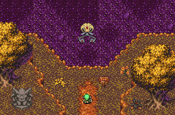
That aside, moving onto the other stuff. The enemies are too varied - a moblin type, a darknut and a stalfos on an overworld screen as bright as that? That just... doesn't seem quite right. Ye may want to change that. House entrance for a cave entrance? Interesting choice. Same thing with using the treehouse tiles in a different way than originally intended to. Quite a nice touch, but it's hard to tell whether it's on the ground or not, so we can't tell what it is. As previously said, great job with the shoreline - I may have to use your shot as an example when setting up shorelines myself. Some of the grass details don't seem to fit - could be a little too much repitition, but then again, I don't know. Seems more of a placement problem come to think of it. Hmm... never thought of using the small cliff tiles like that. Twill have to remember that when making a DoR cliff tutorial in the near future. Nonetheless, a fairly decent shot that needs a little bit of a facelift, but still fair enough.
Revfan9:
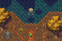
I understand you still need to work out getting more ground details for your set, so I'll skip critiquing the lower section of your shot. My complaint falls with the water - it looks too similar to the grass. I couldn't even tell there was dirt under the water until you showed the blue water shot. Point is, I think a different choice of water would considerably improve the shot. As for what one to use... well, you'd have to find that one elsewhere. It's just the transparent water used there, although it may capture some mystical effect, it's too repetitive with its type of detail. So, given you replaced the water on that shot... that would've just looked plain awesome. Ok, that is, given you'd also include ground detail under the water. Nonetheless, a good shot.
Voted DFW due to, in my opinion, lack of issues in comparison to the other two shots and screen design - plus a few other smaller things.

 This topic is locked