Oh dang. So many to comment on!

Matthew: Dude, that is one big tree! It looks great. I usually don't like symmetry, but it looks like that symmetry is a good idea in this case.
EatinCake: Well, what can I say? The look is great. There's money in several places, which does give the idea of a thieves' hideout. But, just curious, why the electric guitar?
Sir Pimpalot: Argh, attack of the symmetry!

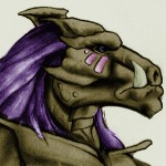
That guy reminds me of one of those Gorons from Twilight Princess. Aside from the goron, there isn't much else to see.
Blue Link 2007: Ok, merging two side sprites of a Mega Mole isn't a smart idea. It looks, uhhh,... weird. The water around the arena looks great, though!

Sharon Daniel: I honestly don't know what to say. The only thing I can say is that the mountains should be more pale in color.
Mr. Z: Finally, someone who uses the Classic Tileset! Despite the NES looks, I kinda like how everything is put together.
Moonwhisper: I'm starting to see a trend here. It truly is beginning to look a lot like Christmas. Yes, everywhere I go. Also, I do not know what to say about the shot. It's,... uhh,... wintery.
Revfan9; Yup, it's a trend, alright. That greenness looks a little odd for a winter pic. Other than that, it looks ok.
And finally, I will make my vote! Uhh,... dang. I should start ruling out some people. *thinks for a while* Ok, after some thought, I think I'll go with Mr. Z. The majority of the screenshots just seem too graphics-oriented. Watch me get flamed for saying that.

 This topic is locked