What a great turnout! I'm so glad the contest has survived to its 500th iteration. It speaks well to everybody's creativity and the forum as a whole.
CjcI haven't seen any classic-style shot quite like this one. I like the overall vibe of the screen and yet I feel some of the graphics don't meld well together.
GeoffreyA nice, vibrant scene. I feel like it would be a little cramped to navigate, though. It's like the screen tries to do too much.
Joelmacool12A well designed Game Boy shot without much flair.
EddyThe repeated shell detail detracts from an otherwise attractive shot.
TheryanA lot of detail packed into a small package. The color palette is distinctive.
Coolgamer012345A pleasant scene, but nothing too interesting.
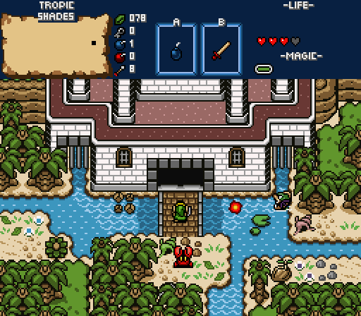
nicklegendsLooking back, the screen is somewhat drearier-looking than I indended. I want a jungle that's lush, not stagnant and swamplike. Oh well.
 Twilight-Prince
The repeated dirt pattern combined with the detail-obscuring shadow of nighttime makes this screen look somewhat drab.
DevianceI'm so glad you decided to enter.

TACO!
The SatelliteI'm pretty sure this was taken directly from
A Link to the Past! Well, not quite.
RedTribeLinkThe screen just looks... confused. The trees don't really match and the telepathy stone is oddly placed. Sorry.
ShaneGorgeous. The gold hue is attractive and I especially like the bird detail. Why is the sky so gold when the sun's so high, though? Either way, voted here.
OrithanCaptures a dead vibe for sure. Some a of the features are a little hard to make out... What are those cube blobs on the right side? Is that vertical strip on the left walkable or not?
ywklsIt's OK... I can't put a finger on it, but I don't care much for the screen design. Sorry to be so vague.
NewJourneysFireAre those shadows cast by clouds? If so, they seem a little densely packed. I like the transparent water. Still, the screen looks oddly sparse... Maybe a more visible tree would help? It's hard to say.
RussBright, unique, but not particularly engaging to me.
Thank you for all your comments and recommendations for my screen. I really appreciate the feedback; it's the only way I'll get better.
I voted for nicklegends. It has all the best qualities of the competition all rolled into one amazing screen.
Thank you!
You stole an idea I had without even knowing it! Namely, use rivers to access areas by swimming beneath bridges. I also like the shadowy areas.
Thanks for your comments.
"A $1000 on nicklegends!"
Thanks, but that's a lot of money to place on a SotW competition. Haha.
Very cool jungle/forest temple shot. You did a great job of fusing the indoor and outdoor elements.
Thank you! I like dungeons that fuse indoor and outdoor areas (it makes them feel bigger), so I thought I'd do the same here.
A very charming screen that masters shades of green and brown, with a hint of both sun and shade. Overall fantastic graphics design and decisions, and my vote for this milestone week.
Thanks, Nathaniel.
I love the forest setting here. Really cool stuff. I dunno if the water is really supposed to be green since that looks odd (unless it's supposed to be part of a swamp or something). Either way, nice.
Thanks, Eddy. In retrospect, I agree with you about the green water. I was envisioning Stow Lake in my mind, but then I remembered that water is gross.

Nicklegends, very nice. The screen is easily one of the best in the contest, and I'm not going to discuss the nice points because of that. So onto the nitpicking... The shadows make the trees and details lose all their detail, which while effective on this screen, makes me concerned about how the adjacent screens look if they are more forest and more shadowed. The other gripe is the gameboy square tiles, the three bushes mostly, but also the sand tile to forest brush.
Thanks, justin. I think you make a very good argument and I'll be careful not to obscure too much detail in the area.
I voted for nicklegends. Something about the depth going on here.
Thanks, Anthus.

 This topic is locked