
its not arrogance you twit. Its knowledge. I know for a fact he's doing HDR, by his admission and word, he said he was remaking Hidden Duality. So it goes to no surprise that that screenshot is most likely a remake of an existing screen from that quest. Its the only thing, that I'm aware of that Angeal is working on.

Screenshot of the Week 356
Started by
Neppy
, Feb 05 2012 08:53 PM
-
 This topic is locked
28 replies to this topic
#17

Moonbread
-

- Members
-

Playing With Psychos
- Pronouns:They / Them
Posted 07 February 2012 - 10:12 AM
QUOTE(Twilight_Knight @ Feb 7 2012, 07:16 AM) 
Not everyone takes inspiration from you DFW, such arrogance...
I did vote for Angeal. It looks functional and clean, but also very pleasing. Nothing too fancy.
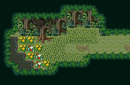
Angeal's screenshot comes from a remake of Hidden Duality, one of DFW's more popular quests.
This discussion is over, too. Back to the thread's original purpose.
#18
Sheik
-

- Members
-
Deified
Posted 07 February 2012 - 04:10 PM
I voted for Dan. I don't like nor get what's up with the trees on the left (what's the second row of leaves for?) but I liked it the most. I always enjoy how unique your stuff is, Dan!
#19
The Satellite
-

- Members
-
May the way of the Hero lead to the Triforce.
- Real Name:Michael
- Pronouns:He / Him
Posted 07 February 2012 - 04:44 PM
Octorockoncrack - Looks fine, I guess.
Franky - It's a very neat concept, but the perspective is off. The entire screen looks... flat. It's hard to tell what's a wall and what's walkable in this shot.
SpacemanDan - It's a fine-looking screen, I just will never be able to like those mountains. And the left side of the screen... it's hard to tell what's going on there. Other than that, no complaints.
Jared - Nice tiles, nice color, but it just feels somewhat boring. I'm sure it works fine in gameplay though.
Angeal - Excellent, perfect, the best shot here. The design is perfect, the palette is nostalgic, it just doesn't get much better than this. My vote went here.
#20
SpacemanDan
-

- Members
-
- Location:Ontario, Canada
Posted 07 February 2012 - 05:30 PM
The left was just an experiment to see if doubling the leafy layers looked okay and to get opinions on the matter. 
As for what exactly is going on, it's supposed to be something like this:
This probably isn't the best example of it, but I hope it illustrates better what I'm trying to do with the tree/leaf layer thing. The leaves are a kind of 'ceiling' where the trees would be a kind of wall. Perhaps another approach would be best? I'm not sure; I'm pretty much open to suggestions. :3 I just don't want to go with the usual brush seen often.
Thanks for the comments! I do appreciate them. :3
#21
The Satellite
-
- Members
-
May the way of the Hero lead to the Triforce.
- Real Name:Michael
- Pronouns:He / Him
Posted 07 February 2012 - 05:34 PM
It's probably just the blackness of it that threw me off. It's just... too abrupt. There really ought to be a better blending between the green and black parts. I know that's the tileset's fault, though, not yours. 
#22
Neppy
-

- Members
-
Grand Overlord Empress
- Real Name:It's dangerous to go alone. Take Nep!
- Location:Minnesota
Posted 07 February 2012 - 05:46 PM
Aha, well that's an interesting style. Perhaps a little modifying of the tiles would make it a little more clear as to what it's meant to be doing, but that other screen lets us notice it a bit easier.
#23
bgw_6
-

- Members
-

Newbie
Posted 07 February 2012 - 06:06 PM
i voted for Jared, it has a mysterious feel to it.
the other screens look too gloomy, well except Angeal's but it didn't have anything out of the ordinary
the other screens look too gloomy, well except Angeal's but it didn't have anything out of the ordinary
#24
Yoshibrothers
-

- Members
-
Newbie
- Real Name:Jordan
- Location:Ohio, USA
Posted 07 February 2012 - 07:02 PM
I voted for Angeal's because it reminds me most of the 2D Zelda Games.(somewhat)
#25
Sheik
-
- Members
-
Deified
Posted 08 February 2012 - 06:58 AM
QUOTE(SpacemanDan @ Feb 7 2012, 11:30 PM)
The left was just an experiment to see if doubling the leafy layers looked okay and to get opinions on the matter.
As for what exactly is going on, it's supposed to be something like this:
This probably isn't the best example of it, but I hope it illustrates better what I'm trying to do with the tree/leaf layer thing. The leaves are a kind of 'ceiling' where the trees would be a kind of wall. Perhaps another approach would be best? I'm not sure; I'm pretty much open to suggestions. :3 I just don't want to go with the usual brush seen often.
Thanks for the comments! I do appreciate them. :3
I love that screen! I would probably make less black space and block the space off with other tiles if you want less walking space but that general idea is wonderful. I love the water, too.
#26
SpacemanDan
-
- Members
-
- Location:Ontario, Canada
Posted 08 February 2012 - 10:00 AM
That screen is actually from an RPG Maker template set; I didn't make it myself. I probably should have been a little clearer on that. My bad. 
Though that's what the Mack & Blue stuff looks like in its original form, and during my days of using RPG Maker, it was my favourite series of sets to use which is probably why I'm striving for something similar. XD
Though that's what the Mack & Blue stuff looks like in its original form, and during my days of using RPG Maker, it was my favourite series of sets to use which is probably why I'm striving for something similar. XD
#27
Twilight Knight
-

- Members
-

Tell all with glee, Argon's on PureZC
- Real Name:Sven
- Location:Rotterdam, NL
Posted 08 February 2012 - 10:15 AM
CastChaos has made a Mac & Blue tileset, you know.
Btw, DFW, apologies for what I said. I thought you claimed it was based on your work, I had no idea Angeal was recreating one of your quests.
Btw, DFW, apologies for what I said. I thought you claimed it was based on your work, I had no idea Angeal was recreating one of your quests.
#28
Nathaniel
-

- Members
-
Deified
Posted 11 February 2012 - 05:36 PM
Octorockoncrack - B+
It's meant to be a dark screen with some lighting, but I think it's still too dark for the amount of lighting provided, as I can barely see the floor tiles. It might look better through the player though. Other than that, I really like it. Great feeling of death surrounding Link.
Franky - B-
Other than it being modernish and industrial, I'm still confused by some of it. It's nice to see something very different like this on occasion, though. Not bad, but not great, but maybe it will grow on me more if you continue to pursue it.
SpacemanDan - A-
What an interesting setting. New terrain types and enemies for the win. Very well done.
Jared - A-
Amazing design, and you only stuck to shades of green. I applaud that greatly. You are skilled in a path that few travel. A close call, but my vote went here.
Angeal - A-
Both very functional and natural is a plus that many fail to achieve. This screen has plenty going for it, without feeling cramped.
#29
Neppy
-
- Members
-
Grand Overlord Empress
- Real Name:It's dangerous to go alone. Take Nep!
- Location:Minnesota
Posted 14 February 2012 - 12:11 AM
Octorockoncrack - 2 votes = 4.55%
Franky - 5 votes = 11.36%
SpacemanDan - 12 votes = 27.27%
Jared - 10 votes = 22.73%
Angeal - 15 votes = 34.09%
Total Votes: 44
Angeal

"I wonder what's across the way." ~Link
Congrats on a great job this week Angeal!
Wonderful turnout this week everyone! Thank you!
Franky - 5 votes = 11.36%
SpacemanDan - 12 votes = 27.27%
Jared - 10 votes = 22.73%
Angeal - 15 votes = 34.09%
Total Votes: 44
Angeal
"I wonder what's across the way." ~Link
Congrats on a great job this week Angeal!
Wonderful turnout this week everyone! Thank you!
0 user(s) are reading this topic
0 members, 0 guests, 0 anonymous users

