
Hal visits Turninga City at the start of his investigation.
Hoff123
I already had full life...
Demonlink
Beautiful preview of my Hylian Tale "Reawakened".
Marco
indeed Patras' are difficult.
Shane
Go home Level 2, you're drunk.

 This topic is locked
Grand Overlord Empress

Posted 06 October 2013 - 11:02 PM
💙

Posted 06 October 2013 - 11:07 PM
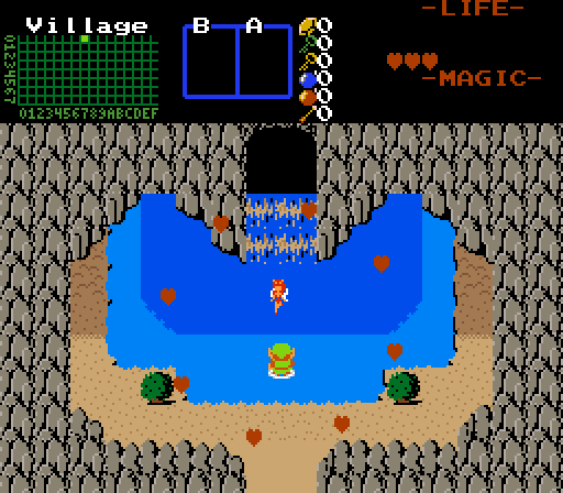
Voted for Marco because it feels refreshing to look at. ![]() Orithan's feels a bit generic complete with a off centered passive sub, Hoff123's is a bit symmetrical and we've seen a similar scene from him, Demonlink's has perspective issues with the water (left of the waterfall) and has solid tiles too close to the egde (and blue hearts?
Orithan's feels a bit generic complete with a off centered passive sub, Hoff123's is a bit symmetrical and we've seen a similar scene from him, Demonlink's has perspective issues with the water (left of the waterfall) and has solid tiles too close to the egde (and blue hearts? ![]() )...
)...
...and mine is drunk. ![]()
Edited by Shane, 06 October 2013 - 11:09 PM.
The Hoff :)

Posted 07 October 2013 - 01:42 AM
Damn, Demonlink ![]() . I nulled, but that's who I would have voted for.
. I nulled, but that's who I would have voted for.

Posted 07 October 2013 - 08:46 AM
I voted for Shane because he held a gun to the back of my head. I happily clicked for his vote.
Good shots peoples.
Hoff123 came in second, because his shot feels like its the only one with true effort put in that isnt a try hard-
It's clean, flows simple, balanced and indeed has some shade to it, I like it. The shade is not overkill, too, like some other classic work I have seen.
Cute colors, too, it really is.
This time around though Shane and I have original shots, by means of presentation and gameplay.
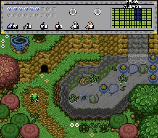
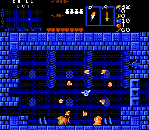
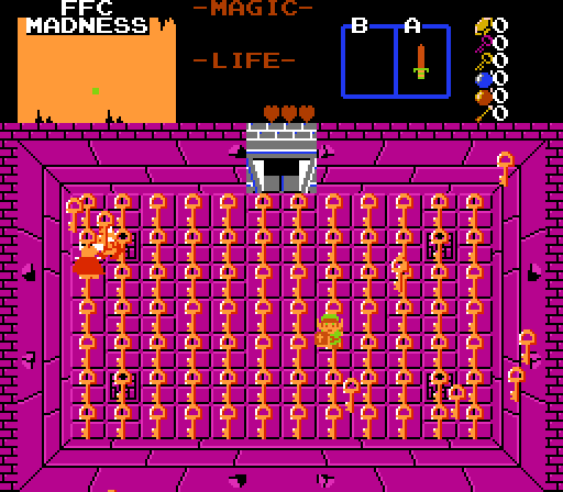
City - Village - Village - Sidescroller - WTFdiscool
Also, you're not selling your subscreens to me people, can't fool your shots like that on me! Minus that, take a look at the DoR screens and its the same stuff from 2008, just recycled. Heavily recycled.
Edited by Marco, 07 October 2013 - 08:52 AM.
💙
Posted 07 October 2013 - 08:51 AM
I voted for Shane because he held a gun to the back of my head. I happily clicked for his vote.
You forgot to add hash-tags after that statement. I'm disappointed in you. ![]()
thanks though, you're swag.qst
Edited by Shane, 07 October 2013 - 08:59 AM.
The Hoff :)
Posted 07 October 2013 - 09:03 AM
Hoff123 came in second, because his shot feels like its the only one with true effort put in that isnt a try hard-
It's clean, flows simple, balanced and indeed has some shade to it, I like it. The shade is not overkill, too, like some other classic work I have seen.
Cute colors, too, it really is.
You don't mean the brown stuff, do you? Because that was actually supposed to be dirt ![]() .
.
Lurking in the shadows...

Posted 07 October 2013 - 12:19 PM
(and blue hearts?
)...
Not every heart has to be red ![]()
By the way, voted for Marco, very nice use of the Classic Tileset ![]()
Edited by Demonlink, 07 October 2013 - 12:19 PM.
Wizard

Posted 07 October 2013 - 02:41 PM
Puh, very hard to decide. Orithan's and demonlink's pics are great!
But I voted for Orithan. I love Town-screens and this one seems to be very interesting. ^^
💙
Posted 07 October 2013 - 08:25 PM
Not every heart has to be red
But there's still the fact that it looks rather odd. ![]()
:3

Posted 08 October 2013 - 06:51 AM
~ Hope of Energy Nede ~

Posted 08 October 2013 - 07:52 AM
Voted for Shane, it had the most swag.
Not every heart has to be red
Warning: Slightly Gross Image(Though still SFW, because I'm nice like that. :3)
Your argument is invalid. *runs*
Edited by Goriya, 08 October 2013 - 07:52 AM.
Dead Man

Posted 08 October 2013 - 08:29 AM
I vote for Demonlink ... I like the status bar and the environment
💙
Posted 08 October 2013 - 08:46 AM
Subscreen of the week anyone? ![]()
But it seems most people get voted on not because they took the time and effort on the screen but the subscreen. It only dis-encourages to be creative with world design and focus on a flashy subscreen. ![]()
Edited by Shane, 08 October 2013 - 08:48 AM.
Studying Scientist - Commission from Silvixen

Posted 08 October 2013 - 01:10 PM
Voted for Marco because it feels refreshing to look at.
Orithan's feels a bit generic complete with a off centered passive sub, Hoff123's is a bit symmetrical and we've seen a similar scene from him, Demonlink's has perspective issues with the water (left of the waterfall) and has solid tiles too close to the egde (and blue hearts?
...and mine is drunk.
Subscreen of the week anyone?
But it seems most people get voted on not because they took the time and effort on the screen but the subscreen. It only dis-encourages to be creative with world design and focus on a flashy subscreen.
I find this complaint to be a bit on the contradictory side, especially when one of your complaints about my screen is centered on the subscreen. I also feel that it is not fair to complain about the number of votes people are getting, as it may unfairly sway votes. How can you be sure that Demonlink is getting all these votes because of his subscreen?
Also, what makes my screen feel "generic", especially in comparison to Demonlink's (who has a type of screen that is seen far more often in SotW than mine)? When you criticize somebody's screen; you want to not only tell them what problems you have with it, but also tell them how to fix these complaints. Just telling someone that their screen is "generic" accomplishes neither.
o_o

Posted 08 October 2013 - 04:43 PM
Hey, subscreens are part of the pictures we're seeing, so they affect the voting too. Sometimes I even vote for a screen because of the subscreen and sometimes I refuse voting for a screen because it has no subscreen or no Link and enemies.
I vote Marco this week for his well-designed sideview screen!
PureZC Events →
Screenshot of the Week →
Poll Screenshot of the Week 812Started by Taco Chopper , 15 Apr 2024 |
|

|
||
 |
Matthew
PureZC Events →
Screenshot of the Week →
Poll Screenshot of the Week 811Started by Taco Chopper , 01 Apr 2024 |
|

|
|
PureZC Events →
Screenshot of the Week →
Poll Screenshot of the Month 200Started by Taco Chopper , 01 Apr 2024 |
|
|
||
|
|
PureZC Events →
Screen Rebirth →
Poll Screen Rebirth 8! The Contest!Started by Taco Chopper , 25 Mar 2024 |
|
|
|
|
|
Shane
PureZC Events →
Screenshot of the Week →
Poll Screenshot of the Week 810Started by Taco Chopper , 20 Mar 2024 |
|
|
0 members, 0 guests, 0 anonymous users


