As it is my first time writing a review of the SotW, I want to do it well for my first time.
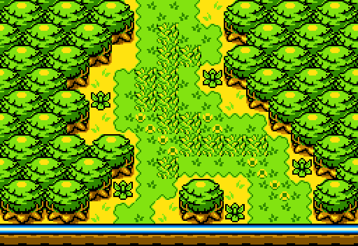
joelmacool12: I really love the structure of the screen. It is wonderful, and you don't see Classic that much on SotW. But, Classic doesn't really do much for me.
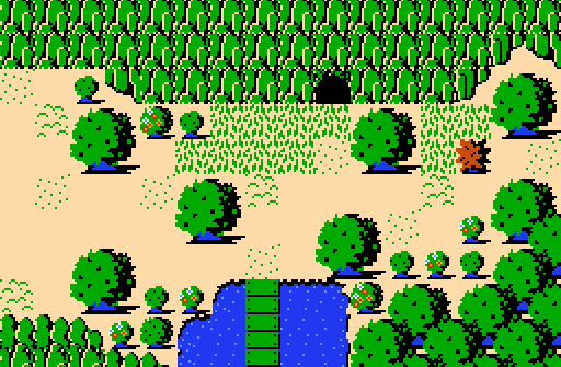
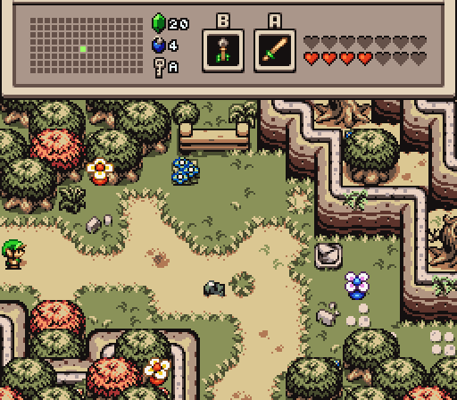
EddyTheOliveira: I really dig how it is trying to emulate the Oracle games. It does well on that part. I really like the colors too. But, it is kind of a boring shot, as it is flooded with the same kind of tree, ya know? Still a nice screen though.
DaviAwesome: I really like the screen as a whole. There is nice detail, the structure is great, and the Heart container tops it all of. But, the thing that pulls it way down is the palette. Look at the water, it is like a neon blue compared to the very bright grass. And the trees compared to that grass looks a little odd. Still a nice screen though. 
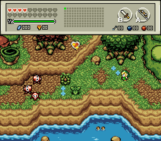
coolgamer012345: That screen is only nice. There isn't that much detail, and the dungeon and coral against Firebird looks kinda odd. I also despise weather or ambient effects on a whole screen. It hurts my eyes. Mainly, it is a cool screen though. It just came down to preference.
BitZero: I really love this screen. The variety of trees and all of the detail is wonderful. I am also a sucker for Firebird, especially when it is used right. I also like how you used a lot of tiles. It looks nice, and I like the palette used. My only complaint is that there is a tile error on the trees near the mountain. I understand why you did it, but it is wrong.
My vote when to BitZero this week. Nice shots, everyone!

 This topic is locked