Jump to content

Photo

Screenshot of the Week 158


  • This topic is locked This topic is locked
41 replies to this topic

Poll: Screenshot of the Week 158 (57 member(s) have cast votes)

Contestants

You cannot see the results of the poll until you have voted. Please login and cast your vote to see the results of this poll.
Vote

#1 link3505

link3505

    Ancient

  • Members
  • Real Name:Ben
  • Location:The Edge of Infinity

Posted 16 April 2007 - 05:22 PM

And here we go again!

CastChaos
IPB Image
Everything looks wonderful on the surface...

DarkFlameWolf
IPB Image
The quest money shot! XD Now how would Link get over that bridge?

Sharon Daniel
IPB Image

Zeldafreak
IPB Image


#2 Revfan9

Revfan9

    Hero of Time

  • Banned
  • Real Name:Dr. Pajamas
  • Location:In front of a screen

Posted 16 April 2007 - 05:29 PM

Figures. The one time I wait to enter my shot, the one time I could have blown all of the other entires away...

CastChaos:

A basic DoR shot. The screen is nearly devoid of objects, except for the flowers that you waaaay overused. Pass.

DarkFlameWolf:

The grass texture sucks, the mountains suck, and the screen flow is odd.

Sharon Daniel:

There's hardly any space for Link to walk in this shot. 90% of the screen are the mountain tiles (that's exaggerating a little, but you know what I mean)

Zeldafreak:

Subscreen=Automatic failure.

#3 The Satellite

The Satellite

    May the way of the Hero lead to the Triforce.

  • Members
  • Real Name:Michael
  • Pronouns:He / Him

Posted 16 April 2007 - 05:34 PM

Well, I voted DarkFlameWolf, but I'll outline below each shot and my reasons:

CastChaos
I almost voted for this one. You've got a great screen going there, but there are too many white flowers, IMO. Maybe if some of the white flowers were taken out, it would've gotten my vote. icon_thumbsup.gif


DarkFlameWolf
Out of the three overworld screens, this just has better unity; that is, everything grouped together is done perfectly. It makes my eyes squeal with glee. icon_deformed.gif Okay, I'm never using a lame joke like that again. icon_lol.gif No, really. It just looks perfect, altogether.


Sharon Daniel
Meh, just a shot of the Pure Tileset, really. Nothing really that special, here. icon_shrug.gif


Zeldafreak
Is that an Ocarina of Time subscreen style? Dude, you've got skill. icon_biggrin.gif However, I guess I don't really vote for subscreens, but yeah, that's an awesome subscreen, man. icon_thumbsup.gif


EDIT: Heh, Revfan got to the flower comment on CC before I did. icon_nerd.gif

Edited by The Satellite, 16 April 2007 - 05:34 PM.


#4 Ben

Ben

    a very grumpy

  • Members

Posted 16 April 2007 - 05:42 PM

Noir's Vote on Eye Candy of the Week 158 goes to DarkFlameWolf

I voted DFW because it at least contains tiles that I've personally never seen used before. I like it.

CC's and SD's shots are just...wayyyy generic Pure shots. CC's has a very...linear feel. The path is square and doesn't change at all. SD's is a basic Pure shot with an OOA tile in it. Whoopee. icon_sweat.gif

ZF's subscreen is nice, but could use more texture on the blue/green parts - the items themselves look good but the background behind and around them needs some texture.

... looking back on this post I sound really harsh. Really, there was no offense intended, I just want to help. :3

#5 Nathaniel

Nathaniel

    Deified

  • Members

Posted 16 April 2007 - 05:45 PM

Of the three overworld shots, DarkFlameWolf's screenshot seems to have the best detail and feels the most natural. The subscreen is not bad, but it just can't outdo the overworld screenshot of my choice.

#6 WindStrike

WindStrike

    Culex is the bane of my existence.

  • Members
  • Location:T.S.S. Freelancer

Posted 16 April 2007 - 08:13 PM

(Oh I'll get back into the SotW business sometime soon... whenever I find myself a good screen in my quest... that won't happen for a while unfortunately... at least, not one that's enough to match DFW's.)

CastChaos:
Three complaints, but one has already been said... so make that two:
- See that tree in the bottom middle? Not sure if it's intentionally colored differently, but it just looks really odd and doesn't flow with the rest of the screen. And if you're suppose to do something with that tree... well, I'd recommend using the yellow blend - twould look better and would fit decently in comparison.
- Very minor, but I noticed your use of mountain corner in the bottom-left is kinda the wrong one. The one you used is more for diagonal cliffs, as compared to a diagonal end corner. Try looking around a little more and see if you can find the one that's used for corners. Nothing big of course... just saying. Now, what disturbs me a bit is the cliffs on the right with the line - the line is fine but uhh... what's with the texture? It's kinda... off. I dunno... but tis ok.
Came close to voting for it just because the flow of the screen matches the palette nicely.

DarkFlameWolf:
Hmmm... the only thing I can criticize is the mountains - they're good mountains, but when they flow with the rest of the screen, those black lines make them stand out A LOT. Aside from that, that's one heck of a beautiful screen, just like the majority of the rest of your shots. ... guess I'll need to find myself a hookshot, eh? Voted!

Sharon Daniel:
Ahem... the shot looks a little plain... and given your other shots we normally see, I'm going to assume this is just a shot you decided to send in for the heck of it, but then again, I wouldn't know. Either way, still sending my comments and feedback.
- Just my opinion, but I've never really been fond of those mountains. I mean... they just don't look like mountains.
- Ehhh... plain grass. Not much detail there... and the flowers, just like CastChaos's shot, are all white and are all clumped together in one spot (ok, so that is more realistic type, but it's ZC - are the locations of the trees realistic either? O_o).
Hmm... can't comment anymore given that, so until extra work is done, no can help. Also, I find that being able to walk on MORE THAN 1/3 of the screen when fighting 3 RED OCTOROKS is MORE than enough room to walk around. Why walk around a bunch when there's no enemies? Not trying to criticize Revfan, but I think the amount of space to walk around in is fine. However, the formation of the cliffs could be more realistic... then again, that's probably more due to the mountains used.

Zeldafreak:
Oh, I LOVE the simplicity of that subscreen and how well it flows together! One thing that bothers me: Link has got ALL OF THOSE ITEMS and ALL OF THE WEAPONS and ALL OF THAT! And HOW MANY HEARTS does he have? Not to mention several other "low" things he has. But the subscreen itself is still really awesome. One suggestion (TO RULE THEM ALL!!!): Put a background to that subscreen. Makes it much more... "appetizing," and would work better for SotWs. Twas tempted to vote on this myself.

Good shots this week - not exactly the greatest competition unfortunately. I mean, even I feel for "vote DFW." Ah well. Still tis nice to know SotW is back up and alive again, so this week = good for starting back up!

#7 Colin

Colin

    Coblin the Goblin

  • Members

Posted 16 April 2007 - 10:37 PM

I voted Cast Chaos, I will get to my constructive criticism sometime later...

#8 Peteo

Peteo

    Back in Business!

  • Members
  • Real Name:Pete
  • Location:Finland

Posted 16 April 2007 - 10:56 PM

Well all shots are quite decent, though DFW takes the win simply because her shot has some detail and her overworld design is always perfect.

#9 CastChaos

CastChaos

    Deified

  • Members

Posted 17 April 2007 - 03:33 AM

QUOTE(Noir)

CC's and SD's shots are just...wayyyy generic Pure shots.

Uhm... I use DoR. If you knew DoR, you'd know that this isn't a screen which is default DoR style.

QUOTE(WindStrike)

Now, what disturbs me a bit is the cliffs on the right with the line - the line is fine but uhh... what's with the texture? It's kinda... off. I dunno... but tis ok.

I needed to close off that part of the screen and I have chosen the "long gap". It has its story. If my demo will ever be released you will see.


Many of you mentioned the flower overusage. Well, for every area I decide the floor detail type and I have chosen these flowers here, thinking that they fit the best. In fact, I made it not-so-variety at will: this makes the player leave the village and search for adventure. You will see in the demo. Still, I think I need to make that screen better.

#10 Alestance

Alestance

    Saint Alestance - Eliminator of the ZGP format

  • Members
  • Real Name:Lonk
  • Location:Pennsylvania

Posted 17 April 2007 - 07:03 AM

Dude, Zeldafreak stole my medallions! icon_lol.gif Nice job at ripping and recoloring them, however anything else you got from me was before I know about how to avoid pillow shading.

All these shots look like standard shots for their respective tileset, save the subscreen. However being he used some of my tiles that automaticly disqualifies me from voting for that shot, thusly I nulled.

Edited by Master_of_Power, 17 April 2007 - 07:09 AM.


#11 The Satellite

The Satellite

    May the way of the Hero lead to the Triforce.

  • Members
  • Real Name:Michael
  • Pronouns:He / Him

Posted 17 April 2007 - 01:30 PM

Well, people are talking about Zeldafreak's subscreen not having a background. Personally, I don't think it should. It appears to be based off of OoT, and that subscreen don't have a background, unless you count the darkened view of the area you're in. Other than that, there isn't really a background for it.

...I guess maybe a darkly shaded map of Hyrule in the background wouldn't hurt a little...

Oh, okay! I guess maybe a background would make it better. icon_razz.gif

#12 Revfan9

Revfan9

    Hero of Time

  • Banned
  • Real Name:Dr. Pajamas
  • Location:In front of a screen

Posted 17 April 2007 - 02:37 PM

QUOTE(CastChaos @ Apr 17 2007, 04:33 AM) View Post

Uhm... I use DoR. If you knew DoR, you'd know that this isn't a screen which is default DoR style.


Pure, DoR, who can tell anymore? It all looks the same.


QUOTE(Master_of_Power @ Apr 17 2007, 08:03 AM) View Post

Dude, Zeldafreak stole my medallions! icon_lol.gif Nice job at ripping and recoloring them, however anything else you got from me was before I know about how to avoid pillow shading.


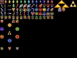
Just to give credit where credit is due, I ripped and recolored all those tiles from your sheet to the DoR set for Zeldafreak. Here's the full sheet I did:

IPB Image

#13 Sharon Daniel

Sharon Daniel

    .

  • Banned

Posted 17 April 2007 - 03:16 PM

QUOTE
Pure, DoR, who can tell anymore? It all looks the same.

Yeah, right... Except the part where DoR's tiles and palettes are completely different than Pure's.

#14 Revfan9

Revfan9

    Hero of Time

  • Banned
  • Real Name:Dr. Pajamas
  • Location:In front of a screen

Posted 17 April 2007 - 03:41 PM

Well, it still feels the same, unless someone who is really good at screen design with the DoR set (which I have seen only from Radien, sadly) to make it feel different from Pure.

#15 Limzo

Limzo

    _

  • Members

Posted 17 April 2007 - 03:43 PM

QUOTE(Revfan9 @ Apr 17 2007, 09:41 PM) View Post
Well, it still feels the same, unless someone who is really good at screen design with the DoR set (which I have seen only from Radien, sadly) to make it feel different from Pure.

I know what you mean Revfan. Remember PUXDor? It was hard to tell the difference in those palletes unless you looked at the images side-to-side.


0 user(s) are reading this topic

0 members, 0 guests, 0 anonymous users