The Satellite is gone this weekend, so I broke into his house and posted this using his computer... on my account. I think the cops are after me. I didn't think this through. ![]()
GrantGreif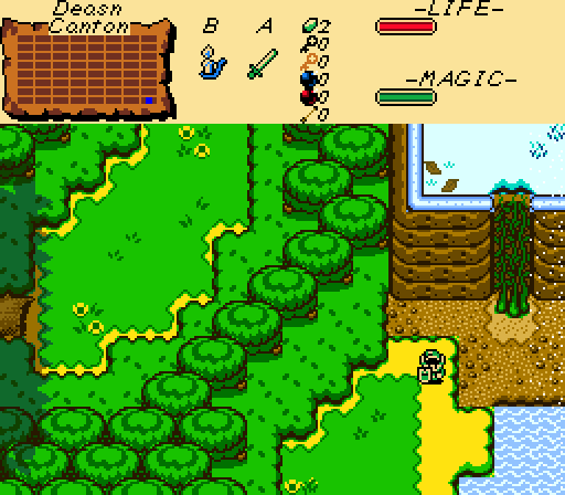
This biome transition makes me want to play Minecraft...
Charizard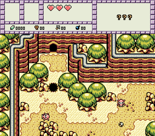
Rocks? ...Um, nope.
Lightwulf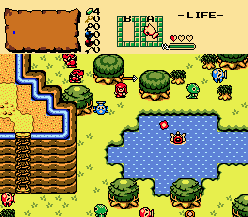
Knuckles the Echidna finds himself lost in a hostile world, armed with only his fists.
Jared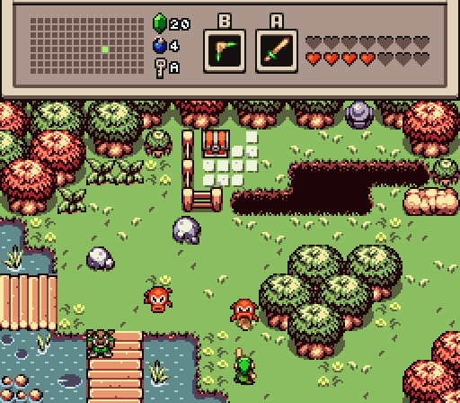
Better get ready!

Screenshot of the Week 462
Started by
nicklegends
, Jun 29 2014 02:12 PM
Charizard GrantGreif Lightwulf Jared
-
 This topic is locked
16 replies to this topic
#1

nicklegends
-

- Contributors
-

Trofessional Pransposer
- Real Name:Ed
- Pronouns:He / Him
Posted 29 June 2014 - 02:12 PM
- The Satellite likes this
#2
Eddy
-

- Moderators
-

ringle
- Real Name:Edward
- Pronouns:He / Him
- Location:London, United Kingdom
Posted 29 June 2014 - 02:32 PM
Oh my god, this is such a hard choice this week.
All the shots are amazing, but I eventually went for Charizard (yet again lol)
2nd place would be either Jared or Lightwulf.
- Shane likes this
#3
trudatman
-

- Members
-

one point nine hero
- Real Name:that guy
- Location:State Of Love And Trust, The United State Of Amorica.
Posted 29 June 2014 - 03:06 PM
Jared's was the one I liked.
#4
Nathaniel
-

- Members
-

Deified
Posted 29 June 2014 - 03:48 PM
Wonderful week. Each screen is very appealing. All four are very functional for a ZC quest. All four show good skill in the design department, including a good sense of ground detail. GrantGrief's and Lightwulf's are the less detailed two on the ground due to the mostly solid color for the grass, but they still worked well for that simplicity. The rest of the details come together to support the whole screen, even with both being biome transitioning. Shane's and Jared's are as detailed as such screens should get, thus they look as complete, but not overdone. It shows how you can do so much with a screen without the need to make it crowded. My vote came down to the simplest of factors: Most overall appeal. For me, that edge goes slightly to Jared.
- Shane likes this
#5
coolgamer012345
-

- Members
-

🔸
- Location:Indiana, USA
Posted 29 June 2014 - 05:52 PM
Went with Charizards' shot, Those weren't rocks...
- Shane likes this
#6
The Satellite
-

- Members
-
May the way of the Hero lead to the Triforce.
- Real Name:Michael
- Pronouns:He / Him
Posted 29 June 2014 - 06:09 PM
hey who's this jerk who took over my job, you're fired
er
Guess I can be a casual voter this time, haven't done this in a while, let's go:
GrantGreif - This shot is pretty solid. It seems like a genuine shot from a GB game almost. I'm not sure I'd change anything, though the canopy shadow on the left side of the screen looks a little odd near the top there.
Charizard - Easily best one this week. Solid composition, tile usage, the works. It got my vote.
Lightwulf - It's pretty solid, but it seems a little... lacking in focus. Not sure if you know what I mean but it seems a bit... scattered. Maybe I'm insane, I dunno.
Jared - It's a decent shot, though admittedly not too interesting. Nothing needs to be changed, though.
- nicklegends and Shane like this
#7
Shane
-

- Moderators
-
💙
- Pronouns:He / Him
- Location:South Australia
Posted 29 June 2014 - 07:44 PM
I voted for Jared. I really love how his screen looks! ![]()
- Jared likes this
#8
Dawnlight
-

- Members
-
My name is NOT Jason!
- Real Name:Justin
- Location:Chicago, IL
Posted 29 June 2014 - 08:28 PM
It's all you know who's fault that I voted for him this week. ![]()
- Shane likes this
#9
Tree
-

- Members
-

Everything must go away
- Real Name:Mundy Fumple McStroodlestein
- Location:The Milky Way Galaxy
Posted 29 June 2014 - 08:58 PM
It's all you know who's fault that I voted for him this week.
Stale joke is stale.
I voted for Jared 'cuz I don't need a reason.
- Jared likes this
#10
Shane
-
- Moderators
-
💙
- Pronouns:He / Him
- Location:South Australia
Posted 30 June 2014 - 01:31 PM
It's all you know who's fault that I voted for him this week.
Lightwulf's?
- Dawnlight and Lightwulf like this
#11
Russ
-

- Administrators
-

Caelan, the Encouraging
- Location:Washington
Posted 30 June 2014 - 01:51 PM
I was torn between Jared and Shane this week, so I ended up having to get incredibly nitpicky to determine the winner. And the end, Jared won out? Why? The mountains in Shane's screenshot make no sense? A two tile high mountain suddenly becomes one til high, whereas a one tile high mountain somehow goes over, rather than joining with, another one tile high mountain. The inconsistent cliff heights just get confusing from a perspective issue, rather than showing slope or elevation chance, as I'm guessing the intent was. While Jared's screen might not be the most interesting screen ever created or anything (flashy pretty graphics aside), it's well designed and functional, and avoids any major tile errors.
- Shane likes this
#12
Shane
-
- Moderators
-
💙
- Pronouns:He / Him
- Location:South Australia
Posted 30 June 2014 - 10:04 PM
I was torn between Jared and Shane this week, so I ended up having to get incredibly nitpicky to determine the winner. And the end, Jared won out? Why? The mountains in Shane's screenshot make no sense? A two tile high mountain suddenly becomes one til high, whereas a one tile high mountain somehow goes over, rather than joining with, another one tile high mountain. The inconsistent cliff heights just get confusing from a perspective issue, rather than showing slope or elevation chance, as I'm guessing the intent was. While Jared's screen might not be the most interesting screen ever created or anything (flashy pretty graphics aside), it's well designed and functional, and avoids any major tile errors.
See, the problem is that when it comes to these mountains tiles, they will always have height inconsistencies. It sucks for me, since I really do find these bothersome. Considering that both ways of joining mountain slopes are wrong, I never really bothered using them like the following image (I edited with MS Paint).
Image
Of course, I'm not saying you should change your vote, cause I can't blame you for voting for Jared. But I think this one tile error isn't reeeeeeally that much of a deal in all honesty. 
#13
Russ
-
- Administrators
-
Caelan, the Encouraging
- Location:Washington
Posted 30 June 2014 - 10:13 PM
Oh no, I'm not saying that at all. I really like your screen. Basically it came down to you and Jared, and I wanted to have some reason to say why I voted for one over the other, rather than "Well I flipped a coin and it landed on Jared", so I stared at the screens for a few minutes until I found something to nitpick. Your screen's still pretty great.Of course, I'm not saying you should change your vote, cause I can't blame you for voting for Jared. But I think this one tile error isn't reeeeeeally that much of a deal in all honesty.
As for the cliffs... now that you point that out, dammit. Dammit dammit dammit. I was living in my nice little fantasy world and then you came and ruined it. Oh well. I still personally think it looks better in the edited screenshot because at least it looks more correct, if that makes sense.
- Shane likes this
#14
DCEnygma
-

- Members
-

you're going to have a bad time
- Real Name:Justin
- Location:Indianaland
Posted 01 July 2014 - 06:42 AM
GrantGreif: I like the way the screen is set up and I think the mismatched environments actually works pretty well in the shot, but I don't really like the super jaggy shadows on the left side. I think it actually distracts from the overall appearance.
Charizard: A very well designed screen. As I've said several times, the more muted color palette works great, giving your screens a very unique look. The only comment I specifically have is that the trees on the left side of the screen seem a bit unusual with how they're stacked when the trees in the main area layer on top of each other. Not a huge issue, just something that catches my eye.
Lightwulf: There is a lot going on with this screen, and I think that's actually to it's detriment. The sheer number of enemies on screen makes it seem very cluttered, and if you picture it without them, while it's a competent screen, it's not really an eye catcher. Also, is that a Zora coming out of shallow water? ![]()
Jared: This screen just nails it, I feel. The placement of enemies, the colors being used, the screen design, everything just sort of works here and creates a very simple, yet inspiring picture. There's enough variation in the grass and water to make it feel alive, but not cluttered. Well done!
This week goes to Jared, just nudging out Charizard.
- Shane and Jared like this


Also tagged with one or more of these keywords: Charizard, GrantGreif, Lightwulf, Jared


0 user(s) are reading this topic
0 members, 0 guests, 0 anonymous users

