And so begins a new century mark...
peteandwally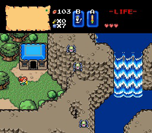
Zelda's house.
Joelmacool12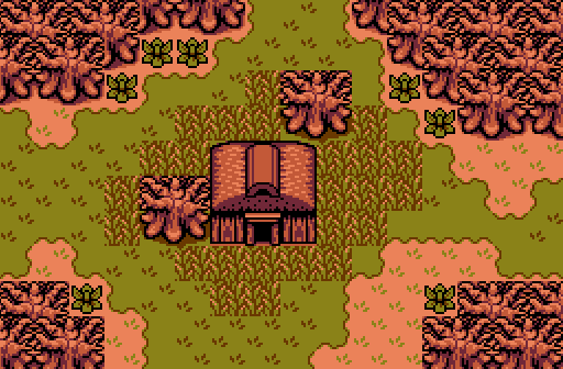
"Wise Women Wanda knows all, she lives in that house, ask her if you need assistance" - Zelda
Din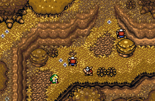
All along the road to Grandmother's house!
Demonlink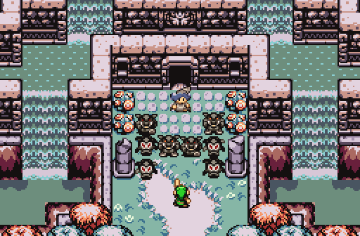
Link has finally found the entrance to Nayru's Haven. However, as he reaches the dungeon, he finds himself face to face with a mysterious man. "My name is Argon and I will not allow you to enter this place. I have been seeking the essence of the Goddess' for myself, and I'm afraid I can't let you interfere with my goal". Argon summons his corrupted henchmen and Link raises his sword to challenge them.

Screenshot of the Week 501
Started by
The Satellite
, Mar 29 2015 06:05 PM
Demonlink peteandwally Joelmacool12 Din
-
 This topic is locked
15 replies to this topic
#1

The Satellite
-

- Members
-

May the way of the Hero lead to the Triforce.
- Real Name:Michael
- Pronouns:He / Him
Posted 29 March 2015 - 06:05 PM
- Joelmacool and SkyLizardGirl like this
#2
Evan20000
-

- Members
-

P͏҉ę͟w͜� ̢͝!
- Real Name:B̵̴̡̕a҉̵̷ņ̢͘͢͜n̷̷ę́͢d̢̨͟͞
- Location:B̕҉̶͘͝a̶̵҉͝ǹ̵̛͘n̵e̸͜͜͢d҉̶
Posted 29 March 2015 - 06:13 PM
I really am not a fan of the BS tileset, but peteandwally made a screen good enough to overcome that and secure my vote.
#3
ShadowTiger
-

- Members
-
The Doctor Is In
Posted 29 March 2015 - 08:18 PM
I really am not a fan of the BS tileset, but peteandwally made a screen good enough to overcome that and secure my vote.
I feel the same way, actually, and it surprised me a little. Voted for the first two people.
#4
Sparkster
-

- Members
-

The Sparking Spark of ZC
Posted 30 March 2015 - 02:03 AM
Go Demonlink
- Demonlink likes this
#5
Eddy
-

- Moderators
-

ringle
- Real Name:Edward
- Pronouns:He / Him
- Location:London, United Kingdom
Posted 30 March 2015 - 07:02 AM
Oh man this is a pretty neat week.
peteandwally - Very beautiful BS screenshot. The design here is really spectacular and it makes me want to play those old BS quests again.
Joelmacool12 - A really solid GB shot which greatly resembles Past Labrynna. The grass could use a different tile though to resemble the way it was in Oracle of Ages, but other than that, very nice.
Din - This is amazing. The colours here make it look like a very nice autumn setting and I can't spot anything wrong with this screen. Great job!
Demonlink - A very pretty and amazing Firebird shot. Again, nothing negative I can say here.
All in all, it was very close between Din and Demonlink, but I think I'm going to go for Din this time round. Amazing job to everyone this week.
- Demonlink likes this
#6
Nathaniel
-

- Members
-
Deified
Posted 30 March 2015 - 10:15 AM
peteandwally - Little house by the waterfall. Great to see BS again in all its glory. Always with that simple and straightforward palette that you can't go wrong with. Oh, and the design is decent too.
Joelmacool12 - Little house in the lost woods. The palette feels awkward, combining that particular green with that particular brown on the ground. The design is acceptable, though.
Din - Grandmother's house just through the woods. I love the palette and the design. Great work with shades of brown. This screen was my second favorite, just barely not getting my vote.
Demonlink - Big house within the waterfalls. Nice depiction of an encounter, and very good for symmetrical design. I love the tiles and the palette. I found this screen to be the most interesting and appealing, thus my vote.
- Demonlink likes this
#7
Haylee
-

- Members
-
~ Hope of Energy Nede ~
- Real Name:Haylee
- Pronouns:She / Her
- Location:Italian Restaurant in Koorong
Posted 30 March 2015 - 10:52 AM
peteandwally - TEACH ME YOUR WAYS, PETEANDWALLY-SENPAI. Voted here.
Joelmacool - Excellent GB screen. Overall, well-structured.
Din - A nicely made screen. Don't really have much else to say.
Demonlink - Another well made screen. It was a tough choice between this and peteandwally.
- Demonlink likes this
#8
Twilight-Prince
-

- Members
-
The Adversary
- Real Name:Starts with a letter of the alphabet.
- Location:Way Out There
Posted 30 March 2015 - 11:33 AM
While I indeed do love to see the old BS Tileset used for a screenshot (and a darn good one at that), my vote is going to Demonlink this week. Quite a very detailed screen there with just enough to on it to keep it interesting. Plus, face-offs are awesome~
- Demonlink likes this
#9
SkyLizardGirl
-

- Banned
-

Unbeknownst to danger we call upon your help
- Real Name:Arianna Crystal Ritter
- Location:Earthia
Posted 30 March 2015 - 05:45 PM
Demonlink:
Such Perfect Symmetry
... gasp* /// voted.

- Demonlink likes this
#10
Nathaniel
-
- Members
-
Deified
Posted 30 March 2015 - 06:10 PM
Demonlink:
Such Perfect Symmetry
... gasp* /// voted.
I'm not sure what to make of this, and I'm not sure if this was directed at me in any sort of way. But if it was in any sort of way, I will clarify with a serene smile. ![]()
In my view, symmetry is neither a good nor a bad thing in and of itself. I think some people can pull off nice screens with it, and I believe that Demonlink does in this case. I have also seen plenty of bad screens that use symmetry, which is typically the case when symmetry seems to be the primary motivation behind its design, and thus too many other elements of screen design are ignored. I think Demonlink's overall screen design skills here are very stellar. It feels like a complete screen. Symmetry is also much more likely to work for buildings and other non-natural phenomenon, and is thus very hard to pull off for something that is meant to be completely natural. His screen of course is a combination of both the natural and the built.
But if I misunderstand or are reading too much into it, I apologize in advance.
#11
SkyLizardGirl
-
- Banned
-
Unbeknownst to danger we call upon your help
- Real Name:Arianna Crystal Ritter
- Location:Earthia
Posted 30 March 2015 - 06:56 PM
Nathaniel, on 30 Mar 2015 - 4:10 PM, said:
I'm not sure what to make of this, and I'm not sure if this was directed at me in any sort of way. But if it was in any sort of way, I will clarify with a serene smile.
In my view, symmetry is neither a good nor a bad thing in and of itself. I think some people can pull off nice screens with it, and I believe that Demonlink does in this case. I have also seen plenty of bad screens that use symmetry, which is typically the case when symmetry seems to be the primary motivation behind its design, and thus too many other elements of screen design are ignored. I think Demonlink's overall screen design skills here are very stellar. It feels like a complete screen. Symmetry is also much more likely to work for buildings and other non-natural phenomenon, and is thus very hard to pull off for something that is meant to be completely natural. His screen of course is a combination of both the natural and the built.
But if I misunderstand or are reading too much into it, I apologize in advance.
Actually I do not see enough Symmetry Mr. Nathaniel. Also i did not even look at your post before i posted actually.* I only glimpsed at all the pics at the top of the post then voted, then commented truthfully for Demonlink - is how i am alot of the times here.
With Zelda games in general, perfect symmetry activates both sides of the brain not just 1 side.
Edited by SkyLizardGirl, 30 March 2015 - 09:18 PM.
#12
Erdrick
-

- Members
-

Redeemed
- Location:There
Posted 30 March 2015 - 10:29 PM
I voted for Demonlink's screenshot. I like how it effectively mixes and updates the graphics used from the GB Zeldas with the Minish Cap graphics. Everyone else did a great job with their screenshots.
- Demonlink likes this
#13
Whiterose
-

- Members
-

I like big tums and I cannot lie.
- Pronouns:He / Him
- Location:New South Wales, Australia
Posted 31 March 2015 - 07:30 AM
Although each has their own charm, I voted for the one which has the most visual appeal to me rather than technical difficulty or story content.
- Joelmacool likes this
#14
Din
-

- Members
-

Doyen(ne)
Posted 31 March 2015 - 10:25 AM
Nulled, but man, this SotW had some really cool shots!
peteandwally: I'm not usually a huge fan of the BS tileset, but you really bent that tileset over your knee and made one of the best-looking BS Zelda screens I've ever seen. Great work!
Joelmacool: A lovely screen that looks like it came straight out of one of the Gameboy Zelda games. Not too barren, and not too in-your-face about it either. Very nice.
Demonlink: As a person who usually runs from perfect symmetry at a first glance, you really pulled it off. The waterfall castle is amazing - it's grand, majestic, and really evokes that classic Zelda vibe of exploration. Although the other screens are excellent in their own right, had I not nulled, this is the one I would've voted for.
Edited by Din, 31 March 2015 - 10:33 AM.
- Joelmacool and Demonlink like this
#15
DarkFlameWolf
-

- Members
-

Murana Wolford
Posted 01 April 2015 - 07:47 AM
Although he isn't going to win, which is a shame. I like Pete and Wally, its so hard to get height elevations looking right in BS.
Also tagged with one or more of these keywords: Demonlink, peteandwally, Joelmacool12, Din


0 user(s) are reading this topic
0 members, 0 guests, 0 anonymous users

