Anthus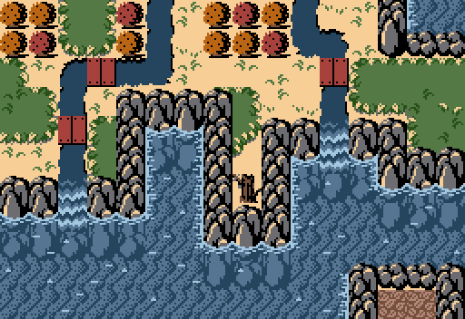
"Pees in the shower."
Feenicks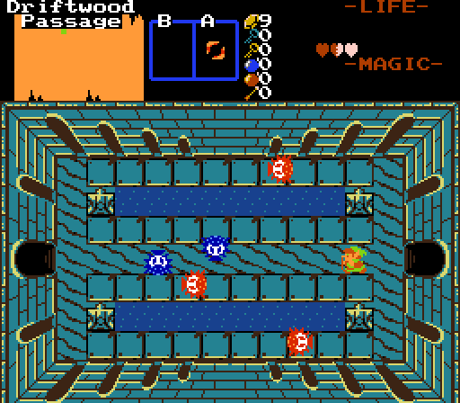
Zelda 1-style dungeon screenshots are the ceremonial first pitch of SotW entries, and I'll let you decide what that means.
HeroOfFire
BlameMoosh for this.
Jenny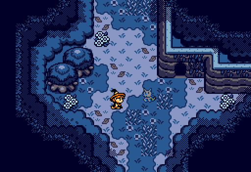
Sheik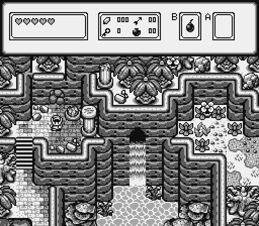
THEMDODO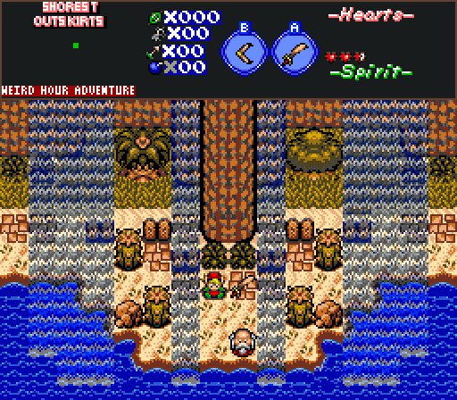
The young Lixius, in his natural habitat.

Screenshot of the Week 773
Started by
Taco Chopper
, Mar 06 2023 01:07 AM
Anthus Feenicks HeroOfFire Jenny Sheik THEMDODO
-
 This topic is locked
19 replies to this topic
#1

Taco Chopper
-
- Administrators
-

protector of the darn forum
- Pronouns:He / Him
- Location:South Australia
Posted 06 March 2023 - 01:07 AM
- Anthus likes this
#2
Blackpaintbowser
-

- Members
-

Go Bowser Go
- Location:somewhere in the world
Posted 06 March 2023 - 11:35 AM
finally
- Jenny likes this
#3
Ether
-

- Contributors
-

Pale Stranger
- Pronouns:She / Her
Posted 06 March 2023 - 12:16 PM
Anthus's custom water tiles are neat! I think my main problem with this screen is the way all of the land is carefully encased within 1x1 mountain tiles so it can never touch the sea directly. I think the idea is supposed to be that the whole island is mountainous and the land is at the same height as the tops of the mountain tiles--but it doesn't look like that, it just looks like there's an arbitrary wall around the island. In general I think this is one of the trickier bits with Cambria; making the mountains actually feel like mountains and not walls is something I see a lot of people flub while making screens that would otherwise be gorgeous.
Feenick's custom walls are also neat! I like the color choices too, it's a cool example of having the highlight be a blatantly different hue than the base and having it work, when Z1 walls tend to be pretty monochrome. The place my mind immediately went to was asking if these walls are flexible enough to handle not being in that exact layout, but that's out of the scope of a screenshot contest, and I've seen how games like the ones in the 6th contest could work around that anyway.
In contrast...the color choices in HeroOfFire's screen feel bland to me and the lack of hue shifting hurts. I think darker water (and hue shifting!!!) would help here. The screen's general composition aside from that is fine but not really exciting. The edited Rolan's Curse monsters are a huge pet peeve for me--the extra colors added to them make them no longer gameboy, but all that does is put the sprites in the GB reject bin. The work of actually making them better would go a lot deeper than that. (To be clear, I don't think sticking to authentic gameboy monsters makes any sense for this tileset; I think you should be looking further afield for monsters or using the ones native to Yuurand.)
Jenny's screen is really pretty! I love the dark canopy effect. I think my biggest criticism is the ghost cat sprite, specifically its front legs--it looks like they're jutting out at an angle that's strange for a cat. I still voted here.
Sheik's screen is also super pretty, and I'm glad that his recovery from making dozens of these is underway! If it weren't for Jenny's entry I might have voted here, but unfortunately I'm shallow and I really really like color.
THEMDODO's screen is interesting. I'm not totally sure how I feel about it overall, I think part of that is unfamiliarity with the tileset. I think the jutting out cliff in the center doesn't work very well. The clear straight line between the beach and the tall grass make this look like it's being carefully and deliberately maintained, while other things about this screen like the clumps of grass in the sand and the cacti look wild. This is me trying to draw out impressions that I should just be noticing subconsciously, and I'm not sure how much it actually matters in practice.
- Anthus, Jenny, Matthew and 1 other like this
#4
FieryBirdyThing
-

- Members
-

Junior
- Location:UK
Posted 06 March 2023 - 12:18 PM
I was torn between Sheik and THEMDODO, but Sheik won out. It's a nice little scene that gets me wondering about what secrets it might be hiding.
#5
Shane
-

- Moderators
-

💙
- Pronouns:He / Him
- Location:South Australia
Posted 06 March 2023 - 01:47 PM
Anthus has some of the best ZC water ever. Did we just discover the coolest water? It's a lovely autumn screen with some bold choices like the Firebird grass. I think it pays off nicely. I think the next course of action is trying to make Cambria water details fit with this new water. Good luck!
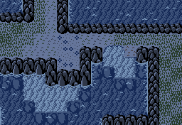
Feenicks has some lovely custom walls that make an otherwise standard dungeon screen more interesting to look at. I feel maybe a screenshot with less symmetrical content in the middle could have sufficed as a better entry for this dungeon.
HeroOfFire not sure what to blame Moosh for here. I agree with Ether's comments on the colours here. I think the flowers (the outer flower block and the flower enemy?) being green is a weird choice too. I personally don't mind the enemies since they seem to kind of match up with the character sprite, but I guess they do kind of clash with the other Yuurand enemies? I'm not sure. The screen layout is quite nice, you've got that nailed.
I voted for Jenny. I love the dark forest setting. Very cute colours and aesthetic. I feel we could maybe expand on the ghostly glow of the flowers somehow and really make it part of the overall aesthetic.
Love Shiek's a lot! Love the elevation and detailing a lot here, very superb as always. Like Ether though, Jenny's colours edged out as who I wanted to vote for.
THEMDODO has a distinct style going here. It looks like a landscape that has dried out kind of despite the flowing water from above. Speaking of, is there an actual place the water is coming from? It is admittedly throwing me off, but I think it makes for an interesting set piece so I do feel conflicted there. Overall though, good work providing something that feels unique!
- Anthus, Jenny, Matthew and 2 others like this
#6
Matthew
-
- Administrators
-
- Real Name:See above.
- Pronouns:He / Him
- Location:Ohio
Posted 06 March 2023 - 03:26 PM
SotW is back with a bang and I'm loving it. Generally great screens all around, and I can't pick a favorite in good faith.
In essence -- none.
- Anthus likes this
#7
Colin
-

- Members
-

Coblin the Goblin
Posted 06 March 2023 - 03:34 PM
Voted Sheik
Anthus - I like this shot overall; the colors, water, and general design are very nice. It seems that gameplay-wise the screen might be a tad claustrophobic. Also it's a small thing, but I personally think the addition of even just a player sprite adds a lot to a SotW entry, but that doesn't have much to do with the screen design itself.
Feenicks - I actually also like this shot a lot. The main thing working against it is that it is a fairly standard rectangular dungeon shot; aside from the nice walls/floor graphics, there isn't much about this shot that distinguishes it from other rectangular dungeon shots.
HeroOfFire - I like the sprites a lot. The aesthetic otherwise doesn't exactly appeal to me from a SotW perspective but I think I get what you're going for and the shot is fairly well-designed within those constraints. Maybe one improvement is to clarify/change the main floor tile that kind of looks like it has tufts of grass in it; it sort of seems strange to have square "stony" tiles with tufts of grass in them to me.
Jenny - for me, it really was a toss-up between if I'd vote for Sheik's or this one. I like the ghost cat, the witch, and the scene being conveyed etc. However, I really don't like the leafy-overhangs. They're over-textured compared to the other graphics and they cut-off too early. For the over-texturing, I had a hard time telling if the dithered shadow they cast also applied to the leaves. For the cut-off, it's really that the cut-off is too straight; especially in the case of the long straightaway on the left side of the screen creating sort of a harsh line.
Sheik - the terrain is fantastic in this shot, especially near the center. The ground details are complex but not so complex that they're noisy. If I had to offer any potential improvement it's that the water tiles "show their grid" a bit too much; if you were willing to spring for a 2x2 water texture I think that could improve things though I understand if that's not a direction you'd want to go given how complex that can make other things.
THEMDODO - I like the scene being conveyed here as well. Though overall I think there's too much visual noise in this shot: the shoreline graphics don't fully flow into each other (there are hard edges when going between horizontal/vertical shorelines to corners), the fence tiles are over-textured, there are little specks of grey in the left tree. Conceptually the waterfalls are fairly cool, though for waterfalls to flow like that, I would have to imagine there are some cliffs looming high overhead that would cast shadows down to this screen, this could be a nice detail to add if it can be done without adding yet more noise to the shot.
- Anthus and THEMDODO like this
#8
Anthus
-

- Members
-

Lord of Liquids
- Location:Ohio
Posted 06 March 2023 - 05:04 PM
Anthus's custom water tiles are neat! I think my main problem with this screen is the way all of the land is carefully encased within 1x1 mountain tiles so it can never touch the sea directly. I think the idea is supposed to be that the whole island is mountainous and the land is at the same height as the tops of the mountain tiles--but it doesn't look like that, it just looks like there's an arbitrary wall around the island. In general I think this is one of the trickier bits with Cambria; making the mountains actually feel like mountains and not walls is something I see a lot of people flub while making screens that would otherwise be gorgeous.
I see what you mean, and yeah it's just how the mountains work. You sort of have to visually lie to yourself to get the proper effect, but I think it still mostly works. There are actually tiles that can be used to have the water meet the ground, there just aren't any on this screen. (You can see what that might look like here). I was also sort of thinking it could work like some of the mountains in Secret of Mana even though that also looks extremely weird at times.
Screenshot of what I mean:
Spoiler

Anthus has some of the best ZC water ever. Did we just discover the coolest water? It's a lovely autumn screen with some bold choices like the Firebird grass. I think it pays off nicely. I think the next course of action is trying to make Cambria water details fit with this new water. Good luck!
Thanks, I am pretty proud of it. Idk if it's better than cool water though, only time will tell. And yeah I'm thinking of either using less of the water effects, or simply changing them over to the Cambria ones.
Voted Sheik
Anthus - I like this shot overall; the colors, water, and general design are very nice. It seems that gameplay-wise the screen might be a tad claustrophobic. Also it's a small thing, but I personally think the addition of even just a player sprite adds a lot to a SotW entry, but that doesn't have much to do with the screen design itself.
Definitely a good point about it being a bit claustrophobic. Thankfully this screen wouldn't have had any enemies on it, it's more or less a screen you just pass through towards the start of the potential quest. On screens with enemies, I'd definitely allow for a lot more movement space.
I nulled, but really all the screens are quite nice. Had I not entered, I'd probably have voted for HoF, Jenny, or Sheik. Sheik's has a TON of detail and character with literally no color so that's impressive. Jenny's has a unique mood and I like those overhangs, and HoF has some really cool dark green vine tiles. Good run this week, everyone!
- Taco Chopper and Matthew like this
#9
Mitchfork
-

- Members
-
no fun. not ever.
- Real Name:Mitch
- Location:Alabama
Posted 07 March 2023 - 12:55 AM
Anthus - Love the water, but the screen design feels a bit tortured to me. Mountains, rivers, and trees are used very blockily, and the fact that the bottom half is all water contributes to an awkward screen balance. Still, as a demonstration of tiles, really excellent stuff.
Feenicks - Again, excellent tile work. Very classic dungeon screen - not where I tend to vote in these contests, but certainly appropriate. I think the sprite palettes here could use some adjustment to mesh a little better with the level palette, though.
HeroOfFire - Others have probably said it better than me, but I also just never really resonated with the Yuurand style so this one was never going to catch me.
Jenny - Excellent screen. The way that the tiered brush gets darker as we get closer to the screen edge, ending with the (near) black end ramp for the forest overhang frames the shot beautifully. The sprite color on the witch really pops here and contributes to the composition as well. Clutter is really minimized with helps to focus in on the characters. Really, really love this shot.
Sheik - Excellent screen too! This was a really good choice from MFII, combining a lot of neat things about tiles you brought into it. There's some neat not-quite-symmetry going on and the waterfall makes a great focal point. I wish this showed off a little more of the original tile work exclusive to the quest, but really good nonetheless.
THEMDODO - There are a couple of oddities about this screen, mainly palette related - I'm not too sure about how the mountains are colored here with both brown and gray colors. The transparency is also playing a bit weird with some of the colors - for instance the tile immediately to the upper-left of the player.
Like others, my choices came down to Jenny and Sheik this week. Ultimately I voted Jenny - I just can't help but appreciate how well composed and moody it is.
#10
Ether
-
- Contributors
-
Pale Stranger
- Pronouns:She / Her
Posted 07 March 2023 - 09:26 AM
In contrast...the color choices in HeroOfFire's screen feel bland to me and the lack of hue shifting hurts. I think darker water (and hue shifting!!!) would help here. The screen's general composition aside from that is fine but not really exciting. The edited Rolan's Curse monsters are a huge pet peeve for me--the extra colors added to them make them no longer gameboy, but all that does is put the sprites in the GB reject bin. The work of actually making them better would go a lot deeper than that. (To be clear, I don't think sticking to authentic gameboy monsters makes any sense for this tileset; I think you should be looking further afield for monsters or using the ones native to Yuurand.)
I'm thinking about this more and I feel like lately I've been acting like hue shifting is a panacea when it's not. (Jenny's screen, which I liked a lot, has a little bit of hue variation, but if I had to dissect it, I think the biggest thing that makes her colors stand out is how the lightest part of her color ramp is much paler and makes the screen feel like it's cast in moonlight. And that would be more of a saturation thing than a hue thing.) I do think something is off with the color ramps and the way the colors look together, and that you have a tendency to be very rigid on the way you do color ramps, in a way that always looks artificial to me. And I think that you should try experimenting more, and that playing around with hues is one possible way of doing that. But it's not everything, and I'm not sure I have an easy answer either.
#11
Bokoblin
-

- Members
-
added tree hair
Posted 07 March 2023 - 02:08 PM


vote for
-CUTE MAGIC BOI-
and make hyrule great again
i just realized it has to be a game screenshot
serpent babas it is then
- Mitchfork likes this
#12
Ether
-
- Contributors
-
Pale Stranger
- Pronouns:She / Her
#13
Bokoblin
-
- Members
-
added tree hair
Posted 07 March 2023 - 02:27 PM
sorry lol didn't know
how do you like the wizzrobe tho?
- Mitchfork and Matthew like this
#14
Sheik
-

- Members
-
Deified
Posted 07 March 2023 - 02:54 PM
That wizzrobe is a cute magic boi, I like him. Also, thanks for the feedback everyone ![]()
#15
Ether
-
- Contributors
-
Pale Stranger
- Pronouns:She / Her
Posted 07 March 2023 - 03:25 PM
I like the head a lot! I like the sort of castley texture at the base of the head, but I think it's gonna get lot in translation when you try to sprite it. I've got mixed feelings on how rectangular the body shape is--it works for something, but I'm not sure that that something is a wizzrobe. It kind of makes me think of daleks a little, more ancient technology than magical. (The blocky castley pattern at the base of the head also contributes to that vibe.) I'm not sure what the pattern on the front is supposed to be, but it's not doing it for me in its current state. It doesn't help that the bottom of that pattern, uh, kind of looks like a butt.
This probably isn't the best thread for that, though.
Also tagged with one or more of these keywords: Anthus, Feenicks, HeroOfFire, Jenny, Sheik, THEMDODO
PureZC Events →
Screenshot of the Week →
Poll Screenshot of the Week 812Started by Taco Chopper , 15 Apr 2024 |
|

|
||
 |
Matthew
PureZC Events →
Screenshot of the Week →
Poll Screenshot of the Week 811Started by Taco Chopper , 01 Apr 2024 |
|
|
|
PureZC Events →
Screenshot of the Week →
Poll Screenshot of the Month 200Started by Taco Chopper , 01 Apr 2024 |
|
|
||
|
|
Jenny
PureZC Events →
Screenshot of the Week →
Poll Screenshot of the Week 809Started by Taco Chopper , 06 Mar 2024 |
|
|
|
|
|
Twilight Knight
PureZC Events →
Screen Rebirth →
Poll Screen Rebirth 7! The Contest!Started by Taco Chopper , 26 Feb 2024 |
|
|
0 user(s) are reading this topic
0 members, 0 guests, 0 anonymous users

