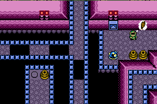
Link thought, "I seems I must use the Roc's Feather up there."
Geoffrey
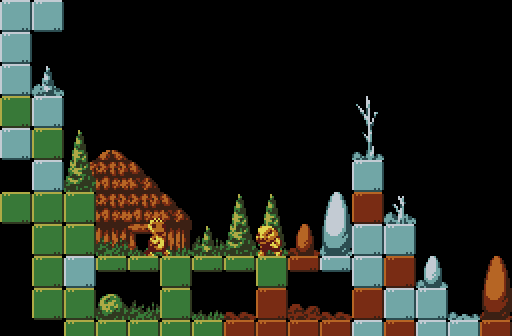
Climb a mountain with me~
bmc10011
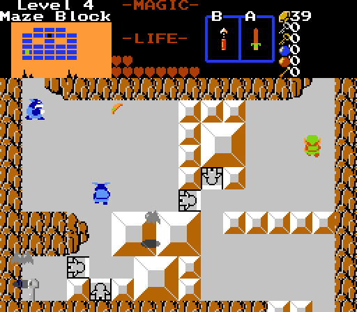
Link's Adventure in Block Land level 4.
ywkls
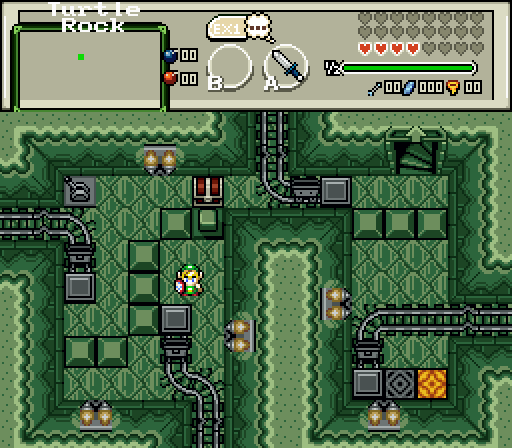
Wait a minute... haven't I already been in this room?

Posted 28 June 2015 - 05:44 PM


Posted 28 June 2015 - 06:20 PM
As I write this, this topic is only half and hour old and already people have voted for me! Thanks all!
My thoughts, since I didn't vote due to my entry.
Joelmacool12- Not quite as good as that one you did in Dance of Remembrance, but not bad. I'm guessing from the layout that this screen has multiple levels. How exactly did you pull off the 'Link is thinking' thing? I've got to figure a script was used there.
Geoffrey- I've seen some of your work elsewhere on the site and it has always struck me as different and original. That being said, are those characters from an existing game or one you made up? I like the hut and the trees.
bmc10011- I feel like I've seen this before...oh, wait! It is one of the screenshots featured on the quest page for this. I like the huge blocks, as well as the ones that look like they are supposed to flip you around.
If I had to vote for somebody else, it would probably be Joelmacool12. Good job all!
Edited by ywkls, 28 June 2015 - 06:21 PM.
Posted 28 June 2015 - 09:44 PM
MAZE BLOCK
Posted 28 June 2015 - 09:45 PM
MAZE BLOCK
Posted 28 June 2015 - 10:49 PM
Geoffrey- I've seen some of your work elsewhere on the site and it has always struck me as different and original. That being said, are those characters from an existing game or one you made up? I like the hut and the trees.
Thanks for the kind words. All graphics are custom.
Posted 29 June 2015 - 01:13 AM
Posted 29 June 2015 - 01:21 AM
Geoffrey got my vote. I feel the sky could use more scenery... clouds maybe? Joelmacool's and bmc's suffer from confusing perspective and are tad empty, especially bmc's. ywkls' is too green. Why not make the blocks, floor or walls a different colour? But all good shots otherwise. Good stuff.
Edited by Shane, 29 June 2015 - 01:21 AM.
Posted 29 June 2015 - 02:28 AM
I'm voting for Geoffrey's because of the unique design it has. I also like how unique the graphics are.
Posted 29 June 2015 - 04:23 AM
Joelmacool12 - Oh man, looks like you're at it again with those cool screens! This isn't your best shot though, but it's still pretty cool looking. I especially love the different elevations throughout the screen.
Joelmacool12- Not quite as good as that one you did in Dance of Remembrance, but not bad. I'm guessing from the layout that this screen has multiple levels. How exactly did you pull off the 'Link is thinking' thing? I've got to figure a script was used there.
No scripts were used in that shot, it was all made from layering. I know that because I watched him make the screen irl ![]()
Geoffrey - This is a really unique shot. The art style here is awesome and for some reason it reminds me of Metroid... I dunno why. Like what Shane said though, a bit of scenery in the sky could help a little bit, but besides that, this is an awesome shot.
bmc10011 - Well, I can't really say I like it as much as other screens you've shown in the past contests. For one, the screen seems pretty empty, the ground and the walls don't really look good together. The big blocks are neat, but those flip tiles don't look right at the middle of the screen. If they were used on the edges it would look much better. Furthermore, I see some tile errors with the mountain walls near the bottom left and at the bottom as they are using the wrong tiles.
ywkls - 2green5me. Oddly enough though, I kinda like it like that, but a bit more colour variation could help. As for screen content, that's a pretty cool dungeon shot you got going there. I especially love the rails and minecarts, that's a really neat touch. Though one question, why is the dungeon called "Turtle Rock" if it looks more like a forest dungeon? ![]()
This week I voted for Geoffrey. It was very close between Geoffrey, Joel and ywkls however. Great job guys ![]()
Posted 29 June 2015 - 06:47 AM
ywkls - 2green5me. Oddly enough though, I kinda like it like that, but a bit more colour variation could help. As for screen content, that's a pretty cool dungeon shot you got going there. I especially love the rails and minecarts, that's a really neat touch. Though one question, why is the dungeon called "Turtle Rock" if it looks more like a forest dungeon?
I would have varied the colors onscreen more if I had thought that there was a reason to do so. One of the problems I've always had in making screens that are different is the fact that each palette is designed to make all combos look a certain way. To my knowledge, there is no way for two different palettes to be shown on the same screen, only different Csets.
The mine carts were something I came up with only a short time ago and made possible with help from Lejes.
As for why it is called Turtle Rock, two reasons. First, the outside corresponds to the typical look of Turtle Rock with the head that guards the entrance. Second, each floor is supposed to represent a shape that the turtle can take. This isn't obvious in the shot, because I didn't give my character a map. (I just set the game to initially start nearby and walked here. There is a map in that dungeon.) The first floor is normal with a head and 4 legs. The second is inside the shell. The third is the shell with just the head poking out.
Edited by ywkls, 29 June 2015 - 06:49 AM.
Posted 29 June 2015 - 07:13 AM
I would have varied the colors onscreen more if I had thought that there was a reason to do so. One of the problems I've always had in making screens that are different is the fact that each palette is designed to make all combos look a certain way. To my knowledge, there is no way for two different palettes to be shown on the same screen, only different Csets.
In the EZGBZ tileset that is not a problem because most dungeons palettes have different colours in CSet 2, 3 and 4 I think. In other tilesets you'd have to edit the palettes yourself to include more colours.
Either way, I voted for you because I like the layout of your screen. Great job everyone ![]()
Edited by Avataro, 29 June 2015 - 07:14 AM.
Posted 29 June 2015 - 07:32 AM
In the EZGBZ tileset that is not a problem because most dungeons palettes have different colours in CSet 2, 3 and 4 I think. In other tilesets you'd have to edit the palettes yourself to include more colours.
Either way, I voted for you because I like the layout of your screen. Great job everyone
I've borrowed tiles occasionally from that tileset, but it just doesn't have enough variety to suit my tastes. Even when I first started making quests, I wanted a tileset that at least looked like it was as good as the one used in LTTP.
As for editing palettes... I'm not sure that I'd even know where to begin. As far as I'm concerned, it is simply easier to use a tileset with more palettes.
Thanks for the compliment on the layout of the screen. This was specifically designed to showcase the complexity of this dungeon. Just for reference, you first enter via the right minecart, take that warp and wander around elsewhere. You can reach that bottom minecart on the way, but you can't get the box yet because it's blocked by the post. You must wander around some more to reach the left minecart to hit the switch and lower the post, then come back and get the box. That last staircase is the last time you'll enter this room, at a much later point in the dungeon.
Posted 29 June 2015 - 09:29 AM
Joelmacool12- Not quite as good as that one you did in Dance of Remembrance, but not bad. I'm guessing from the layout that this screen has multiple levels. How exactly did you pull off the 'Link is thinking' thing? I've got to figure a script was used there.
No scirpt has been used here, its just tile-ing and such. Thank you!
Posted 04 July 2015 - 08:41 PM
Geoffrey - This is a really unique shot. The art style here is awesome and for some reason it reminds me of Metroid... I dunno why. Like what Shane said though, a bit of scenery in the sky could help a little bit, but besides that, this is an awesome shot.
Thanks for the vote. It probably looks like Metroid because I had just finished playing Super Metroid when I began drawing the tiles.
Posted 06 July 2015 - 01:08 AM

0 members, 0 guests, 0 anonymous users