Eddy's was a bit too modern -- I can appreciate the modern setting, don't get me wrong. But I prefer medieval maps more.
#toomuchrealismyo
But yeah, that's perfectly understandable. I kinda wanted to try something new and that happened lol

 This topic is locked
ringle

Posted 02 November 2014 - 09:52 AM
Eddy's was a bit too modern -- I can appreciate the modern setting, don't get me wrong. But I prefer medieval maps more.
#toomuchrealismyo
But yeah, that's perfectly understandable. I kinda wanted to try something new and that happened lol
🩶

Posted 02 November 2014 - 10:01 AM
#toomuchrealismyo
But yeah, that's perfectly understandable. I kinda wanted to try something new and that happened lol
Yeah, I like it. It's certainly unique, and not to mention, you did a great job on Subrosia; it looks great. ![]()
o_o

Posted 02 November 2014 - 10:06 AM
Here's gameplay footage of my map. I may or may not get back to this project someday ![]()
https://www.youtube....h?v=zboyf1-sOSM
Sadly the quality isn't the best, but yeah.
Edited by Avataro, 02 November 2014 - 10:07 AM.
Trofessional Pransposer

Posted 02 November 2014 - 04:51 PM
The animated details really bring the place to life. Too bad it's so difficult to create an animated map.Here's gameplay footage of my map. I may or may not get back to this project someday
https://www.youtube....h?v=zboyf1-sOSM
Sadly the quality isn't the best, but yeah.
Lurking in the shadows...

Posted 02 November 2014 - 07:39 PM
I voted for Avataro, I'm a sucker for forest shots, but alas, this guy here managed to pull something beautiful and it's not in DoRH. Shoelace would have been second place for me, but I also love the Sky Land feel and it's something new! But like some said, it's a bit too busy, but who cares, it's the effort for pulling something like this off that I love! Oh yeah, and too much Donkey Kong from those barrels. I would have loved to vote for both, they were pretty much tied from my perspective, but... yep.
Here's gameplay footage of my map. I may or may not get back to this project someday
https://www.youtube....h?v=zboyf1-sOSM
Sadly the quality isn't the best, but yeah.
Dude, this makes Hylian Legacy look bad. I fricking love that intro and the scripts so far! (You used Tango.zh for the strings right?) You better take this project again! ![]()
Edited by Demonlink, 02 November 2014 - 07:39 PM.
The Shaman of Sexy!

Posted 03 November 2014 - 11:32 AM
Deified

Posted 04 November 2014 - 11:20 PM
I nulled my vote. And indeed we had a good turn out. Interesting comments with the busy part of my map. I guess I will explain my side. I sorta thought about other games where there are just screens connecting just to connect. Every time I make a screen I kinda ask what is the point of this area. I feel that it is important on how I design because now I have back stories for every path. Even if the player doesn't know it I know the back story on the areas. And you can see it in the design.
Now obviously ZC is one screen to another. I don't think of the screens being busy because I think everything is needed. I am not a fan of repeativeness. I make the areas with tons to do and many routes to go through; but goal being to not be repeative. In my game I won't have random heart pieces laying around the over world. People will need to work for them. Lol
You know what may help with the "business"? Adding a white tint to the land below. Kind of like what Skyward Sword did, except only making a transparent layer. It would make everything seem a bit lighter and toned out, so we don't focus on it as much as the rest of the actual screen/island we're on.
Edited by Jared, 04 November 2014 - 11:34 PM.
The Shaman of Sexy!
Posted 05 November 2014 - 10:03 AM
Yeah that won't work though. I am already using all of the layers. lol. The sky background is all Layer 3 then I click the use as bottom layer. Plus, the way zscript works with drawing things under Layer 2, causes a problem, so I had to settle with this method. It's alright though, I think people will get over it. If I think it plays fine in game, it is pretty easy to see what is the ground level, that's all that matters. ![]()
Deified
Posted 05 November 2014 - 10:14 AM
You could always try transparent FFCs. ![]()
🩶
Posted 05 November 2014 - 10:19 AM
You could always try transparent FFCs.
That'd be pretty insane, honestly. There wouldn't be enough FFCs anyway, I think. ![]()
Also, while I'm here making a post, I might want to add that I think you misunderstood me, Shoelace. It's good to have different routes and making Heart Container Pieces more harder to find. However, I meant it's visually busy to look at, as there's so much going on that my mind is literally trying to decide what to look at first... In game, it will be a lot better since I can slowly, screen by screen, process the world. I have mad respect for what you've created and what your goal is, don't get me wrong, but it was just a matter of finding the most appealing map. And that isn't to say, I don't like your map. Well, I don't, because I love it. ![]()
But hey, I'm a sucker for stories too, so your game might blow my mind lol.
Edited by Shane, 05 November 2014 - 10:28 AM.
o_o
Posted 05 November 2014 - 11:56 AM
Yeah that won't work though. I am already using all of the layers. lol. The sky background is all Layer 3 then I click the use as bottom layer. Plus, the way zscript works with drawing things under Layer 2, causes a problem, so I had to settle with this method. It's alright though, I think people will get over it. If I think it plays fine in game, it is pretty easy to see what is the ground level, that's all that matters.
Well then, you could try changing the colors, that are used in the background, itself (in the palette editor). It really will pay off. Here's a screen that I made, that has a sky background:
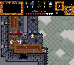
This way, the background looks much more distant and it'll be easier to see what's going on. ![]()
Edited by Avataro, 05 November 2014 - 02:07 PM.
The Shaman of Sexy!
Posted 05 November 2014 - 02:32 PM
Well then, you could try changing the colors, that are used in the background, itself (in the palette editor). It really will pay off. Here's a screen that I made, that has a sky background:
True. Problem is, I am like heavily using the whole palette. If I lighten the greens, I can't use green in the area. I use 10+ different colors for the surface, so it wouldn't work very well. I really wish ZC had a few more palettes and tilespace. Because since every tile is 8-bit and I am using 220 full tile pages, I can't afford to reboot. I also just tried the white transparent, that didn't work at all. It kinda killed colors. lol.
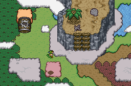
What I did though, is I made the surface tiles a little lighter, but I couldn't go any lighter because of color uses. Hope this looks better:
 ->
-> 
Adept

Posted 07 November 2014 - 10:20 AM
Here's gameplay footage of my map. I may or may not get back to this project someday
https://www.youtube....h?v=zboyf1-sOSM
Sadly the quality isn't the best, but yeah.
life is fragile, temporary, and precious

Posted 07 November 2014 - 11:53 AM
Trofessional Pransposer
Posted 01 December 2014 - 08:01 PM
0 members, 1 guests, 0 anonymous users


