Screenshot of the Week 268
#16

Posted 11 August 2009 - 10:40 AM
#17

Posted 11 August 2009 - 11:57 AM
#18

Posted 11 August 2009 - 02:03 PM
Great shots this week guys!
#19

Posted 11 August 2009 - 08:01 PM
Other than him, though, Platinum would've gotten my vote - I remember such dungeons working incredibly well. Nuvo, as always, has excellent graphics for such a low bitdepth. Beta Link's shot is alright, but the transparent water killed it for me.
e: again I'm leaving out words
Edited by skateboarder11, 11 August 2009 - 08:02 PM.
#20

Posted 11 August 2009 - 10:13 PM
A solid shot with good design sense and the unfortunate problem of transparent water.
T. Platinum: 6/10
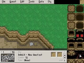
The way the grass abruptly hits the tiles makes it seem like the monsters here keep the dungeon really groomed. Even in Pure, you can take the grass borders and make the scene really pop by getting the grass to creep across the tiles like a mold. There's also the issue of the moss and vine tiles on the wall. While I like them both (especially the on on the right) they're used too sparingly and just on the top edge, making it feel empty on the other walls. Other than that, Link's palette could use a few more colors.
Angeal: 7/10
No nostalgia factor for me since I never played Hidden Duality. I did see the scene you adapted from, though, and it's a pretty good recreation for a vast difference in style. However, I think that you kept a little too much Pure where it doesn't belong- the two notables are the tree clumps and the straightness of the mountains. The tree clumps can easily be replaced by brush tiles or the larger edited MC/LttP treetops to throw off monotony and increase the variety. The straight mountains are really self explanatory- on the right side in particular, you have the great fortune of a four-tile stacked mountain. You can easily break this in half to two different ridges, or at least turn/angle it. The transparent water is better than in Beta Link's shot, but still not to hot.
Nuvo: 8/10
I really want sprites next time.
#21

Posted 12 August 2009 - 05:58 AM
Voted for him btw.
#22

Posted 12 August 2009 - 10:06 AM
Two things.
To make the water look better, try out the white transparent water in CSET 5... provided you haven't edited that color out or anything. I just tried it out, it came out great. It works best if the graphics underneath are white and brown.

(JPG, I know, but look at the sand and dirt, and how well they work underneath... yeah, there isn't any transition between the sand and dirt, I was just showing that they both worked.)
Also, flowing water, if it's moving fast enough, isn't transparent. You could probably get away with opaque waterfalls.
...
Yeah, I'm getting sick of this blue recreation water... what's it doing outside of miniature golf courses? I don't know. But if you're going transparent, you really gotta evaluate what's underneath before you determine the water color... because water isn't blue., unless there's a lot of sky it can reflect. If it's next to a mountain, it's going to reflect the mountain more than sky, so it'll be more mountain colored. You can get away with blue if it's opaque though, because then it's like it's obvious that it's just water, and not trying to be realistic, but failing horribly.
You also need to consider what's IN the water. If it's swamp water, don't make it transparent. It's going to be full of mud and stuff.
Also, I"m sick of the fact that people around here are making the transparent water go so deep, you can basically see to the bottom of the ocean. After a while, it just stops being transparent.
TK: What's wrong with the water? It doesn't look good. That's what.
Sorry if I may come off as a bit of a jerk with this post. I hope I didn't offend at all.
Null'd by the way.
Edited by Nuvo, 12 August 2009 - 10:06 AM.
#23

Posted 12 August 2009 - 02:48 PM
Two things.
To make the water look better, try out the white transparent water in CSET 5... provided you haven't edited that color out or anything. I just tried it out, it came out great. It works best if the graphics underneath are white and brown.

(JPG, I know, but look at the sand and dirt, and how well they work underneath... yeah, there isn't any transition between the sand and dirt, I was just showing that they both worked.)
Okay, I'll try that out. Thanks for the tip!
Also, flowing water, if it's moving fast enough, isn't transparent. You could probably get away with opaque waterfalls.
Ok, I'll see if I can do that.
...
Yeah, I'm getting sick of this blue recreation water... what's it doing outside of miniature golf courses? I don't know. But if you're going transparent, you really gotta evaluate what's underneath before you determine the water color... because water isn't blue., unless there's a lot of sky it can reflect. If it's next to a mountain, it's going to reflect the mountain more than sky, so it'll be more mountain colored. You can get away with blue if it's opaque though, because then it's like it's obvious that it's just water, and not trying to be realistic, but failing horribly.
You also need to consider what's IN the water. If it's swamp water, don't make it transparent. It's going to be full of mud and stuff.
There actually is a swamp area in the game, in which I decided not to use transparent water for exactly that reason.
Also, I"m sick of the fact that people around here are making the transparent water go so deep, you can basically see to the bottom of the ocean. After a while, it just stops being transparent.
Same here. Introduction of the game takes place on the ocean. No transparent water.
TK: What's wrong with the water? It doesn't look good. That's what.
Sorry if I may come off as a bit of a jerk with this post. I hope I didn't offend at all.
Don't worry about that, at least you gave me suggestions on how to improve. Everyone else is basically saying "It sucks, go fix it". >_>
Null'd by the way.
Comments in bold.
Edit: Too much RAEG.
Edited by Beta Link, 12 August 2009 - 04:19 PM.
#24

Posted 12 August 2009 - 02:53 PM
Comments in bold.
It does kind of annoy me, though. I made the palette and started using transparent water at least 6 months ago, and I've shown at least a dozen screenshots with it being used, and the comments I got for it were about 90% positive. And now everyone decides to start complaining? What the hell?
#25

Posted 12 August 2009 - 02:57 PM
In fact, now that I think about it, I feel kinda like a prick for complaining about people not liking my shot even though I'm in the lead.
Edited by Beta Link, 12 August 2009 - 03:00 PM.
#26

Posted 12 August 2009 - 03:40 PM
But yes, I can understand what Nuvo means, these are good suggestions.
#27

Posted 12 August 2009 - 04:22 PM
#28

Posted 15 August 2009 - 08:57 PM
The contrast thing, though, is an issue and I'll try to fix that soon.
The way the grass abruptly hits the tiles makes it seem like the monsters here keep the dungeon really groomed. Even in Pure, you can take the grass borders and make the scene really pop by getting the grass to creep across the tiles like a mold. There's also the issue of the moss and vine tiles on the wall. While I like them both (especially the on on the right) they're used too sparingly and just on the top edge, making it feel empty on the other walls. Other than that, Link's palette could use a few more colors.
Dang, I really thought I had a chance this week. At this rate I'll be the worst known SoTW competitor in the history of PZC
#29

Posted 17 August 2009 - 03:48 PM
T. Platinum - 2 votes = [5.56%]
Angeal - 9 votes = [25.00%]
Nuvo - 11 votes = [30.56%]
Total Votes: 36
Beta Link

To the east!
Congratulation Beta Link!
0 user(s) are reading this topic
0 members, 0 guests, 0 anonymous users

 This topic is locked


