
I didn't get an opportunity in the last thread to say so, but kudos to Pabru for using my first incomplete tileset! And winning with it, for that matter. I've upgraded a lot of those graphics (mostly the mountains) so they don't suck quite as much. Good job.
None of this weeks shot stick out to me at all.

Screenshot of the Week 332
Started by
Mitchfork
, Aug 07 2011 09:48 PM
-
 This topic is locked
27 replies to this topic
#17

Twilight Knight
-

- Members
-

Tell all with glee, Argon's on PureZC
- Real Name:Sven
- Location:Rotterdam, NL
Posted 08 August 2011 - 02:44 PM
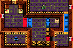
To me, King Harkinian's dungeon shot is the most appealing. A pretty great dungeon shot I say. The others aren't that appealing to me, honestly.
#18
Aslion
-

- Members
-

End Fascism
- Real Name:Ryan
- Location:Plug One's spectacles
Posted 08 August 2011 - 04:29 PM
QUOTE(Pokemonmaster64 @ Aug 8 2011, 02:48 AM) 
I'm perfectly fine with people saying that it's no good because it isn't my work. I'm not fine with people claiming that I didn't make the screen legitimately. I can assure you that I did rip all the tiles in and if you want to continue doubting me, I can send you the quest file. I'd also like to point out that if you look at the actual map, you can see that the colors are different because I used Zelda 1's palette. You're free to hate on the screen, but don't try to deny the effort I made to create it.
In fact, anyone else wants proof? Here's your proof: http://www.mediafire...pspyjto01lkckom
But you didn't make it. You ripped in some graphics. Graphics that you didn't make yourself. Nobody's doubting that you actually did rip the tiles in, but there's no creativity to your screen. It's just some graphics.
Chris Miller's shot is fine, not the worst one this week. It's just not really a SOTW shot, it's just a basic dungeon shot. There's no real flare to it or anything.
King Harkinian's shot is just ugh. The walls are way too straight and square, the colors on some of the tiles are downright awful, and the entire thing looks like a cluttered mess. I don't care for it at all.
I voted for Pabru this week. It looks nice and is designed well, I couldn't think of any way to improve it. Good job.
#19
King Harkinian
-

- Members
-

This site is still a thing?
- Real Name:THE KING
- Location:Hyrule
Posted 08 August 2011 - 06:00 PM
This week I think the competition was decent.
Chris Miller-Ehh... beginner's shot. It's bland, and It looks like it was thrown together in 5 minutes.
Pabru- Great Shot. If I wasn't in the competition, I would vote for this... sorta. I wouldn't, for one reason only. The dreadful, monochrome palate. The shot is perfect in every other way. If you want a nightmarish theme, I wouldn't go with the stereotypical purple monochrome, in which I've seen MANY times. Go with a dark, nighttime palate. Throw in some mist and fog, and there you go. If the palate was different this would've won my vote.
PokemonMaster64- So... You put link on the overworld of mario 3. It would be awesome to actually play the side scrolling levels of mario 3 as link, like Super Mario Crossover. But a pic of the overworld is sorta boring.
Me- I tried to follow the guidelines of what you would see in a GBC Zelda game, but well designed for those standards. I spent 30 + minutes building and making sure the screen looked its best. For those who care, the palate I used was the palate for the last level of OoA, the one with Ramrock as the boss. If you barfed looking at the colors in my screen, then you would barf looking at the original. The palate no matter what has bright colors that stand out, especially the yellow borders in my opinion. I could of used something different, but I was going for an ancient ruins feel, and this worked.
I nulled. And I think I might of nulled even if I wasn't in it, because none of the shots this week truly stood out for me.
#20
Cukeman
-

- Banned
-

"Tra la la, look for Sahasrahla. ... ... ..."
- Location:Hyrule/USA
Posted 09 August 2011 - 05:22 PM
QUOTE(King Harkinian @ Aug 8 2011, 04:00 PM)
...
So can Link only hit the switch with his boomerang when he is on high ground?
I'm trying to figure this puzzle out.
Edited by Cukeman, 10 August 2011 - 11:59 AM.
#21
SpikeReynolds
-

- Members
-
Ironically bald furry
- Real Name:Spens
- Location:Grand Rapids, Michigan
Posted 10 August 2011 - 07:18 AM
Voted for Chris. There's something oddly nostalgic about that shot that just does it for me. Pabru was a close second. That shot is GORGEOUS, I'm just a sucker for nostalgia.
#22
Sheik
-

- Members
-

Deified
Posted 10 August 2011 - 07:22 AM
QUOTE(King Harkinian @ Aug 9 2011, 01:00 AM)
Chris Miller-Ehh... beginner's shot. It's bland, and It looks like it was thrown together in 5 minutes.
Me- I tried to follow the guidelines of what you would see in a GBC Zelda game, but well designed for those standards. I spent 30 + minutes building and making sure the screen looked its best. For those who care, the palate I used was the palate for the last level of OoA, the one with Ramrock as the boss. If you barfed looking at the colors in my screen, then you would barf looking at the original. The palate no matter what has bright colors that stand out, especially the yellow borders in my opinion. I could of used something different, but I was going for an ancient ruins feel, and this worked.
I'm sorry, but your's looks just as much like a beginner's shot to me.
While it's not completely randomly designed, the "detail" on the ground (the rubble or whatever it is) doesn't blend with the floor tiles at all. It breaks the pattern completely and stands out pretty bad against it. Had you chosen tiles that have purple (rather than green) as their prominent colour than it wouldn't look as broken. It's a bad tile choice (yet the idea is nice of course). The way you've placed those other tiles doesn' really sell for me either. The layout of the walls on the southern border of the screen is actually a design-no-go (wall against wall is seldomly a good idea) and for example those borders aren't layed out very good either. If you're using borders, why don't you actually frame the floor like it's supposed to? The way you've placed them looks in-complete. I see why you've done this (it would've been impossible to walk up these stairs otherwise for example) but you didn't have to do it this way, if you decided to rearrange the walls (which you did not, for reasons I don't know). The statues are placed in an okay-way, though the lone one on the western border looks out of place, it's just not very harmonic (speaking of the composition of the screen). The way the switch breaks those borders is another case of lazy-layout. By rearrangeing the walls just slightly, you would've been able to put it in a place that would look a lot better. Even the red and blue blocks are placed kind of unlucky. It works, I guess, but it just doesn't look very good this way. They seem to have been placed without loosing much thought on how it looks as long as it works.
I don't feel it's GBC designed for higher standarts. In fact, I think the GBC design was of higher artistic standarts. What Nintendo did looked kinda "closed", kinda "finished", your's looks more like a concept-layout which lacks final touches. Here's what I mean, and I think it's quite obviouse by simply looking at it:

^Your screen.

^Original OoA screen.
Now, I don't mean to ground you or something. Your post just had such an attitude that I felt it might not hurt to point out your flaws. And because I feel people are going to put the "hater" on me for this, I'll take the time to remake your screen (eventhough I'm not a big fan of the general layout idea) how I think it should look to look good:
Edited by Sheik91, 10 August 2011 - 09:20 AM.
#23
King Harkinian
-
- Members
-
This site is still a thing?
- Real Name:THE KING
- Location:Hyrule
Posted 10 August 2011 - 07:17 PM
QUOTE(Cukeman @ Aug 9 2011, 06:22 PM)
So can Link only hit the switch with his boomerang when he is on high ground?
I'm trying to figure this puzzle out.
Yes. But that's not all. I came up with an idea for a boomerang that you can stop in midair by holding the button it's equipped to. But to solve this puzzle you also need to make it that you stand on the blue block in front of the chest when it raises, because you are supposed to jump off it and land on the ledge to the right in order to complete the puzzle. Normally you wouldn't think of anything like this, but this puzzle is part of a little something I'm working on, and these types of puzzles and situations will be common. Of course none of this would be possible without scripting, and no scripts have been written for this yet. But I came up with all these things way before this SoTW. Hope I've clarified a few things about my screen. Yes it is a concept screen, and not 100% complete. In the final version it would be cleaned up a bit.
Ps. And if you get stuck on the bottom section, there is a warp underneath the cracked statue an the bottom of the screen. Bomb it.
#24
Shane
-

- Moderators
-

💙
- Pronouns:He / Him
- Location:South Australia
Posted 11 August 2011 - 11:49 PM
King Harkinian, I would listen to Sheik's advice if I were you. Also I would replace the dirt terrain with solid chunks of rubble that will make the screen a little more "ancient". Also the way the red and blue blocks are set up on the left could end up with some problems, I would move the blue apart or you could do it the other way around and move the red apart.
Also, I would brighten up the staircase like Nintendo did in that shot of theirs that Sheik showed.
Also, I would brighten up the staircase like Nintendo did in that shot of theirs that Sheik showed.
Edited by Midnight_King, 11 August 2011 - 11:53 PM.
#25
King Harkinian
-
- Members
-
This site is still a thing?
- Real Name:THE KING
- Location:Hyrule
Posted 12 August 2011 - 10:58 AM
I never said I wouldn't listen to his advice. I agree with him on many of these things. I really don't know is I can brighten the stair case, I used the color that was provided in the main Cset of this palate, and nothing else, excluding the raising lowering switches, but next time I open ZC I'll check.  By the way, where did you find those dirt tiles? I've never seen them before.
#26
Sheik
-
- Members
-
Deified
Posted 13 August 2011 - 10:35 AM
QUOTE(King Harkinian @ Aug 12 2011, 05:58 PM)
I never said I wouldn't listen to his advice. I agree with him on many of these things. I really don't know is I can brighten the stair case, I used the color that was provided in the main Cset of this palate, and nothing else, excluding the raising lowering switches, but next time I open ZC I'll check.
You could like open the tile editor and change the colour. It's a quick edit that shouldn't even take a minute.
Personally, I wouldn't go with the dirt idea at all but rather leave the floor "perfect" as is. GB(Colour) ground isn't ment to be overly detailed and dirt between bricks just looks sorta odd anyways. However, those dirt tiles are included in EZGBZ 2.0..
#27
King Harkinian
-
- Members
-
This site is still a thing?
- Real Name:THE KING
- Location:Hyrule
Posted 13 August 2011 - 10:44 AM
QUOTE(Sheik91 @ Aug 13 2011, 11:35 AM)
Those dirt tiles are included in EZGBZ 2.0.
They are? I use EZGBZ 2.0/2.1 (whichever is the newest) and I have never seen them. But I guess it would look better as a normal floor, maybe scatter a small amount of bones around....
#28
Mitchfork
-

- Members
-
no fun. not ever.
- Real Name:Mitch
- Location:Alabama
Posted 14 August 2011 - 10:38 PM
Chris Miller - 5 votes = [9.80%]
Pabru - 32 votes = [62.75%]
Pokemonmaster64 - 4 votes = [7.84%]
King Harkinian - 10 votes = [19.61%]
Total Votes: 51
Pabru

Enter the Forest of Nightmares
Congratulations!
Pabru - 32 votes = [62.75%]
Pokemonmaster64 - 4 votes = [7.84%]
King Harkinian - 10 votes = [19.61%]
Total Votes: 51
Pabru
Enter the Forest of Nightmares
Congratulations!
0 user(s) are reading this topic
0 members, 0 guests, 0 anonymous users

