Joelmacool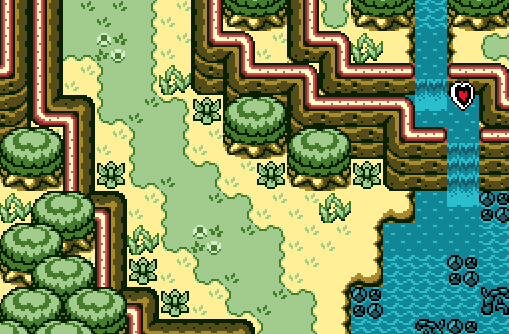
I tried to make my own palette lol
Anthus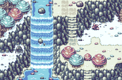
Dimentio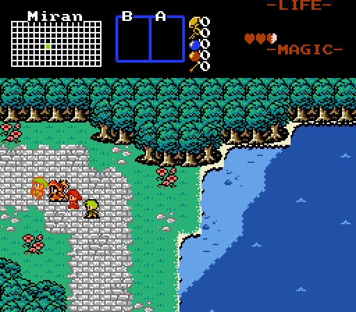
"We're going on an adventure! Yay!"

-
 This topic is locked
14 replies to this topic
#1

Neppy
-

- Members
-

Grand Overlord Empress
- Real Name:It's dangerous to go alone. Take Nep!
- Location:Minnesota
Posted 19 November 2017 - 11:55 PM
- Joelmacool likes this
#2
Cukeman
-

- Banned
-

"Tra la la, look for Sahasrahla. ... ... ..."
- Location:Hyrule/USA
Posted 20 November 2017 - 12:16 AM
Wow, I really love the natural feel of the landscape/layout in Anthus' screen! Doesn't feel overly planned, rigid, or mathematical. Voted.
Edited by Cukeman, 20 November 2017 - 01:09 AM.
#3
trudatman
-

- Members
-

one point nine hero
- Real Name:that guy
- Location:State Of Love And Trust, The United State Of Amorica.
Posted 20 November 2017 - 12:43 AM
nice submissions! third one gets my vote. thank you for sharing.
#4
Eddy
-

- Moderators
-

ringle
- Real Name:Edward
- Pronouns:He / Him
- Location:London, United Kingdom
Posted 20 November 2017 - 04:10 AM
Pretty good turnout this week!
Joelmacool - I really like the custom made palette for this shot, it looks nice. The screen itself is quite well made too. The only bit of small criticism I have is to probably try and make the waterfalls look a bit better by rounding off the mountains on both sides, kinda like this:

Sorry for the small and blurry image, but you kinda get what I mean. Good job anyway!
Anthus - This looks really nice. I definitely like the structure and the use of the tileset, and the palette is pretty neat too. I noticed some weird mountain errors in two parts of the screen though:
 and
and 
Both of these segments seem to have some weird mountain tile placements which can probably be fixed up. Other than that though, good stuff.
Dimentio - Is this even classic anymore? lol. Pretty good job here, the custom tiles are very fresh and neat. Also like the train of people to the left side there, reminds me a lot of Earthbound lol. The subscreen doesn't fit well with the screen, but I assume that's still WIP so I won't really worry about it too much.
Despite some tile errors, I voted for Anthus this week, but this was definitely a close contest IMO.
- Anthus and Shane like this
#5
Jenny
-

- Members
-

Hero of Time
- Real Name:Jennette
- Pronouns:She / Her
Posted 20 November 2017 - 07:03 AM
Joelmacool - I like the palette as well as the screen, however I would say that the reds of the mountain railing might stick out a bit too much.
Anthus - Excellent screen in a very nice tileset. Not much I can see wrong that hasn't already been mentioned.
Dimentio - Simple, but the tiles work really well together.
I voted for Dimentio.
#6
Naru
-

- Members
-

Magus
Posted 20 November 2017 - 07:15 AM
Dimentio's screen looks great, I must be an idiot for not playing it already. Or at least the legendary earthbound; question is, is it playable without a controller, I am limited to my keyboard.
Anthus changed the water's color? It looks really nice.
Joelmacool - I don't like the darker brown (trees/mountains). Not sure why, but based on what Noel teached us I would assume that the darker colors might be too saturated?
Anthus changed the water's color? It looks really nice.
Joelmacool - I don't like the darker brown (trees/mountains). Not sure why, but based on what Noel teached us I would assume that the darker colors might be too saturated?
#7
Deedee
-

- Moderators
-
Bug Frog Dragon Girl
- Real Name:Deedee
- Pronouns:She / Her, They / Them
- Location:Canada
Posted 20 November 2017 - 10:42 AM
Personally, I prefer Joel's screen over Anthus'. Anthus's has a lot of tile errors with the mountain, specifically on the left side with the odd height change. I also dislike the LS tileset so tileset dislike bias. Joel's has a good flow though.
- Anthus and Joelmacool like this
#8
Joelmacool
-

- Moderators
-
Addicted to Overwatch
- Real Name:Joel
- Location:Country of Europe
Posted 20 November 2017 - 12:36 PM
Pretty good turnout this week!
Joelmacool - I really like the custom made palette for this shot, it looks nice. The screen itself is quite well made too. The only bit of small criticism I have is to probably try and make the waterfalls look a bit better by rounding off the mountains on both sides, kinda like this:
Sorry for the small and blurry image, but you kinda get what I mean. Good job anyway!
I actually prefer the waterfall looking the way it does now. Mainly because waterfalls flow on top of the mountains and not inside it (Did I word that correctly? lol). It just seems more natural the way I've done it.
#9
strike
-

- Members
-

life is fragile, temporary, and precious
- Real Name:Olórin
Posted 20 November 2017 - 01:03 PM
Joel- I really like the palette. It seems sort of washed out but the blue seems overly saturated. It gives off a very weird, creepy, subverted vibe to me. Also it helps that the shot is of an outside area, it sort of doubles the inversion. I like it. Besides the palette though, the shot isn't special to me in anyway.
Anthus- The mountain tile errors stand out and are a problem. Also some of the grass seems weird. The perspective on the waterfall also seems off. I think the water needs to fall for a shorter distance if you want it to be falling straight down. In this shot, it would have to be falling diagonally but diagonal waterfalls in real life aren't unbroken like that. I really like the minimalist palette and the realism of the shot. It feels like a real place, not just an assortment of tiles. I voted for it.
Dimentio- it bothers me that some of the crew members have black outlines and others don't. The shot has a lot of negative space but it doesn't really work to capture my imagination. It feels more like dead space. I do think the tiles go pretty well together though.
- Anthus likes this
#10
Eddy
-
- Moderators
-
ringle
- Real Name:Edward
- Pronouns:He / Him
- Location:London, United Kingdom
Posted 20 November 2017 - 02:19 PM
I actually prefer the waterfall looking the way it does now. Mainly because waterfalls flow on top of the mountains and not inside it (Did I word that correctly? lol). It just seems more natural the way I've done it.
Fair enough, but this looks very weird to me IMO.
#11
Sheik
-

- Members
-
Deified
Posted 20 November 2017 - 03:07 PM
I voted for Joel because I liked his screen the best (duh). As for the palette I woud suggest either (A) keep the water as it is and make the screens darker or (B) keep the greens as they are and make the water brighter and move it towards the greyscale. I personally think (B) would be more interesting.
- Joelmacool likes this
#12
Anthus
-

- Members
-
Lord of Liquids
- Location:Ohio
Posted 20 November 2017 - 03:38 PM
Yeah, there are two tile errors that are pretty obvious in mine. There's actually a third if you look closely just left of the bottom stairs, and south of the light blue tree ![]() . These are mostly limits of the mountains, since I kinda used them in ways not intended. I could redesign the screen to not use them in such a way, but I was going for an "organic" approach here. I'm willing to let a few non-glaring tile issues slide, but I don't like the one with the corner right by the stairs. This is actually very loosely based off of a picture I took a while back. There's usually a small waterfall at the location pictured, but it was dry that day.
. These are mostly limits of the mountains, since I kinda used them in ways not intended. I could redesign the screen to not use them in such a way, but I was going for an "organic" approach here. I'm willing to let a few non-glaring tile issues slide, but I don't like the one with the corner right by the stairs. This is actually very loosely based off of a picture I took a while back. There's usually a small waterfall at the location pictured, but it was dry that day.
Joel: I like the ground and tree colors, but the water looks kind of off. Maybe make the highlights lighter? I dunno. ![]()
Dimentio: I like this one quite a lot. I've always been a fan of jamming NES graphics together with more colors than they had before. I like the FF2 (or 3?) trees used here too. I've thought about using them in a similar way, along with the mountains from FF2/ 3. Not the OW mountains, the mountains you see when you're in an area.
- Eddy likes this
#13
Shane
-

- Moderators
-
💙
- Pronouns:He / Him
- Location:South Australia
Posted 21 November 2017 - 02:40 AM
I voted for Dimentio! He has presented a nice style that's simple and charming and the composition of the shot is effective and rather scenic. I'd argue the character outlines are "inconsistent", but I recall Z2/AoL having some NPCs have black outlines and others having brown so no big deal IMHO. Though I do hope you end up making your subscreen fit in with the style more down the line!
Also Joel, as for your palette, it looks unique. It's not something I'd do normally, especially with the "black", but it does add to the greenness of the palette. I'd make the tan/yellow and blue more green, maybe. You might end up having a nice forest palette!
#14
symbiote01
-

- Members
-

Doyen(ne)
- Real Name:Doug
- Location:WA
Posted 21 November 2017 - 07:03 PM
Joel- I like the color for the water- much better than some GB-styled screens. Still can't help but cringe at the red neon lights top the mountains- a common problem in GB-styled screens. I like the waterfalls the way they are- it gives a more 3D effect to have the water falling forward of the cliff. It suggests a newer waterfall- it hasn't had the time to wear down the side of the mountain as much. The blue rocks and other stuff in the water suggests to me that they are maybe submerged? Probably not, considering the black outlines. A nice screen, as far as GB-styled screens are concerned. I am biased against GB-style, I'm afraid.
Anthus- I really liked this screen- the mountains are suberb, and the strange frosting-flower trees really fit the otherwise muted colors. I don't really have much negative to say, though if I really nitpick, the darker blue water at the base of the waterfall feels a little off. In a screen with added realism (above the traditional or GB-styled ones) these things stand out more. Overall a very good screen!
Dimentio- This was my pick for the week. It was a Final-Fantasy(I think)-themed screen, which was new to my eyes. I like the trees. Two little nitpicks- where the land meets the water at the corners seems squarish, like there should be a better transition; and the foursome of characters. Two of them have black outlines, and two of them do not. This little inconsistency puts two of them out-of-place in the picture.
#15
Neppy
-
- Members
-
Grand Overlord Empress
- Real Name:It's dangerous to go alone. Take Nep!
- Location:Minnesota
Posted 26 November 2017 - 09:56 PM
With 50.00% of the vote, the winner of Screenshot of the Week 637 is Anthus!
Congrats!!
Voting totals:
- Joelmacool - 7 votes [16.67%]
- Anthus - 21 votes [50.00%]
- Dimentio - 14 votes [33.33%]
- Anthus likes this
Also tagged with one or more of these keywords: Anthus, Joelmacool, Dimentio
 |
Jenny
PureZC Events →
Screenshot of the Week →
Poll Screenshot of the Week 809Started by Taco Chopper , 06 Mar 2024 |
|

|
|
|
|
Taco Chopper
PureZC Events →
Screenshot of the Week →
Poll Screenshot of the Week 808Started by Taco Chopper , 19 Feb 2024 |
|
|
|
|
|
Phosphor
PureZC Events →
Map of the Month →
Poll Map of the Month 149Started by Shane , 02 Feb 2024 |
|

|
|
|
|
Sheik
PureZC Events →
Screenshot of the Week →
Poll Screenshot of the Year 2023Started by Taco Chopper , 29 Jan 2024 |
|
|
|
|
|
Anthus
PureZC Events →
Screenshot of the Week →
Poll Screenshot of the Year 2023 - Blue BracketStarted by Taco Chopper , 22 Jan 2024 |
|
|
2 user(s) are reading this topic
0 members, 2 guests, 0 anonymous users

