I usually tick the no subscreen and invisible Link rule to show that there's no gameplay, meaning further it's not a part of a quest.
i sees .* //
!0~0!
Edited by SkyLizardGirl, 23 February 2015 - 06:00 AM.

 This topic is locked
Unbeknownst to danger we call upon your help

Posted 23 February 2015 - 06:00 AM
I usually tick the no subscreen and invisible Link rule to show that there's no gameplay, meaning further it's not a part of a quest.
i sees .* //
!0~0!
Edited by SkyLizardGirl, 23 February 2015 - 06:00 AM.
ringle

Posted 23 February 2015 - 10:50 AM
Very close contest this week... like REALLY close.
LinkFan212 - Looking pretty good, though there isn't a whole lot to look at. It's also a bit TOO symmetrical for my tastes, but that's probably just nitpicking at this point.
Sparkster - It looks nice, though the palette seems a bit... off and a bit too saturated with blue (if that's the right way of saying it). You could probably use a different palette that would suit more of a field or something similar to make it look a bit better.
Shane - i r8 8/8 no b8 m8 Seriously speaking, this is a really amazing screen. The house and the trees around it is really well placed and the colours and tile choices are perfect for the setting. Great job!
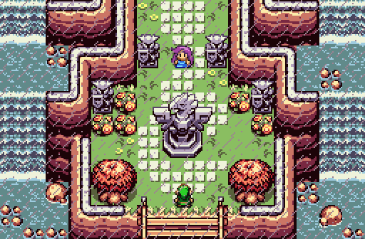
Demonlink - Another amazing screen. I'm a really big fan of the waterfalls on the side as well as what's in the centre. I also love the attention to detail.
It was incredibly hard to choose between Shane or Demonlink, but I might have to vote for Demonlink. If I could vote for more than one person, Shane would've got my vote too.
Deified

Posted 23 February 2015 - 11:59 AM
LinkFan212 - It is a nice looking screen. It's pleasing to the eyes, although a bit dark for what seems like something that isn't intended to be. Symmetry might work in this case, considering the triforce symbol indicating this location has a certain significance. The ground details are pleasantly done. However, such a screen doesn't stretch a person's screen design potential, considering that about half the screen space is a tessellation of one tree.
Sparkster - When looking at this screen, what immediately comes to mind is all the straight lines. I see horizontal, vertical, and diagonal lines, and they stretch far. That doesn't work well when using DoR or any hybrid version of that, as they are more difficult tilesets to master, of which you at least clearly understand the latter. It might help to take a more holistic approach to designing such screens. That is, having a master plan for one or more screens before starting to build it. Perhaps vision something in your head that you would like to imitate in ZC. What you need is inspiration.
Shane - I'll talk about this screen as a sample of how the screen above it can be better. While this is clearly not DoR (it's Firebird), I think what Shane did here can very easily apply to DoR and DoR hybrids. It looks natural, complete, and flows well. The only obvious straight lines that come to mind here are what is man made: The building, the sign, and the fence. Even the road shows a good sense of curve in a program that uses a grid layout. It's an excellent screen, and my vote for this week. It couldn't have been done without any sort of plan, unless one is an incredible natural at it all.
Demonlink - Another nice screen. It does take on a symmetry like in LinkFan's screen, but this reaches even further by adding a lot more details. Such concepts can be applied regardless of the overworld biome you choose to go with. The color of the rain is a great fit here too, as it's clear enough to see that it's there, but doesn't contrast too much to the point that it gets in the way of seeing the rest of the screen. If I could vote for two screens, I would vote for this one too.
EVERYDAY is a BIG DAY

Posted 23 February 2015 - 07:25 PM
First of all, I want to say thanks for the criticism to all who have posted. It does please me to hear that many of you actually like it, but at the same time don't like the symmetry. Though I know most don't like it, I will keep it like that way. As you can tell by the Triforce, and even the map title, it is a sacred place which by all means should have order. But I will change some of this though. I'm going to replace and remove some trees to add a little more detail and such, just to make it look better I guess. And the darkness, that is needed, for once you all know the true meaning of that place, you will understand why the ambiance is how it is...(Also, you guys where way off on what you thought it was xD)
Anyways, I actually voted for Shane...I really like that house. It's nice and purtty! Also just the magnificent detail is astonishing. I love the big trees, and the nice walking path. It all adds to the cheerful and happy look to the screen itself. I also can see there is a rupee sign. From that I can either guess this is a shop, or a game place. Either way, looks awesome! Great job Shane! ![]()
I did enjoy Demonlink's as well. Though it didn't peak my interest as much as Shane's did, I still enjoyed it very much. I actually right as typing this noticed both Shane's and Demonlink's screens are the same tileset! XD But either way, that bird statue with the rain caught my attention more than anything. The nice rain with the statues make the mood as if your about to enter like a final dungeon or a castle of some sort. Kind of like how Twilight Princess did it. The river makes me think it's more of a castle, which too could be the final dungeon. ![]() Then again, with the girl there, it could just be the start of the game. But again, awesome job Demonlink!
Then again, with the girl there, it could just be the start of the game. But again, awesome job Demonlink!
Sparkster's didn't catch my attention as much as Shane and Demonlink's did, but it still looks great. I've never used that tileset, but I've heard the effort you must put into it to make the screens look nice. Though I believe you did put effort in, maybe you could go for more? The screen just looks kind of empty, and though it may just be the starting screen, it still feels empty. In my opinion, the starting screen needs to have the most effort put into it, it's the screen that opens up the quest, the adventure! It gives the player the mindset of how the quest will look, and though your screen still looks awesome, it'll give a player the mindset of thinking it may not have the bestes of details. Again, my opinion, but I think it can go a long ways though. Anyways, looks good, nice design and excellent Link by the way. I like how you have your sword pouch-like-thing in the back of Link, it looks cool. ![]()
The Sparking Spark of ZC

Posted 24 February 2015 - 05:02 AM
Sparkster - When looking at this screen, what immediately comes to mind is all the straight lines. I see horizontal, vertical, and diagonal lines, and they stretch far. That doesn't work well when using DoR or any hybrid version of that, as they are more difficult tilesets to master, of which you at least clearly understand the latter. It might help to take a more holistic approach to designing such screens. That is, having a master plan for one or more screens before starting to build it. Perhaps vision something in your head that you would like to imitate in ZC. What you need is inspiration.
Sparkster's didn't catch my attention as much as Shane and Demonlink's did, but it still looks great. I've never used that tileset, but I've heard the effort you must put into it to make the screens look nice. Though I believe you did put effort in, maybe you could go for more? The screen just looks kind of empty, and though it may just be the starting screen, it still feels empty. In my opinion, the starting screen needs to have the most effort put into it, it's the screen that opens up the quest, the adventure! It gives the player the mindset of how the quest will look, and though your screen still looks awesome, it'll give a player the mindset of thinking it may not have the bestes of details. Again, my opinion, but I think it can go a long ways though. Anyways, looks good, nice design and excellent Link by the way. I like how you have your sword pouch-like-thing in the back of Link, it looks cool.
Your opinions about my screeen reminds me of a topic in your forums I think it's called "Mistakes noobs are making". There's a section called "DoR is best tileset so I want to make a quest with it."
EDIT: Thx anyway. ;-)
Edited by Sparkster, 24 February 2015 - 05:03 AM.
May the way of the Hero lead to the Triforce.

Posted 01 March 2015 - 06:48 PM
With an overwhelming 81.67% of the vote, the winner of Screenshot of the Week 496 is Demonlink!
Congratulations!
Voting totals:
- LinkFan212 (1 votes [1.67%])
- Sparkster (0 votes [0.00%])
- Shane (10 votes [16.67%])
- Demonlink (49 votes [81.67%])
PureZC Events →
Screen Rebirth →
Poll Screen Rebirth 9! The Contest!Started by Taco Chopper , Yesterday, 11:07 PM |
|

|
||
PureZC Events →
Screenshot of the Week →
Poll Screenshot of the Week 812Started by Taco Chopper , 15 Apr 2024 |
|

|
||
 |
Matthew
PureZC Events →
Screenshot of the Week →
Poll Screenshot of the Week 811Started by Taco Chopper , 01 Apr 2024 |
|

|
|
PureZC Events →
Screenshot of the Week →
Poll Screenshot of the Month 200Started by Taco Chopper , 01 Apr 2024 |
|
|
||
|
|
Shane
PureZC Events →
Screenshot of the Week →
Poll Screenshot of the Week 810Started by Taco Chopper , 20 Mar 2024 |
|
|
0 members, 0 guests, 0 anonymous users

