Jump to content

Photo

Screenshot of the Week 496

Demonlink LinkFan212 Sparkster Shane

  • This topic is locked This topic is locked
20 replies to this topic

Poll: Screenshot of the Week 496 (64 member(s) have cast votes)

~

You cannot see the results of the poll until you have voted. Please login and cast your vote to see the results of this poll.
Vote

#1 The Satellite

The Satellite

    May the way of the Hero lead to the Triforce.

  • Members
  • Real Name:Michael
  • Pronouns:He / Him

Posted 22 February 2015 - 07:14 PM

LinkFan212

LinkFan212.png

Something new is coming...


Sparkster

Sparkster.png

Starting area of my custom Quest "Zephyrian Conquest" and my impession of DoR: Hybrid. It's awesome but hard to use it well.


Shane

Shane.png

Making my way downtown.


Demonlink

Demonlink.png

Lyil: Welcome to the Sunset Phoenix Falls. I've been expecting you traveler...


  • Joelmacool likes this

#2 Shane

Shane

    💙

  • Moderators
  • Pronouns:He / Him
  • Location:South Australia

Posted 22 February 2015 - 07:25 PM

Why is every Link at the bottom center of the screen facing up? 2spooky4me


Nulled.


LinkFan212: Definitely looks like an entrance to a forest early in the quest. A little too symmetrical for my liking though. At least the nice detailing breaks it up a bit.


Sparkster: It's a nice start. I would suggest shaping the mountains a little more and choosing a different palette as it doesn't seem fitting for a starting area.


Demonlink: My vote would of been here if I had not entered, it looks really great. Though the parts where the mountain meets the water look a bit odd, but that's it. A little symmetrical, but it looks more purposed here for the theme of the area.


Edited by Shane, 22 February 2015 - 07:35 PM.

  • Jared, Demonlink and LinkFan212 like this

#3 The Satellite

The Satellite

    May the way of the Hero lead to the Triforce.

  • Members
  • Real Name:Michael
  • Pronouns:He / Him

Posted 22 February 2015 - 07:35 PM

Why is every Link at the bottom center of the screen facing up?


#ConspiracyoftheWeek


  • Shane, Eddy, Jared and 6 others like this

#4 Shoelace

Shoelace

    The Shaman of Sexy!

  • Members
  • Real Name:Michael
  • Pronouns:He / Him
  • Location:Arizona

Posted 22 February 2015 - 08:00 PM

I voted for demonlink this week. I love the feel of the shot.
  • Demonlink likes this

#5 Dawnlight

Dawnlight

    My name is NOT Jason!

  • Members
  • Real Name:Justin
  • Location:Chicago, IL

Posted 22 February 2015 - 08:07 PM

I voted for Demonlink this week. <insert random female celebrity here>!!!! (inside joke)


  • Demonlink likes this

#6 justin

justin

    Adept

  • Members

Posted 22 February 2015 - 08:28 PM

Instantly was drawn to the two Firebird shots, with Demonlink having a bit more wow factor than Shane. The colours are more interesting as is the setting. My gripe is that the water would more logically be flowing over the low point of land, not on the high point on either side.

Shane, the flow looks nice, and I really dig how the large trees change up the standard FB look. The palette is a bit boring. I do really admire the way you detail screens.

Sparkster, it's a start. A bit too uniform, too many straight lines, and needs more unique detailing that flows with the environment.

LinkFan212, initially I skimmed passed the screen because there didn't seem to be anything to it. Too much of the screen is just the same tree. However, on a second look I did enjoy the subtle ground detailing.

Unsure where my vote is going between the two FB shots, might null...
  • Shane, Demonlink and LinkFan212 like this

#7 strike

strike

    life is fragile, temporary, and precious

  • Members
  • Real Name:Olórin

Posted 22 February 2015 - 08:34 PM

I voted for Shane. It's just a solid, cool shot. Demonlink's was a little too semetrical and I didn't like the caption. Hey, they were both good alright? :0 Great job to everyone involved

-Strike
  • Shane and Demonlink like this

#8 DragonDePlatino

DragonDePlatino

    Pixel Dragon

  • Members

Posted 22 February 2015 - 09:39 PM

LinkFan212
There's not much I can say here. It's a nice, functional screen and the palette works. But really, if you're submitting something to SoTW you should go above and beyond your basic screen. :)

Sparkster
This is a pretty good first effort! You've got a lot of DoRH's basics down, but I can't help but feel this screen is a little sterile. All of the cliffs are perfectly straight and the path on the left runs in a straight line. Try mixing up your tiling a bit to make things more natural!

Shane
A close second for me! This screen flows very well, and it looks like it would fit into a larger overworld really well. I'm impressed how snugly you fit your MC trees together and the fenced-off area in the lower right really balances the screen without making it feel cramped.

Demonlink
I like it! I was a little irked that a storyline mockup won last week's contest, but I find this to be a nice middle ground between something functional and beautiful. It's tempting to make screens like this perfectly symmetric, but the little asymmetric details kept this from feeling too stiff. Good job!

Edited by DragonDePlatino, 22 February 2015 - 09:39 PM.

  • Shane, Demonlink and LinkFan212 like this

#9 Zahalfor

Zahalfor

    Newbie

  • Members

Posted 22 February 2015 - 09:40 PM

Loved everyone's shots this week. Everyone did a great job.


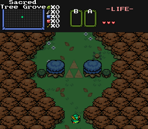
LinkFan212: this strikes me as an important landmark, a place of special occasion. If I were playing this screen, I would be looking for something really big ahead! Though I do agree that interspersing some different tree types among the browns would decorate the screen a little bit more, and I'm sure you could keep mirroring the tree types to keep that 'tended/orderly' look you've got going on :).


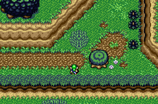
Sparkster: I like the overall thought behind this screen. You said it's your starter screen and I can definitely see how it works for that. I'm not too keen on the colors in the palette, but if you're going for something a little 'off the wall', it does that. Also some slight variance in that straight line cliff on the bottom would dress up the screen nicely, I think. I do like it quite a bit though, speaks well for the rest of your quest :). If I have time in the near future, may have to look it up... :)


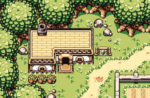
Shane: looks like a cozy house on the edge of a forest. I like the solid design of this screen, very nice.


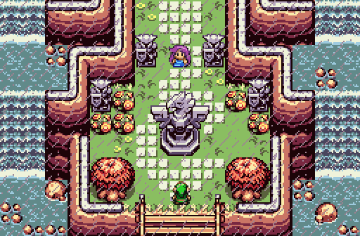
Demonlink: this screen won my vote. I like the design and it has a touch of mystery and adventure to it. Personally, I don't see anything wrong with the water, looks like the cliffs are holding it back from flooding the center. Maybe have to watch out for a flood and it is raining... ;).


Thanks for sharing everyone. Love all the screenshots this week, everyone did a great job!


  • Shane, Demonlink and LinkFan212 like this

#10 David

David

    Fallen leaves... adorn my night.

  • Administrators
  • Real Name:David
  • Pronouns:He / Him

Posted 22 February 2015 - 09:45 PM

Pretty good week. However, in the end, it was between Shane and Demonlink for me. After a while of thinking, I eventually voted for Demonlink's screens, though only by the smallest margin possible. Here are my full comments and critiques:


LinkFan212-

  • This isn't too bad for a screen. The atmosphere and palette are not bad at all, though they're perhaps a bit too dark in general. The ground detailing is also very good and I amend you for that. However, I feel like the usage of the trees is far too repetitive since the trees are all the same. Consider adding variety by adding in some different looking trees. Also, the screen is a bit too symmetrical. Otherwise, this is a decent screen, so good job!
  • 7.5/10 (Good)


Sparkster-

  • This also isn't too bad for a DoR screen, so good job, but there are many things that could be improved that would make this screen stand out more. First things first, the palette doesn't seem to fit well with this screen in general (there's too much blue). Secondly, there should be more variety in the mountain structure, especially the bottom mountain line. Making it curve and bend a bit more will make it look far more interesting. Finally, there could be more detailing in general; perhaps add more plants and a greater variety of bushes. All those things together will make this screen look much better though it looks very decent already!
  • 7.2/10 (Good)


Shane-

  • This is an excellent screen. The detailing and the structure are practically perfect. You really excel in that factor, I've got to say. However, if feel like this screen is a bit lacking on the atmospheric side. A simple way to fix this is to use a more interesting palette because the current one looks a bit too bland and bright. Other then that, incredible job with the screen!
    9.4/10 (Amazing)


Demonlink-

  • This is another extremely amazing screen. The detailing, structure, and atmosphere are both excellent and beautiful. The only complaint that I have is that the screen feels too symmetric and thus seems to have less variety. Otherwise, incredible job!
  • 9.5/10 (Amazing)


As you can see, Shane was REALLY close behind Demonlink for me in this one. Great job to all the submitters, however! :)


  • Shane, Demonlink and LinkFan212 like this

#11 TheLegend_njf

TheLegend_njf

    Deified

  • Members
  • Real Name:Grant

Posted 22 February 2015 - 11:42 PM

Wow! So I'm like literally blown away by Demonlink's shot.
  • Avaro and Demonlink like this

#12 Demonlink

Demonlink

    Lurking in the shadows...

  • Members
  • Real Name:Miguel
  • Location:Wouldn't you like to know?

Posted 23 February 2015 - 12:21 AM

Thanks everyone for your kind words! The irony of that shot is that I made it out of pure boredom while doing my homework. The screen being symmetrical was on purpose since it's like an entrance to an amazing and beautiful realm!

Everybody else has nice screens as well!

LinkFan212: That's a very nice and solid Pure tileset shot, but I feel there isn't something that stands out.Still, it works and looks great, and that's the most important!

Sparkster: Awesome first use of DOR! Yes, it's a bit hard to get used to, but you got a great start going on there! Nice job :)

Shane: If I had a penny for everytime you make something stunning, I would be broke... Errr, a multi billionaire! Everything works great, and my vote would have gone here if I hadn't participated. Excellent!
  • Shane and LinkFan212 like this

#13 Sparkster

Sparkster

    The Sparking Spark of ZC

  • Members

Posted 23 February 2015 - 03:03 AM

My own vote goes to that fantastic design of Shane.
  • Shane likes this

#14 SkyLizardGirl

SkyLizardGirl

    Unbeknownst to danger we call upon your help

  • Banned
  • Real Name:Arianna Crystal Ritter
  • Location:Earthia

Posted 23 February 2015 - 05:37 AM

#ConspiracyoftheWeek


Lolz.* yeahs.  i always make my charas face down so you can see their faces or in action in sideways view slashing outs with a sword/weapon.  how the heck are people catching pictures with no charas in their screenshots like shane?

Why not ever in the .qst playing itself for a screenshot??


(i just don't know which one to votes - this time, my head is spinning dizzy nows.')

-you guys did this to me lol.


However i likes Demonlinks - because i love water.*  it is one my fave habitats as i am more of an aquatic type lizzygirl.

Looks kinda like what i would makes, but with my own modified aquatic tileset insteads.


Edited by SkyLizardGirl, 23 February 2015 - 05:59 AM.

  • Demonlink likes this

#15 Shane

Shane

    💙

  • Moderators
  • Pronouns:He / Him
  • Location:South Australia

Posted 23 February 2015 - 05:55 AM

how the heck are people catching pictures with no charas in their screenshots like shane?

Why not ever in the .qst playing itself for a screenshot??

I usually tick the no subscreen and invisible Link rule to show that there's no gameplay, meaning further it's not a part of a quest.


  • Demonlink likes this


Also tagged with one or more of these keywords: Demonlink, LinkFan212, Sparkster, Shane

0 user(s) are reading this topic

0 members, 0 guests, 0 anonymous users