Jump to content

Photo

Screenshot of the Week 345


  • This topic is locked This topic is locked
25 replies to this topic

Poll: Screenshot of the Week 345 (39 member(s) have cast votes)

~

You cannot see the results of the poll until you have voted. Please login and cast your vote to see the results of this poll.
Vote

#1 Neppy

Neppy

    Grand Overlord Empress

  • Members
  • Real Name:It's dangerous to go alone. Take Nep!
  • Location:Minnesota

Posted 19 November 2011 - 11:16 PM

Furion
IPB Image
Transitioning Environment

Nolornbon
IPB Image
In the world of Evervale, Link must brave part of the Slime Ruins in order to get the Wooden Sword. However, a Mirror Wizzrobe is nearby and will shoot at and kill anybody who tries to open the blue chest and claim the wooden sword. icon_evil.gif

Lightwulf
IPB Image
Whoever use to live here will be pretty upset at the mess the Vires made of their master bedroom.

Ventus
IPB Image
Oh look a generic screen-shot.

Yoshidude
IPB Image
Link wonders how he will get the treasure chest.

Jared
IPB Image
Have I risen from the ashes? Maybe so!

#2 Dawnlight

Dawnlight

    My name is NOT Jason!

  • Members
  • Real Name:Justin
  • Location:Chicago, IL

Posted 19 November 2011 - 11:33 PM

I voted for Furion although I do admit that we've seen too much of that kind of graphics from you.

#3 Jared

Jared

    Deified

  • Members
  • Real Name:Jared
  • Pronouns:He / Him
  • Location:New Hampshire

Posted 19 November 2011 - 11:34 PM

Furion: Without a doubt, beautiful. You've captured the flow perfectly, transitioning. 10/10

Nolornbon: Very good. I love the colors, and theme. Kind of inspires me, actually! For a dungeon! icon_biggrin.gif 9/10

Lightwulf: Smallness aside, very nice. However, Link doesn't blend in. But it's SoTW, not Link of The Week icon_razz.gif A lot of work has been put into this. icon_smile.gif 9/10

Ventus: I'll be honest. This is your worst screen. Ever. I KNOW you can do better. The tiles are used wrong, and the grass is repetitive. The layout is okay, though. 4/10

Yoshidude: It's okay. It's boring, however. Very monotone, nothing that makes it stand out. Not saying that every screen needs to stand out, but it helps make them look better. 6/10

By the way, Yoshidude. You need to stop asking for critique and advice if you're not going to change and fix your screens with them. Everyone is getting annoyed with this. So straighten up or STOP asking for help. icon_aggravated.gif

Me: I can say I honestly put a lot of work into this, and ripping/recoloring the small tree tiles. I think it turned out amazingly. I'm proud of myself. Plus, I can't take all the credit. Thanks a lot for helping, Shane icon_smile.gif 10000/10

Pretty good week!
Ended up voting for myself Nolornbon. He just gave me inspiration, and I can't thank him enough icon_smile.gif

#4 Jenny

Jenny

    Hero of Time

  • Members
  • Real Name:Jennette
  • Pronouns:She / Her

Posted 19 November 2011 - 11:48 PM

QUOTE(Jared @ Nov 20 2011, 01:34 AM) View Post

Yoshidude:
By the way, Yoshidude. You need to stop asking for critique and advice if you're not going to change and fix your screens with them. Everyone is getting annoyed with this. So straighten up or STOP asking for help. icon_aggravated.gif
I tried sending in the fixed version of this screen, but I guess it didn't go through


Furion: 6/10
Fancy graphics, but nothing too special about the screen.

Nolornbon: 8/10
This screen is actually pretty creative, I like it icon_smile.gif


Lightwulf: 7/10
Another creative screen, but it has some bad style clash

Ventus: 5/10
Yes, It is a generic screen-shot

Yoshidude: -icon_toast.gif/10

Jared: 7/10
Its a good screen, but nothing to special.

Edited by Yoshidude, 19 November 2011 - 11:51 PM.


#5 Shane

Shane

    💙

  • Moderators
  • Pronouns:He / Him
  • Location:South Australia

Posted 19 November 2011 - 11:57 PM

Voted for Jared, watching him make that screen was one of the most best ZC moments anyone could've shared. icon_biggrin.gif

#6 Tree

Tree

    Everything must go away

  • Members
  • Real Name:Mundy Fumple McStroodlestein
  • Location:The Milky Way Galaxy

Posted 19 November 2011 - 11:58 PM

I voted for Jared.

Wonderful Dor shot and great use of the mountains. I don't know how, but it reminds me of playing Minecraft. Which makes it look great by the way. The small trees really don't fit with the graphics AT ALL.

But it's score from me is a 8.5/10. Good job brothah icon_wink.gif

#7 Jenny

Jenny

    Hero of Time

  • Members
  • Real Name:Jennette
  • Pronouns:She / Her

Posted 20 November 2011 - 12:00 AM

Hmm, if both of you voted for Jared, why does he only have one vote? icon_eyebrow.gif

#8 Jared

Jared

    Deified

  • Members
  • Real Name:Jared
  • Pronouns:He / Him
  • Location:New Hampshire

Posted 20 November 2011 - 12:02 AM

QUOTE(Shane @ Nov 19 2011, 11:57 PM) View Post

Voted for Jared, watching him make that screen was one of the most best ZC moments anyone could've shared. icon_biggrin.gif


I am so in love with you Shane icon_love.gif

#9 Shane

Shane

    💙

  • Moderators
  • Pronouns:He / Him
  • Location:South Australia

Posted 20 November 2011 - 12:06 AM

QUOTE(Yoshidude @ Nov 20 2011, 02:30 PM) View Post

Hmm, if both of you voted for Jared, why does he only have one vote? icon_eyebrow.gif


I forgot to vote before I left. icon_heh.gif

#10 Neppy

Neppy

    Grand Overlord Empress

  • Members
  • Real Name:It's dangerous to go alone. Take Nep!
  • Location:Minnesota

Posted 20 November 2011 - 12:08 AM

QUOTE(Yoshidude @ Nov 19 2011, 10:48 PM) View Post

I tried sending in the fixed version of this screen, but I guess it didn't go through
Actually, this is the second version of this screen you sent in. So, yeah...
Original - Yoshidude
IPB Image

#11 Shane

Shane

    💙

  • Moderators
  • Pronouns:He / Him
  • Location:South Australia

Posted 20 November 2011 - 12:08 AM

QUOTE(Jared @ Nov 20 2011, 02:32 PM) View Post

I am so in love with you Shane icon_love.gif


You're welcome Jared. icon_love.gif Was meant to merge with my last post, yeah. icon_heh.gif

Edited by Shane, 20 November 2011 - 12:12 AM.


#12 Neppy

Neppy

    Grand Overlord Empress

  • Members
  • Real Name:It's dangerous to go alone. Take Nep!
  • Location:Minnesota

Posted 20 November 2011 - 12:45 AM

I voted for Nolornbon this week. Wonderful shot this week. I'm a huge sucker for GB shots. icon_wink.gif

#13 Jenny

Jenny

    Hero of Time

  • Members
  • Real Name:Jennette
  • Pronouns:She / Her

Posted 20 November 2011 - 12:55 AM

QUOTE(Angeal @ Nov 20 2011, 02:08 AM) View Post

Actually, this is the second version of this screen you sent in. So, yeah...
Original - Yoshidude
IPB Image
But I meant to send in this version.

IPB Image

#14 Dawnlight

Dawnlight

    My name is NOT Jason!

  • Members
  • Real Name:Justin
  • Location:Chicago, IL

Posted 20 November 2011 - 09:01 AM

Calm down Yoshidude. Regardless of whether your second shot was presented, that does not change my vote.

Geez, why are people so desperate to win SotW while in reality it's not a big deal? icon_shrug.gif

#15 Adem

Adem

    -

  • Members
  • Real Name:Anything except rap and country.
  • Location:New England

Posted 20 November 2011 - 09:38 AM

I voted for Nolornbon. Werk.

Furion: There really isn't anything wrong with it, but it's not really anything special if put with some of your previous submissions over the past few months. I mean, it's a great show. It's just not...unique.

Lightwulf: It's not that bad, but it's not that great either. I think one of those three middles rows of the bed should go. You could get away with making the bed two pillows wide, but three is just kind of weird. It almost seems like it's there to fill up space...Now, good luck to the player making it through that room alive. icon_deformed.gif

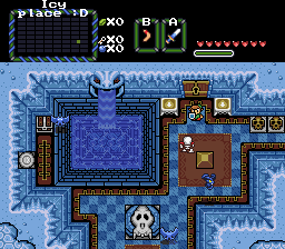
Ventus: While the layout of the screen is fairly interesting, there are a lot of misused tiles, perspective issues, and the grass needs to be fixed. Also, that square stonewall thing looks rather unnatural. But snaps to you for giving Origins III a try. I know from a experience how difficult it can be to use.


Yoshidude:
QUOTE(Yoshidude @ Nov 20 2011, 01:55 AM) View Post

But I meant to send in this version.

IPB Image

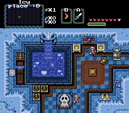
All due respect, I don't really see many differences at all. It's like playing one of those games where two pictures are side by side and you have to find all of the subtle differences. icon_shrug.gif It's just a friendly competition, buddy. Don't sweat things so much. The layout is decent, it just needs more pizazz.

Jared: The ciiiiiiircle of liiiiiiiiiiiiiiiiiife~! It moooves us aaaaa-a-aaaaaalllllllll!!

... *ehem*

I like it! However, if you're going to use those custom trees, I'd recommend finding something to replace the LttP trees, as it messes a lot with the perspective. I also recommend adding more light to them to make them fit in more. The screen itself could use a little bit more color, but that's just another thing on the list of my opinions. icon_smile.gif

Great week, guys!


0 user(s) are reading this topic

0 members, 0 guests, 0 anonymous users