Jump to content

Photo

Screenshot of the Week 222


  • This topic is locked This topic is locked
40 replies to this topic

Poll: SoTW222 (55 member(s) have cast votes)

Contestants

You cannot see the results of the poll until you have voted. Please login and cast your vote to see the results of this poll.
Vote

#1 /M/

/M/

    6♣7♠8♥9♥10♥

  • Members
  • Location:Gotham City

Posted 03 August 2008 - 06:33 PM

LostInHyru1e:
IPB Image
"Su madre. "

Nuvo:
IPB Image
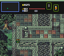
"90% Custom Graphics!"

ZeeLiam:
IPB Image

#2 Dawnlight

Dawnlight

    My name is NOT Jason!

  • Members
  • Real Name:Justin
  • Location:Chicago, IL

Posted 03 August 2008 - 06:36 PM

I'm Voting for LostinHyru1e.

LostinHyru1e: Although that screen is not one of your best screens, it still barely gets my vote.

Nuvo: Too checkery. Looks pretty confusing. Although I do like the trees and stuff.

ZeeLiam: Too empty and plain.

Pretty Disappointing this week. icon_shrug.gif

Edited by TriMaster001, 03 August 2008 - 07:43 PM.


#3 Colin

Colin

    Coblin the Goblin

  • Members

Posted 03 August 2008 - 07:22 PM

QUOTE(TriMaster001 @ Aug 3 2008, 05:36 PM) View Post

Pretty Disappointing this week. icon_shrug.gif

Wow, that sure helps all of our self-esteem. Sorry, but right now, that comment sounds oh so annoyingly elitist.
EDIT: Sorry for that, this is how I get every time I enter SotW, it always gets me frustrated when I spend such a long time on making custom graphics, editing palettes, to be beaten by a screenshot made of presets(No offense to you LiH, your screenshot is excellent)... except for the fact that I'm tied for leader now? Ah well, one of those votes on my shot or mine.

I can understand why you say checkery, so I'll do something about that.

LiH: Your screen is excellently designed.

ZeeLiam: That's actually shaped pretty well. A little bit more color, such as brown mountains, it will look even better.

#4 Plissken

Plissken

    What's with these homies dissing our girls?

  • Members

Posted 03 August 2008 - 07:42 PM

Went for Nuvo cause for custom graphics they are sure impressive and I like the general layout of the screen. JPEGs suck though, so much detail and stuff in here though that it's kinda hard to tell but it's still noticeable.

Maybe it's cause whenever I see a JPEG I puke, but LIH really has something that I don't really like, but I can't put my finger on it. Anyways, just remember JPEGs = horrid ZC shots.

Also, ZeeLiam, I see a mock up! While I really don't have to much room to talk cause I made a mock up once, but that's just cause I really didn't feel like setting up the character and enemy sprites for a new tileset. icon_razz.gif
But come on man! It's classic, it's already all setup. I mean, you didn't even open up ZC, and just cropped a ZQ pic (Don't kill me if that's not true, I'm going off the stuff at the very top of the pic that looks like the bottom of the top menu bar in ZQ.) Other than that the shot's ok, I mean, it's fairly bland and kinda unexciting by nature. It's not the worst shot ever, actually is quite a good shot for classic, but I don't see it being SotW worthy. :\

Also same goes for you, and I'll just say something Evile once told me. "If you post ZC pics and they're a JPEG, you have a 50% chance of being ganged raped the next day."

All JPEGs today? Wow, this is like...one of my biggest pet peeves in anything ZC...

Edited by Plissken, 03 August 2008 - 08:08 PM.


#5 Colin

Colin

    Coblin the Goblin

  • Members

Posted 03 August 2008 - 07:55 PM

Wow, my shot is a JPEG?! I could've sworn I set ZC's snapshot format to PNG. That's how it was a second ago... must have switched back... or maybe Photobucket is now switching both BMP's, and PNG's to JPEG, that would be annoying.

Here's an update to the shot... in PNG form, I'm still working on the tile flooring, it's gonna need to lose a bit of unnecessary detail. They'll also probably shrink to 8x8 tiles... I might even make them hexagons.

IPB Image


#6 William

William

    Banditos

  • Members
  • Real Name:You'll have to guess.
  • Location:Between the Pacific Ocean and the Atlantic Ocean

Posted 03 August 2008 - 08:09 PM

I'm so happy, first time doing screenshot of the week and I have some votes! This is so cool!

Edited by ZeeLiam, 03 August 2008 - 08:10 PM.


#7 Alestance

Alestance

    Saint Alestance - Eliminator of the ZGP format

  • Members
  • Real Name:Lonk
  • Location:Pennsylvania

Posted 03 August 2008 - 08:11 PM

I wish I had all my pretty graphics again, I would enter if there are so few entries icon_neutral.gif

#8 LostInHyru1e

LostInHyru1e

    Can you take me as far as PureZC?

  • Members
  • Real Name:Lost
  • Location:Refer to Screename

Posted 03 August 2008 - 08:17 PM

I like Nuvo's shot, but it's a little too confusing, the graphics look a bit weird.

ZeeLiam- glad to see you on here, little bro. icon_biggrin.gif Actually pretty well designed for Classic, keep practicing and you'll get better and better with every screen.

QUOTE
Also, ZeeLiam, I see a mock up! While I really don't have to much room to talk cause I made a mock up once, but that's just cause I really didn't feel like setting up the character and enemy sprites for a new tileset. icon_razz.gif
But come on man! It's classic, it's already all setup. I mean, you didn't even open up ZC, and just cropped a ZQ pic.


I'm gonna let you in on a little secret. Almost every single shot I've ever entered in SoTW(and that's probably around 15) has done that, including this one. All of the ones that don't have a subscreen are really just cropped ZQuest shots. icon_biggrin.gif It's just so much easier to get the action in the "right" places, then trying to take a moving shot in ZC. I want to have stuff going on, but I don't want it to be as random as it would be if I took it in ZC.

Edited by LostInHyru1e, 03 August 2008 - 08:18 PM.


#9 Owneybaloney

Owneybaloney

    Newbie

  • Members

Posted 03 August 2008 - 08:28 PM

Lostinhyru1e: Good screen but a little to dark.

Nuvo: O.K. but a little to confusing

Zeeliam: Nice first screen.

Good luck guys.

#10 Cameron

Cameron

    Illustrious

  • Members
  • Real Name:Matt
  • Location:South Jersey

Posted 04 August 2008 - 08:06 AM

LiH: This was really well designed 'nuff said. Got my vote.
Nuvo: A little confusing, but you almost had me with the awesome trees!
Zeeliam: Great for classic tileset, but it's like night and day compared to LiH's screen.

#11 Eddard McHorn Van-Schnuder

Eddard McHorn Van-Schnuder

    smash the bye button

  • Members
  • Real Name:Ronny Wiltersen

Posted 04 August 2008 - 08:15 AM

gray0x.... if it wasn't for that ugly palette... so I'm going for Nuvo... why? Cause it's good... and it reminds me of a ceratin star wars game for the ps1 that I really enjoyed.

#12 Russ

Russ

    Caelan, the Encouraging

  • Administrators
  • Location:Washington

Posted 04 August 2008 - 12:17 PM

LostInHyrule: Very good. Gets my vote. But once again, why does it say "You're mother" in Spanish? Why is "you're mother" the caption for every one of your screenshots?

Nuvo: Very nice work.

ZeeLiam: I love classic, and that screen design is amazing!

#13 Neppy

Neppy

    Grand Overlord Empress

  • Members
  • Real Name:It's dangerous to go alone. Take Nep!
  • Location:Minnesota

Posted 04 August 2008 - 12:25 PM

QUOTE(Migokalle @ Aug 4 2008, 08:15 AM) View Post
gray0x.... if it wasn't for that ugly palette... so I'm going for Nuvo... why? Cause it's good... and it reminds me of a ceratin star wars game for the ps1 that I really enjoyed.
gray0x isn't in this week. >.> But anyways, I voted for Nuvo this week though. IGood setup, and good tiles. LiH has a nice screen, but I can't see dark screens too well at the moment. Zeeliam has a very good first screen. I like the setup of it. Very well made for a classic tileset shot. Good work this week everyone!

#14 Moonbread

Moonbread

    Playing With Psychos

  • Members
  • Pronouns:They / Them

Posted 04 August 2008 - 02:42 PM

I vote for Nuvo because someone else has no idea how to use SD3 grass properly or how to submit a GIF... I'm fine with Nuvo's because at least I can clearly see the shot.

Edited by Moonwhisper, 04 August 2008 - 02:42 PM.


#15 Aslion

Aslion

    End Fascism

  • Members
  • Real Name:Ryan
  • Location:Plug One's spectacles

Posted 04 August 2008 - 03:09 PM

QUOTE(Migokalle @ Aug 4 2008, 08:15 AM) View Post

gray0x.... if it wasn't for that ugly palette... so I'm going for Nuvo... why? Cause it's good... and it reminds me of a ceratin star wars game for the ps1 that I really enjoyed.


Since when am I involved? :O
You know I would never make a shot with that palette or straight lines like that. Or am I the Classic shot? bleghghdklfs

I nulled. Nuvo's would of got my vote but it's too confusing.


0 user(s) are reading this topic

0 members, 0 guests, 0 anonymous users