Screenshot of The Week 173
#1
Posted 19 August 2007 - 10:37 AM
TriMaster001
No caption provided.
Moonwhisper
No caption provided.
Linkus
Cities; a hard thing to figure out in ZC. It's even worse in this size!
Ebola Zaire
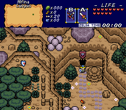
Link, having cleared the evil from Death Mountain, traverses the long road through the Babel Ruins.
Hoten
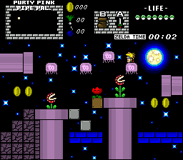
Frakking octorocks ruining my walk on the beach...
To those without captions, please submit captions with future submissions. Much obliged.
Anyway .. um. .. I . .. uh..
PureZC has kicked Teilyr from this topic. (Get off the stage!)
#2
Posted 19 August 2007 - 10:43 AM
#3
Posted 19 August 2007 - 10:53 AM
#4
Posted 19 August 2007 - 10:54 AM
Even though Linkus has those pretty graphics, Ebola Zaire's shot has more activity than any other shot. Hoten's shot almost got my vote, but there are a few tile errors .
#5
Posted 19 August 2007 - 11:12 AM
Ebola Zaire, I voted for you, the palette very much reminds me of Sabotage Dragoon(which is a good thing to some people). The screen design is great too.
Moonwhisper gets second vote.
Edited by Nuvo, 20 August 2007 - 07:16 AM.
#6
Posted 19 August 2007 - 11:27 AM
Anyhoo, my vote goes to Trimaster. A good solid Pure screen. Nice to look at at.
#7
Posted 19 August 2007 - 11:35 AM
Edit: I think I'll go with Ebola.
Edited by GoldenChocobo, 19 August 2007 - 11:46 AM.
#8
Posted 19 August 2007 - 11:38 AM
Ebola gets second and TriMaster gets third. Great turnout this week, all good too.
#9
Posted 19 August 2007 - 11:57 AM
Moon- Keep working on your tile making skills
Linkus- It would be hard to see whats going on if there was any action. The bottom of the trees are strange and too dark, and the lamp post blends into the sidewalk. Great realistic tilework, though.
Ebola- I like the mood and the layout of this shot. Gets my vote.
Hoten- JPGed.. Octorocks are ugly (not having an outline, making them fuzzy and inconsistent with everything else), there is a miscolored rock, and I don't like the pallete (could be from the JPGness). The screen layout is good though.
Edited by Fire Wizzrobe, 19 August 2007 - 11:59 AM.
#10
Posted 19 August 2007 - 12:16 PM
#11
Posted 19 August 2007 - 12:34 PM
Moonwhisper - Meh. Nothing too great about this. And the way you change light sources with vertical flipping and the like is kinda awkward.
Linkus - ZOMG! Photograph, or not!? *Votes*
EZ - This screen really reminds me of that area in Minish Cap... Castor something.
Hoten - You should probably use the sand as a 4x2 block. And that rock that has a grass background is really outta place.
Great screens this week, guys!
#13
Posted 19 August 2007 - 12:51 PM
#14
Posted 19 August 2007 - 01:30 PM
Hoten is also good and Moonwhisper made pretty SMW2 feeling.
#15
Posted 19 August 2007 - 02:43 PM
That is the embodiment of pwnage.
0 user(s) are reading this topic
0 members, 0 guests, 0 anonymous users