Jump to content

Photo

Screenshot of the Month 126

Twilight-Prince Rocks4Free Demonlink Joelmacool12 Bagel

  • This topic is locked This topic is locked
9 replies to this topic

Poll: Screenshot of the Month 126 (46 member(s) have cast votes)

I have no witty commentary for 126, now vote or don't vote, I don't care.

You cannot see the results of the poll until you have voted. Please login and cast your vote to see the results of this poll.
Vote

#1 The Satellite

The Satellite

    May the way of the Hero lead to the Triforce.

  • Members
  • Real Name:Michael
  • Pronouns:He / Him

Posted 07 June 2015 - 04:33 PM

Twilight-Prince - SotW 506

Twilight-Prince.png

The first room of Kul'ata Temple, a structure deep in the jungle where ancient folk worshiped the Sun and Moon. What mysteries and dangers await inside...?


Rocks4Free - SotW 507

Rocks4Free.png

"These city slums are definitely not where I want to be..."


Demonlink - SotW 508

Demonlink.png

"The Temple of Seasons was once a beautiful sanctuary built with grace for the four stationary seasons. With time, evil monsters have plagued the Temple's Halls, and a dangerous poison has contaminated the once clear waters of the palace. Be aware of the dangers within O Chosen Hero; that is, if you are brave enough to retrieve the Rod of Seasons from its depths..."


Joelmacool12 - SotW 509

Joelmacool12.png

Welcome to the pathway to the ancient 'Temple of Time'.


Bagel - SotW 510

Bagel.png

Building a house here was a great idea!


#2 nicklegends

nicklegends

    Trofessional Pransposer

  • Contributors
  • Real Name:Ed
  • Pronouns:He / Him

Posted 07 June 2015 - 04:59 PM

Five different winners last month. Neat!


I said it during the contest and I'll say it again:  something about Twilight-Prince's shot is really immersive.  I can picture the scene in my head from the broken statues to the glimmer of sunlight to the foliage; how it looks, how it sounds, how it smells... It's hard to foster such a sensation with so few pixels. An effort like this absolutely earns my vote.


  • Twilight-Prince likes this

#3 Fox

Fox

    Will the Hero rise again?

  • Members
  • Real Name:Scott
  • Location:Southern California

Posted 07 June 2015 - 05:06 PM

Been a long time since I've voted in one of these. Let's get to it!


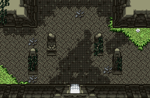
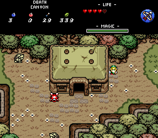
Twilight-Prince: While it's not complicated layout-wise, it really doesn't need to be. Your entry nails what it sets out to accomplish: it sets the mood for what seems to be an interesting location. The place really looks ancient and forgotten. The greenery gives the place some nice color and reinforces the theme, and the destroyed tile flooring is interesting and a nice touch. I don't know that the grass should be as green as it is for an indoor area - maybe add windows to let more natural light in that hits parts of the interior, which I think would add even more to the ambiance you're going for. I think the only other thing I'd try is to use a different color for the light at the entrance, though maybe what you've gotten is best. I always have to try it out myself to be sure.


Rocks4Free:

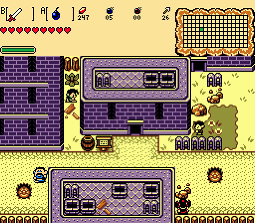
I can feel the vibe you've got going on in your entry. Nice details with some of the rubble and potholes to set the mood, and I particularly like the alley between buildings. The roads edges are maybe a little too smooth for what I think you're going for... maybe add some cracks or missing pieces from the edges?


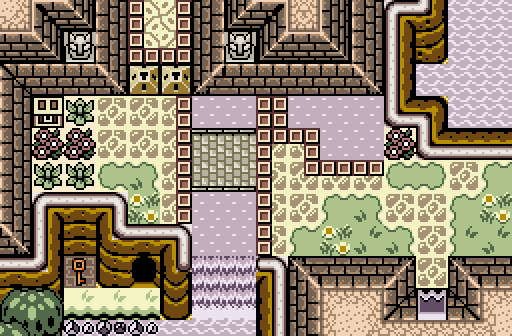
Demonlink: Certainly the most complex layout of the bunch. Some of the tiles are placed a little haphazardly, such as the stone tiling. The stone perimeters around the water overlapping those stone tiles doesn't really work for me. I like that you have a bridge across the water, though maybe it's a little flat. The water next to the flowers on the right side of the screen ends a little abruptly. On the other hand, I like the layout itself.


Joelmacool12: The colors are just a little too bright for my taste. It would also be nice to use different different shades of green for the grass, bushes, and trees so that it doesn't all run together.


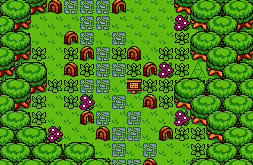
Bagel: I like the shading on those trees, and the general colors you're using. The Moblins a re maybe a little muted. The trees are varied enough to not just look like a bunch of copy-pasting, but not so different that it doesn't look like they'd actually grow that way.


Nice screens all around, but ultimately, my vote goes to Twilight-Prince.


  • Twilight-Prince likes this

#4 ZeldaPlayer

ZeldaPlayer

    What's up my playas

  • Members
  • Location:USA

Posted 07 June 2015 - 07:18 PM

I have to go with Demonlink. His is the best.

Edited by ZeldaPlayer, 07 June 2015 - 07:19 PM.


#5 SyrianBallaS

SyrianBallaS

    Defender

  • Members
  • Real Name:Samer
  • Location:Detroit, Michigan

Posted 07 June 2015 - 08:37 PM

Twilight-Prince ftw


I think I reviewed all these screens before.


  • Twilight-Prince likes this

#6 Hergiswi

Hergiswi

    don't look for me, i'm just a story you've been told

  • Members
  • Real Name:chris
  • Location:house

Posted 07 June 2015 - 08:50 PM

It's great to see so much GBC in use. Great stuff. The shot that called out the most to me, however, is Twilight-Prince's. The shading is flawless.


  • Twilight-Prince and SyrianBallaS like this

#7 SUCCESSOR

SUCCESSOR

    Apprentice

  • Banned
  • Real Name:TJ

Posted 07 June 2015 - 08:59 PM

I don't usually vote and I almost never comment. I am not gonna get all deep about this:


Demonlink got my vote. It looks great and the only thing I didnt care for was the weird floor border.


Rocks4free's shot looks very old-school. I'd have voted here if the palette was better.


Bagel, it looks great but that Link sprite is terrible. It doesn't match anything else and even looks bad on its own. I played your 745 demo briefly and spent the whole time thinking about how awful that sprite is.


Joelmacool, It's okay. Everything looks too messy. The pathway should be atleast somewhat... "path-like?" and probably a lot less of the other stuff.


The guy who's name I forgot with the dark screenshot, It looks great no complaints. Theres nothing striking about it which is why it lost out on my vote.


#8 Eddy

Eddy

    ringle

  • Moderators
  • Real Name:Edward
  • Pronouns:He / Him
  • Location:London, United Kingdom

Posted 08 June 2015 - 10:28 AM

I gave all my thoughts and comments on each SotW, so I'll keep it brief.


There's plenty of great shots this month, and it was quite close between Demonlink and Twilight-Prince, as their screens stood out the most but I'm gonna go for Demonlink.


#9 symbiote01

symbiote01

    Doyen(ne)

  • Members
  • Real Name:Doug
  • Location:WA

Posted 13 June 2015 - 02:51 AM

Twilight-Prince: My choice.  I love the forboding color scheme and dark vines on the columns.  The bright grass against the dark is quite a contrast.  And if I had one gripe, it would be the lack of transition between the grass and the walls (no tufts of grass sticking up to speak of).  The more detailed the tileset, the more important these little details become.


Rocks4Free: It's a GB-style screen.  With a minimalist color-scheme in mind, it is a good shot.  Doesn't really look like a slum, though- not enough garbage or broken road.  Those purple walls look ripe for tagging.


Demonlink: Not a bad shot.  The palette is inoffensive to the eyes.  The strange tetris blocks in the road are a little weird for me- they look like uncrossable barriers.  Also, there is a lack of water transition tiles.  In all, not a bad setup, just not my favorite.


Joelmacool12:  I find it interesting that the main colors here are all secondary- green, orange, and purple.  It looks like a wicked croquet course.  There's a lot going on visually- my eyes have a hard time not-wandering.  This is a screen that would normally take up two seconds of a gamer's life- you run through it and it's gone.  Since it is leading to place like 'The Temple of Time', I expect the very next screen to be visually stunning- which makes this one the precursor or 'herald' to greatness.


Bagel:  This is a great shot.  The scene really pops for me.  I like that there are different colors of the same tree, and several tree varieties, too.  Parts of my brain demand shadows for the house and cliffs at the bottom of the screen- they are missed.  Also, the only shot to include a subscreen- I like the minimalist approach to item counters, and the single choice secondary weapon (no sword-swapping here!)


  • Twilight-Prince likes this

#10 The Satellite

The Satellite

    May the way of the Hero lead to the Triforce.

  • Members
  • Real Name:Michael
  • Pronouns:He / Him

Posted 15 June 2015 - 12:03 AM

WITH HIS BOLD STROKES HE this narration is already doomed to fail, the winner is Twilight-Prince!


Twilight-Prince.png


See you in Screenshot of the Year!


Voting totals:

- Twilight-Prince - SotW 506 (16 votes [44.44%])

- Rocks4Free - SotW 507 (1 votes [2.78%])
- Demonlink - SotW 508 (15 votes [41.67%])
- Joelmacool12 - SotW 509 (2 votes [5.56%])
- Bagel - SotW 510 (2 votes [5.56%])


  • Twilight-Prince likes this


Also tagged with one or more of these keywords: Twilight-Prince, Rocks4Free, Demonlink, Joelmacool12, Bagel

0 user(s) are reading this topic

0 members, 0 guests, 0 anonymous users