Posted 05 January 2015 - 12:41 PM
Wow, any one of these could easily vie for SotY.
Nitpicky comments
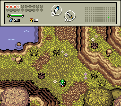
Demonlink, first screen, it's amazing, the details the palette everything. It's fault is that there isn't anything happening to pique my interest, that's barely a critique since it's just a random screen from a quest where every screen is of this high quality.
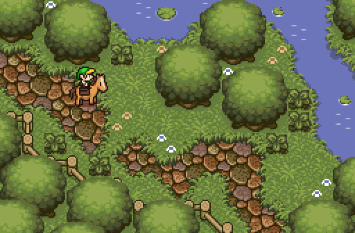
Jared, ultimately I think this might get my vote. The details are amazing, so natural looking. There were some comments about the path, but that's the best part for me. My only gripe are the trees, the perspective looks a bit off, and the leaves look too hires for the rest of the screen which has a defined sharpness to it.
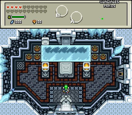
Demonlink 2, I'd love to see more screens from this dungeon, the theme looks really awesome, and a gameplay screen would really sell me. The square ice patch is the only fault I have with the screen. The rest of the screen makes sense, but I can't figure out why there would be a patch like that either naturally or unnaturally. Maybe a couple of smaller irregularly shaped ice patches would make more sense? If this is a mine, some evidence of that would be a cool detail as well.
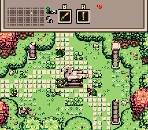
Sheik, this is another favourite among favourites. My gripe is a bit nebulous, in that I feel the ground details aren't up to your usual standard. I really enjoy how you cluster grass details such that repeated tiles in the cluster even adjacent somehow take on a unique look. This screen doesn't have that. So basically I love this screen, but it isn't your best.
I might just null, because all that was incredibly pedantic.

 This topic is locked