Sephiroth: A very impressive beach shot.... And that's about it. It's really well done, but it's just outclassed, this month, in terms of design, as the beach, especially the layout you used, is kinda stock. You really do good work with that tileset, though!
Thanks; I realize its outclassed this week by gems like Orithan's and Anthus' shots, but I felt the need to kinda mention my revival in a way that matched with this triple-digit SotW milestone.
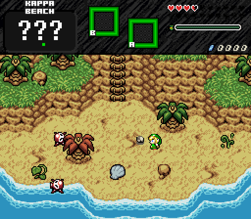
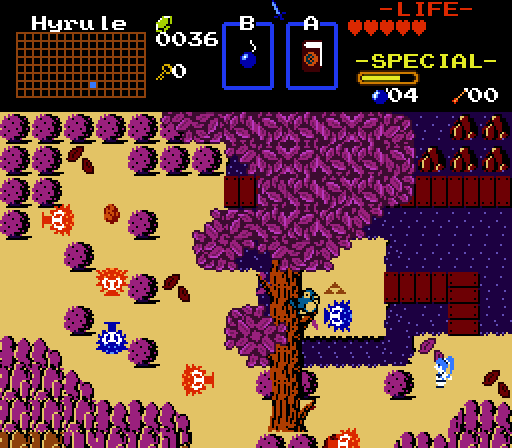
Had I not entered, I would of went with Sephiroth's. I really like it when DoR is used like this (clean and simple). Also nice name for the beach. 
Thanks; the name for the beach was just a spur-of-the-moment kinda thing, but it is kinda ... iDunno, ... influenced by a certain large gaming streaming site?

Sephiroth - This is an interesting one. You could say it's a bit on the empty side, but in a way so that it actually looks pretty good. I like what you got going here and that subscreen looks pretty neat too.
My quirk I have with this particular tileset, is that while it contains a lot of individual detail tiles to use, I don't really like going overboard. Especially when it's supposed to be a rather clean area such as this. Thank you.
Sephiroth:
I'm really liking the palette here. It has a very bright, and cheery, and first area vibe to it. The screen is well composed, and the detail is nice. Not much else to say on this one. I probably would have voted for this, or Shane's title screen, had I not entered.
The idea is this particular screen will be the first screen you'll see after whatever title screen I decide to put together. And yes, that's really a pair of octoroks on the first screen. Fortunately they're the super-easy slow ones, so it's not that difficult to dodge at the early game. One thing I like doing is sticking the initial sword in a small introductory level, so I'm putting that elsewhere in the beach area. You'll need to sword to progress further past the beach. Thanks for the comments.

Sephiroth- I like how clean and appealing this shot is, it's just a bit too symmetrical in my opinion.
Thanks; while I do somewhat agree its a bit too symmetrical, if you look at the
full map of the beach area, you will see it is but a single screen out of a rather neat 12-screen area. Its just how it ended up.

Sepiroth:4th place for me. I love how you put the ??? because it has that mystery feel. The subscreen looks very aesthetically pleasing. Great job.
4th place, eh? Any other comments aside from the subscreen? Which that subscreen is still a work in progress.
Regardless, thanks for the comments.
Shane, Anthus, Orithan and Sephiroth all have screens that I like.
Joel's is good too, though the text does get in the way I can still enjoy the effort put into it.
In the end, I voted for Anthus.
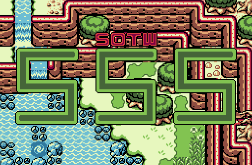
Joelmacool: While I see where you were going with this screenshot, making it appear to be a title screen for SotW #555, that text is quite ugly. It also blocks the view of the rest of the screenshot, which looks like a spectacular overworld GB screen.
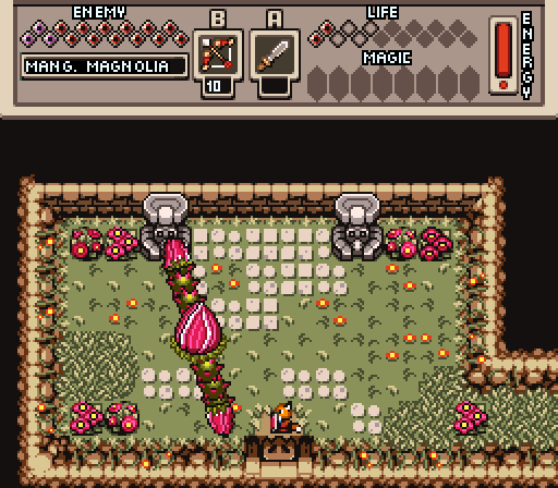
Orithan: I'm going to guess that the northern wall is scripted to slide upwards after the boss/mini-boss is defeated to reveal a prize for Hal. The screen overall is quite square, as others have said; but it might be necessary due to the way your scripted boss/mini-boss works, so I can give that to you. What doesn't really make sense though is why there's no upper wall border on that north wall like there is on the rest of the screen. It goes from wall directly to solid black instead of that nice smooth transition that you can see on the south and western wall. It even looks like it wraps around to that north wall, but then it just goes solid black.
The rest of that screen is impeccable though.
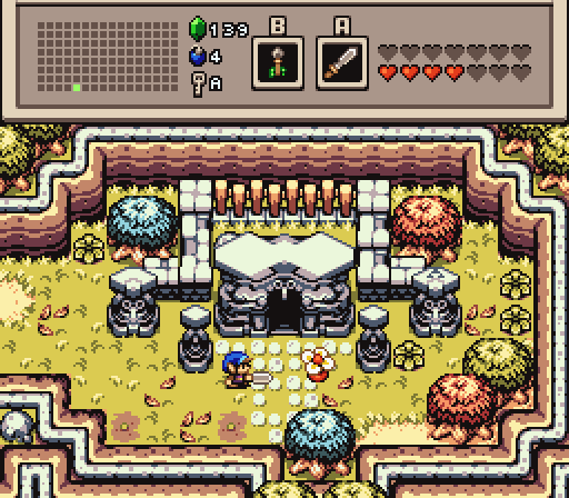
Anthus: This screenshot kinda reminds me of a Zelda 1 overworld screen that's been merged with the look and feel of Minish Cap without the old Minish Cap mountain graphics. Structurally the screen is very well done, the pallete you chose is very nice, I love it.
Sephiroth: Life's a beach sometimes.
Lunaria: We have a Zelda 1 perspective overworld screen, then we have a side-scrolling perspective tree planted directly in the middle of the screen. Perspective clash to the max here. Its quite difficult to gauge where Link would be able to walk with that tree the way it is.
Shane: You're home, Shane. Go drunk.
... Regardless; This title screen is quite good. I do agree that the logo itself is a bit on the small side, but nonetheless, looks quite good.

 This topic is locked


