Joelmacool
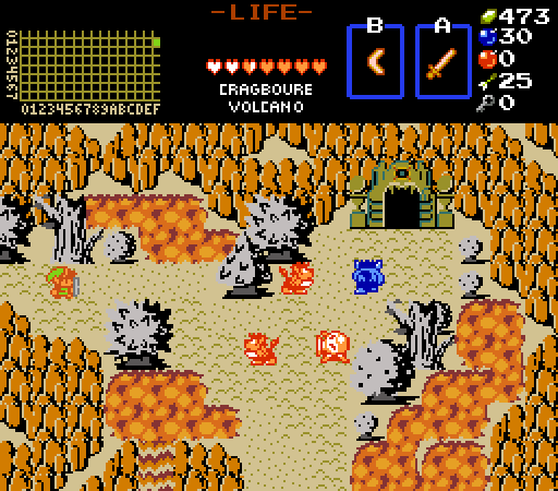
The trees are grey-ish because of ash. ![]()
Moosh
Did someone call for filler screenshot?
Lüt
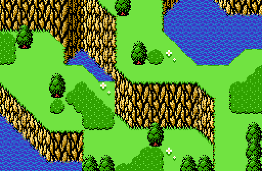
Apparently growing bushes is the Mad Axeman's way of making up for chopping down trees.

 This topic is locked
May the way of the Hero lead to the Triforce.

Posted 13 November 2016 - 11:13 PM
Joelmacool
The trees are grey-ish because of ash. ![]()
Moosh
Did someone call for filler screenshot?
Lüt
Apparently growing bushes is the Mad Axeman's way of making up for chopping down trees.
Justice is served!

Posted 14 November 2016 - 12:05 AM
Voted for Joelmacool. Another fine example of classic tileset usage.
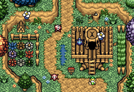
I was almost considering a vote for Lut, but I believe the biggest drawback is how the palette makes the SD3 grass look discolored.
What's up my playas

Posted 14 November 2016 - 01:34 AM
Been a while since I last voted, man these are great submissions! Well this week I voted for Lut. He really showed a great screen with the tileset!
Everything must go away

Posted 14 November 2016 - 01:39 AM
I don't know what it is, but Lut's 'shot is one of the most natural looking screens I've ever seen in Zelda Classic. Like, it looks like it could exist here on Earth. Very pretty, and cozy-feeling. I voted here.
Gigi & Merri Superstar Saga

Posted 14 November 2016 - 02:58 AM
Joel--nice work on this... reminds me of an eldin volcano from the NES era! very well done details with the lava falls and whatnot.
Moosh--it's nice but i think its a lil plain. feels a little unnaturally still if ya catch mt drift.
Lut-- i feel like the tile set is nice but it also feels like its a bit too busy. there is a good flow it just feels a little noisy.
My vote went to Joelmacool. Lut is a close second!
ringle

Posted 14 November 2016 - 04:38 AM
Joelmacool - Not bad at all. I really like the effect of making trees all grey because of ash, that's a very neat touch. The screen itself is nicely made and definitely fits a volcanic setting. Nice job.
Moosh - Pretty nice shot. I like the tiles you used here which has to make me ask, what tileset is this? I do feel some parts of the ground could use a little more detail since it seems kinda empty in some places, but good job anyway.
Lut - I really like the idea of this shot, and it looks really cool too. Though I'm not very sold on the palette here. Something about the grass colours just doesn't look right to me, though everything else is fine.
I voted for Joel this week with either Moosh or Lut in close second.
Germanize

Posted 14 November 2016 - 10:00 AM
So that's where the grass is from.the biggest drawback is how the palette makes the SD3 grass look discolored.
...not that I disagree, but I didn't actually make any of these palettes.Though I'm not very sold on the palette here. Something about the grass colours just doesn't look right to me, though everything else is fine.
...is the best comment I could hope for. ThanksI don't know what it is, but Lut's 'shot is one of the most natural looking screens I've ever seen in Zelda Classic. Like, it looks like it could exist here on Earth. Very pretty, and cozy-feeling. I voted here.
ringle
Posted 14 November 2016 - 10:16 AM
...not that I disagree, but I didn't actually make any of these palettes.
Yeah, I knew that you didn't make the palette, I've seen this used in other places before ![]() I do think a different palette might have suited the screen more though, but that's up to you (and I'm no palette expert so I dunno what would be good to begin with lol)
I do think a different palette might have suited the screen more though, but that's up to you (and I'm no palette expert so I dunno what would be good to begin with lol)
Tiny Little Questmaker

Posted 14 November 2016 - 02:33 PM
Oh and uh, Moosh you're giving me a flashback to like 25 years ago, how are you doing that? Those tiles look so familiar.
So that's where the grass is from.
The trees, grass, and water are from Ys. The mountains are my own. I'm really fond of this series, so I started assembling a tileset based on the NES ports, since NES is easiest to work with. Chances are it's just another boredom killer that'll never be finished, but who knows.
"Tra la la, look for Sahasrahla. ... ... ..."

Posted 14 November 2016 - 11:45 PM
J- Sure, blame it on the Pokemon trainer.
I like the layout, but there's a lot of style clash with the graphics.
M-Zelda golf? It's time to hit the links.
L-The color on those peahats makes them look like flying bomb flowers, that would make a cool enemy!
Addicted to Overwatch

Posted 15 November 2016 - 10:59 AM
I like the layout, but there's a lot of style clash with the graphics.
Blame the style clash on the pokemon trainer Moosh ![]() It's his tileset.
It's his tileset.
Tiny Little Questmaker
Posted 15 November 2016 - 05:06 PM
Blame the style clash on
the pokemon trainerMooshIt's his tileset.
And yet people keep using it for some reason. And the style clash jimmies keep getting rustled anew. It's great. ![]()
Moosh--it's nice but i think its a lil plain. feels a little unnaturally still if ya catch mt drift.
Your comments about it feeling unnaturally still are duly noted. I think the problem is that I didn't post the screen in an animated gif format. I've amended this and also completely redesigned everything about the screen. Not so still when everything's moving about is it!? How do you like me now!? YOU STILL GONNA CALL MY SCREENSHOT UNNATURALLY STILL!?!?! ![]()
Yes I'm that guy who dreamt Dani was Zelda. LOL Cimfam/zelda

Posted 17 November 2016 - 01:38 PM
Moosh gets my vote for how atmospheric it looks. You guys are stepping it up with your screens I'm impressed yo. Nobody really had any flaws here, I basically chose my vote for Moosh because it looked the most atmospheric to me.
Sponsored by Taco Bell

Posted 18 November 2016 - 11:48 AM
Lut all the way for me!
Bug Frog Dragon Girl

Posted 20 November 2016 - 11:46 AM
Your comments about it feeling unnaturally still are duly noted. I think the problem is that I didn't post the screen in an animated gif format. I've amended this and also completely redesigned everything about the screen. Not so still when everything's moving about is it!? How do you like me now!? YOU STILL GONNA CALL MY SCREENSHOT UNNATURALLY STILL!?!?!
Aww Ysssss...
Anyways voted Lut because I totally don't have anything againstYs and chaos tileset, noooo... ![]()
0 members, 0 guests, 0 anonymous users


