Joelmacool
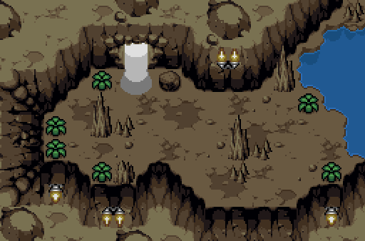
No, it's not from Lost Isle. ![]()
Jared
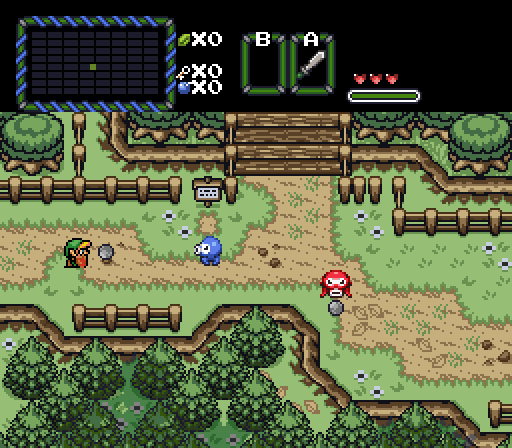
Finally out of Ordona Forest...
Shane
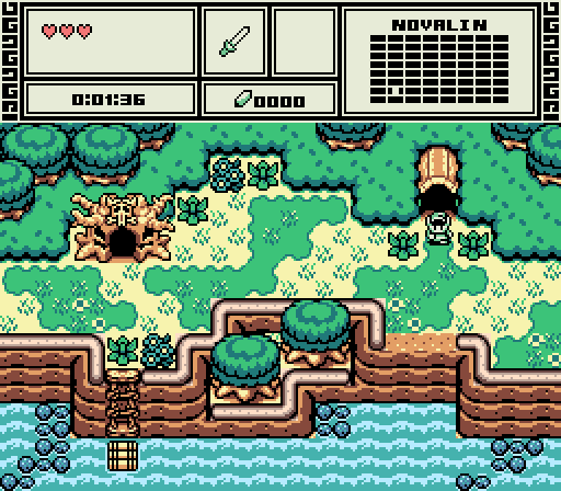
Leaving the Wildlands to get a potion!

 This topic is locked
May the way of the Hero lead to the Triforce.

Posted 03 April 2016 - 09:10 PM
Joelmacool
No, it's not from Lost Isle. ![]()
Jared
Finally out of Ordona Forest...
Shane
Leaving the Wildlands to get a potion!
💙

Posted 03 April 2016 - 09:20 PM
Both shots are great. I like Joel's because it gives you reasons to revisit this screen twice but Jared's has a cool forest/field transition that looks smooth. That, and the bridge is nice too. I guess in addition to me entering, I decided to null.
one point nine hero

Posted 03 April 2016 - 10:32 PM
ringle

Posted 04 April 2016 - 05:12 AM
Joelmacool - This is a really awesome looking cave. I've never seen a cave shot be as good as this in a very long time. Fantastic work.
Jared - I really like how this one looks too. Definitely suits a field setting very well and the screen design is awesome here.
Shane - Once again, the GB look is perfect here. The colours are really nice to look at and I like how everything else looks.
Very close between all three, but I went for Joel this week.
Magus

Posted 04 April 2016 - 07:38 AM
Edited by Naru, 05 April 2016 - 10:16 AM.
Addicted to Overwatch

Posted 04 April 2016 - 07:52 AM
Joelmacool - nice screen, I would prefer bigger caves though, the walls look kind of odd so near to each other (north and south). Also the candles do not fit.
????
1) This isn't the entire cave, you use the flippers to go elsewhere and there is a bombable wall.
2) Pretty much you are saying: Put no walls. How else would I create walls? Put nothing there? I don't understand, I think they look perfect the way it is...
3) The candles were MADE for the caves.
Magus
Posted 04 April 2016 - 08:08 AM
Addicted to Overwatch
Posted 04 April 2016 - 08:12 AM
Keep in mind my english is not the best, I am often not able to communicate my thought to 100%. At least not in understandable english.
The distance between the walls is not really wide and I think they create a perspective that clashes. If the room would be bigger this would be solved. If it still is not understandable, just ignore this, voted for you anyway.
Even if the candles were made for the screens, they look like from another tileset.
Hm, alright then. Thanks for voting I guess ![]()
Yes I'm that guy who dreamt Dani was Zelda. LOL Cimfam/zelda

Posted 05 April 2016 - 04:27 AM
Joel.
That's a cave I'd love to live in.
lol
Lord of Liquids

Posted 05 April 2016 - 07:26 PM
Went with Joelmacool this week. I love the MC caves. The other shots are pretty solid, as usual from those guys ![]()
Deified

Posted 05 April 2016 - 10:31 PM
It's close between Shane and Jared.
I voted for Jared mainly because it looks like Link's about to get a black eye. ![]() Jk. I just really like Jared's submission this week.
Jk. I just really like Jared's submission this week.
Coblin the Goblin

Posted 06 April 2016 - 11:54 AM
So, basically all three of you who submitted this week made absolutely perfectly crafted screens. Seriously, I really can't point out a design flaw in a single shot. This made it difficult for me to vote, but I ended up going with Jared. I like how his shot has the pine trees on the upper cliff tiers, and the normal trees on the lower cliff tiers. That's a kind of thing I used to do when I still ZQd.
I want to make a remark, and I don't want to come off as rude or anything. The three shots submitted this week, while perfectly crafted, aren't interesting. Basically totally generic, there's no interesting or creative use of the graphics/tools you've been given, none of the shots seem to have some sort of focal point or subject which would make them stand out. I essentially have been seeing these three shots in SotW show up every week over the years (an exaggeration...), to the point that they leave something to be desired.
Look, though. I get it, you all are making your quests, and maybe there isn't always a very unique screen for you to put up to this contest. So hopefully I'm not discouraging any of you. Keep doing your thing and participating. I'm mostly saying that to win my vote and stand out from the other perfectly designed screens, you're going to have to do something different/unique/creative.
Edited by Strato, 06 April 2016 - 11:55 AM.
Deified

Posted 06 April 2016 - 02:02 PM
2) Pretty much you are saying: Put no walls. How else would I create walls? Put nothing there? I don't understand, I think they look perfect the way it is...
You could make the cave bigger in order to avaoid the effect that Naru is referring to. If the southern wall of the cave was one screen below (instead of on the same screen, that is: the cave was one screen wider to the south) you wouldn't have the issue of having the nothern and southern wall as close to each other which would allow the graphics to "shine" more in the sense that they wouldn't look as akward in terms of perspective.
I don't think it is too much of an issue, though.
Wizard

Posted 06 April 2016 - 04:08 PM
all good screenshot, at the end i voted for Joelmacool.
is just my immagination or the west "wall" ( sorry for me is a wall, there surely a better word for describe in english but..i don't knew it )...is bombable?
Addicted to Overwatch
Posted 07 April 2016 - 04:40 AM
all good screenshot, at the end i voted for Joelmacool.
is just my immagination or the west "wall" ( sorry for me is a wall, there surely a better word for describe in english but..i don't knew it )...is bombable?
The west wall is bombable ![]()
PureZC Events →
Screenshot of the Week →
Poll Screenshot of the Week 812Started by Taco Chopper , 15 Apr 2024 |
|

|
||
 |
Matthew
PureZC Events →
Screenshot of the Week →
Poll Screenshot of the Week 811Started by Taco Chopper , 01 Apr 2024 |
|

|
|
PureZC Events →
Screenshot of the Week →
Poll Screenshot of the Month 200Started by Taco Chopper , 01 Apr 2024 |
|
|
||
|
|
Shane
PureZC Events →
Screenshot of the Week →
Poll Screenshot of the Week 810Started by Taco Chopper , 20 Mar 2024 |
|
|
|
|
|
Phosphor
PureZC Events →
Map of the Month →
Poll Map of the Month 149Started by Shane , 02 Feb 2024 |
|

|
0 members, 0 guests, 0 anonymous users

