Jared
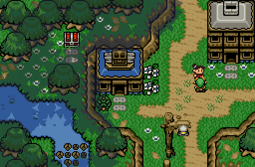
My parents own the shop right there! Did you know it's also a café?
Anthus
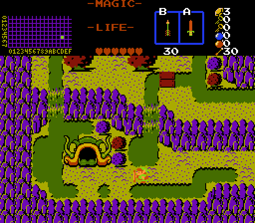
"Mmmmm, Swampy.."
Joelmacool
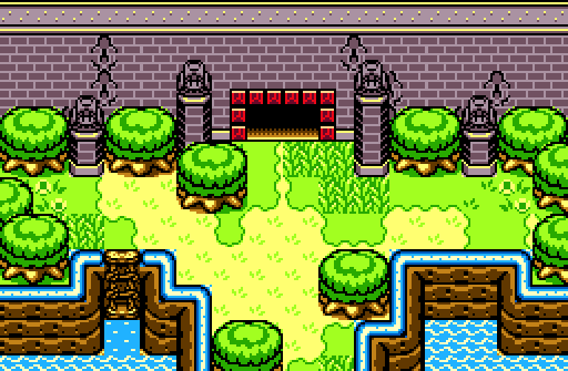
It's a castle! By looking at the statues you already know who owns the castle... ?

 This topic is locked
May the way of the Hero lead to the Triforce.

Posted 13 March 2016 - 08:32 PM
Jared
My parents own the shop right there! Did you know it's also a café?
Anthus
"Mmmmm, Swampy.."
Joelmacool
It's a castle! By looking at the statues you already know who owns the castle... ?
Formerly Lineas

Posted 13 March 2016 - 11:33 PM
Ooh! First critique! This is a good week, all three shots here are quite good
Jared: I really like your screen. Not only is the tileset beautiful, but you used it very well. Not much else to say; kudos.
Anthus: I love your use of classic, here, but why did you have to use that fish-head thing? The rest of the screenshot is so well done, but that one graphic really clashes with the overall style of the screen.
Joelmacool: Beautiful, man. Only real issue I have is with those weird designs in the wall. Their placement seems strange, more like they're tile errors, than intentional. I mean, are they supposed to be cracks? Because, if so, they're just way too uniform. It's a bit distracting.
I voted for Jared, mainly because I just really love his screen, and it was the only one without something that immediately looked wrong, to me. It looks like something I'd want to play as a completed quest, if I saw this as one of the teaser shots.
Magus

Posted 14 March 2016 - 03:26 AM
Voted for Jared, awesome stuff. Really reminiscent of the earlier Pure Quests except much more polished. Only critique is to change the lamppost with something a little less DoR/MC looking and with something more LttP/Pure in appearance; it seems out of place.
ringle

Posted 14 March 2016 - 08:54 AM
Jared - Really nice screen. I love the divide between both sides here. Took me a while to realise that lamp on the bottom right is indeed a lamp, but I love how everything else looks.
Anthus - I really like the colours of this one, not sure why but they look really cool and suit a swamp setting very well.
Joelmacool - Really nice job with this screen. Love everything about it. Like Binx said though, those cracks on the castle walls can be worked on a bit.
I voted for Jared this week with Joel in close second.
Yes I'm that guy who dreamt Dani was Zelda. LOL Cimfam/zelda

Posted 14 March 2016 - 08:57 AM
This to me is a stone cold lead pipe lock
Jared.
I love all 3 but Jared's is by far the best tbh.
Deified

Posted 14 March 2016 - 10:44 AM
Only critique is to change the lamppost with something a little less DoR/MC looking and with something more LttP/Pure in appearance; it seems out of place.
Yeah, I definitely thought that too. I just couldn't find a wooden lamppost anywhere that would somewhat fit, so I had to settle for that for now.
Thank you everyone for you comments and critiques!
Edited by Jared, 14 March 2016 - 10:44 AM.
Yes I'm that guy who dreamt Dani was Zelda. LOL Cimfam/zelda
Posted 15 March 2016 - 05:33 AM
I will say about the other 2, they look strong as well. I just think this is a runaway for this particular round.
Kingdom Builder

Posted 18 March 2016 - 08:13 AM
Jared: Everything looks solid. I love how the caption you went with is just the line of the NPC. I also love how you made it obvious that there is a secret on the left side of the screen to reach later in the quest. If anything, the two stones in front of the chest don't seem necessary. Mostly cause it makes that particular spot feel a bit unnatural. But that would be terribly nitpicky and I probably wouldn't even notice in a full quest.
Anthus: I absolutely love the way you used the classic tileset for this shot. I'm impressed. The colors are just absolutely perfect. I even think the fish head looks fine. I think of it as the entrance to a dungeon, which I assume is what you were going for. Like Jared's piece, I also greatly enjoy the way you make it obvious you will be revisiting the screen to get to this area. It shows that there's more to the adventure. If I were to change anything, it would be to recolor the bushes. They almost look weird with their color placement. I think I would at least flip flop the colors on the top two bushes.
Joel: It's good, and I do like the ladder, but it's also very, plain. And the plainness makes the small things I don't like jump out more. One, the square of grass in front of the right side of the door. I don't like it. It extends over the green below it, and looks off. The other thing is, like others have said the cracks. They look like they were meant more as decorations than cracks. And when i think decoration, I am bugged by things not being symmetrical. Unless it's very random, I wouldn't make the decorations on something, especially a thriving castle, asymmetrical. It needs to look natural if it's going to be random.
That said, I went with Anthus. What barely put him over Jared for me, was that he was very creative with the classic tileset.
May the way of the Hero lead to the Triforce.
Posted 20 March 2016 - 07:35 PM
With 85.71% of the vote, the winner of Screenshot of the Week 550 is Jared!
Congratulations!
Voting totals:
- Jared (42 votes [85.71%])
- Anthus (3 votes [6.12%])
- Joelmacool (4 votes [8.16%])
 |
Jenny
PureZC Events →
Screenshot of the Week →
Poll Screenshot of the Week 809Started by Taco Chopper , 06 Mar 2024 |
|

|
|
|
|
Taco Chopper
PureZC Events →
Screenshot of the Week →
Poll Screenshot of the Week 808Started by Taco Chopper , 19 Feb 2024 |
|
|
|
|
|
Phosphor
PureZC Events →
Map of the Month →
Poll Map of the Month 149Started by Shane , 02 Feb 2024 |
|

|
|
|
|
Sheik
PureZC Events →
Screenshot of the Week →
Poll Screenshot of the Year 2023Started by Taco Chopper , 29 Jan 2024 |
|
|
|
|
|
Anthus
PureZC Events →
Screenshot of the Week →
Poll Screenshot of the Year 2023 - Blue BracketStarted by Taco Chopper , 22 Jan 2024 |
|
|
0 members, 1 guests, 0 anonymous users

