Joelmacool
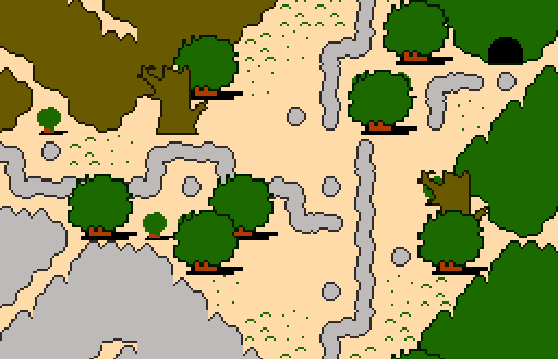
A tileset I'm working on. ![]()
BigJoe
Link's Past Future!
Dimentio
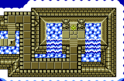
My, my, it seems we have reached the peak of chilly receptions.

 This topic is locked
May the way of the Hero lead to the Triforce.

Posted 13 December 2015 - 04:41 PM
Joelmacool
A tileset I'm working on. ![]()
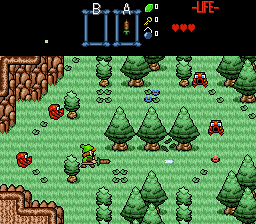
BigJoe
Link's Past Future!
Dimentio
My, my, it seems we have reached the peak of chilly receptions.
💙

Posted 13 December 2015 - 05:00 PM
I voted for BigJoe. While his isn't perfect graphically, I could understand the design, and the graphics do produce a captivating charm. I would remove the outlines on the "dark green grass pieces".
ZC enthusiast

Posted 13 December 2015 - 06:42 PM
I really like Joelmacool's tileset idea. Though this particular shot would feel a lot more alive if it had enemies or npcs in it.
Bug Frog Dragon Girl

Posted 13 December 2015 - 07:47 PM
Originally, my screenshot was going to be this:
Then I realized that somehow a 10 second animation takes over 15mb of memory. And they have a rule against that. Why the hell would an animation be that large anyways? How is it possible?
Edited by Dimentio, 13 December 2015 - 07:48 PM.
Deified

Posted 13 December 2015 - 11:54 PM
ringle

Posted 14 December 2015 - 09:30 AM
Joelmacool - That is one hell of a tileset. I like what you got going, but a few things could still be improved (like giving those small bushes an actual outline). It's also very hard to tell if the area on the bottom left is mountains or is ground, so maybe a different colour would help there (like everywhere else).
BigJoe - This looks really cool. The graphics are really interesting and funky and I like it a lot. I also get Z1 vibes from looking at this, so good job.
Dimentio - Blue lava ftw. I like the look of this screen, and I really like the fact that this place is floating on clouds, that's pretty neat.
I voted for BigJoe this week.
Yes I'm that guy who dreamt Dani was Zelda. LOL Cimfam/zelda

Posted 14 December 2015 - 07:21 PM
Dimentio gets my vote this week. This is definitely the one that grabs me the most, but all 3 are solid.
Hero of Time

Posted 15 December 2015 - 01:02 AM
i voted for joel
Yes

Posted 15 December 2015 - 07:33 AM
So far I'm the only one who voted for Joel. Lol
I just like it, it's neat.
Same. It made me laugh, funny looking in a good way haha.
Yes I'm that guy who dreamt Dani was Zelda. LOL Cimfam/zelda
Posted 15 December 2015 - 03:29 PM
Originally, my screenshot was going to be this:
Spoiler
Then I realized that somehow a 10 second animation takes over 15mb of memory. And they have a rule against that. Why the hell would an animation be that large anyways? How is it possible?
You'd be surprised how big of a file it takes for an animation. I've seen some people need lots of memory for a 5 second animation, or something.
Bug Frog Dragon Girl
Posted 15 December 2015 - 07:25 PM
I only just realized BigJoe's screen is a remake of a Zelda 1 Screen. Dangit.
Apprentice

Posted 17 December 2015 - 07:02 PM
Here are some other pictures based on the same idea as my submission.


I picture the entire thing as being a re-envisioning of the original Legend of Zelda. The enemies would function slightly differently than their NES counterparts, with more intelligence and variation in behavior.
Deified

Posted 18 December 2015 - 03:52 PM
I voted for Joel. While it certainly has the simplest graphics, using solid colors and at least somewhat looks hand drawn, I think it has the best screen design of the three. Not that the other two have bad design, so not to put those down. Joel's was certainly the biggest risk taker (that alone is not enough reason to vote for it), trying to do more with limiting graphics.
May the way of the Hero lead to the Triforce.
Posted 21 December 2015 - 12:53 AM
With 43.48% and by a single vote, the winner of Screenshot of the Week 538 is BigJoe!
Congratulations!
Voting totals:
- Joelmacool (7 votes [15.22%])
- BigJoe (20 votes [43.48%])
- Dimentio (19 votes [41.30%])
0 members, 1 guests, 0 anonymous users


