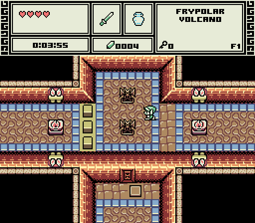
Polaris: Lol, love the caption. For a moment I thought, is this week's theme dragon statues? I'm curious about the object on the wall near the button. As a gameplay screen it's fine, but as a SotW entry I question the four-black-corners/cross composition.
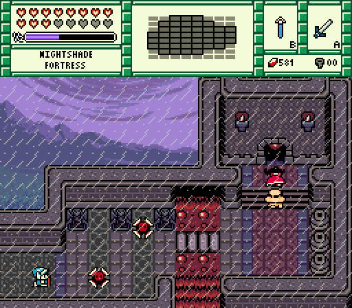
Demonlink: I feel this shot really pushed the design in a fresh direction. The layout is neat, the use of the background is dramatic and inspired, and the rain is a nice touch. I like how much story is in this shot at the top of a tower/castle. Is that a custom NPC behind "Ralph"? The only thing I question is why lava would be pouring out of the top of a castle- lava hissing in the rain is a cool idea, but where is the lava coming from and why I wonder. This was a very close second IMO. Also, the colors are nice.
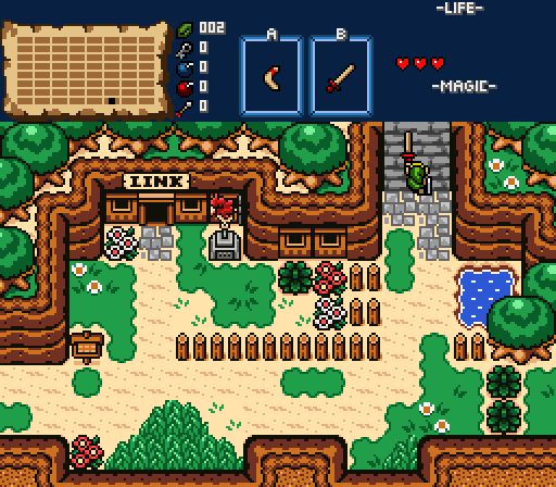
Sheik: Wow, I really like this! Vibrant, lush and colorful! I would totally play this. Looks so much more apealing than the empty landscapes of Z1. This took my vote simply for how fun and eye-catching this looks. Voted.

 This topic is locked