Well, I gotta say, this isn't the best month we've had but yeah, criticism time:
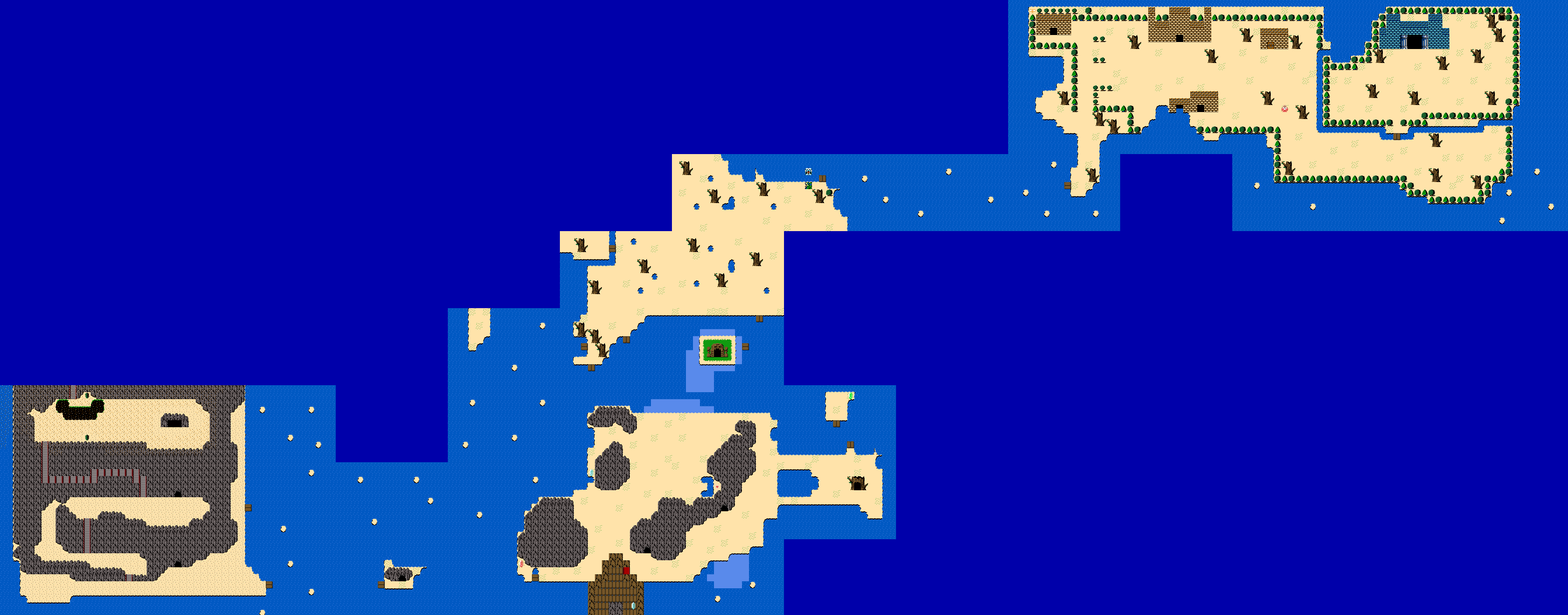
Joelmacool12 - RIP indeed. However, you have made better maps than this, and I can definitely see the improvements over this starting map. For one though, the land areas does seem a bit on the bland side and there isn't much ground detail. Furthermore, the ocean also seems empty with nothing much really happening. One last thing, those stairs over on the left look really odd with the mountain and don't look right at all. That can easily be fixed. Overall, not a bad map by any means, but can heavily be improved.
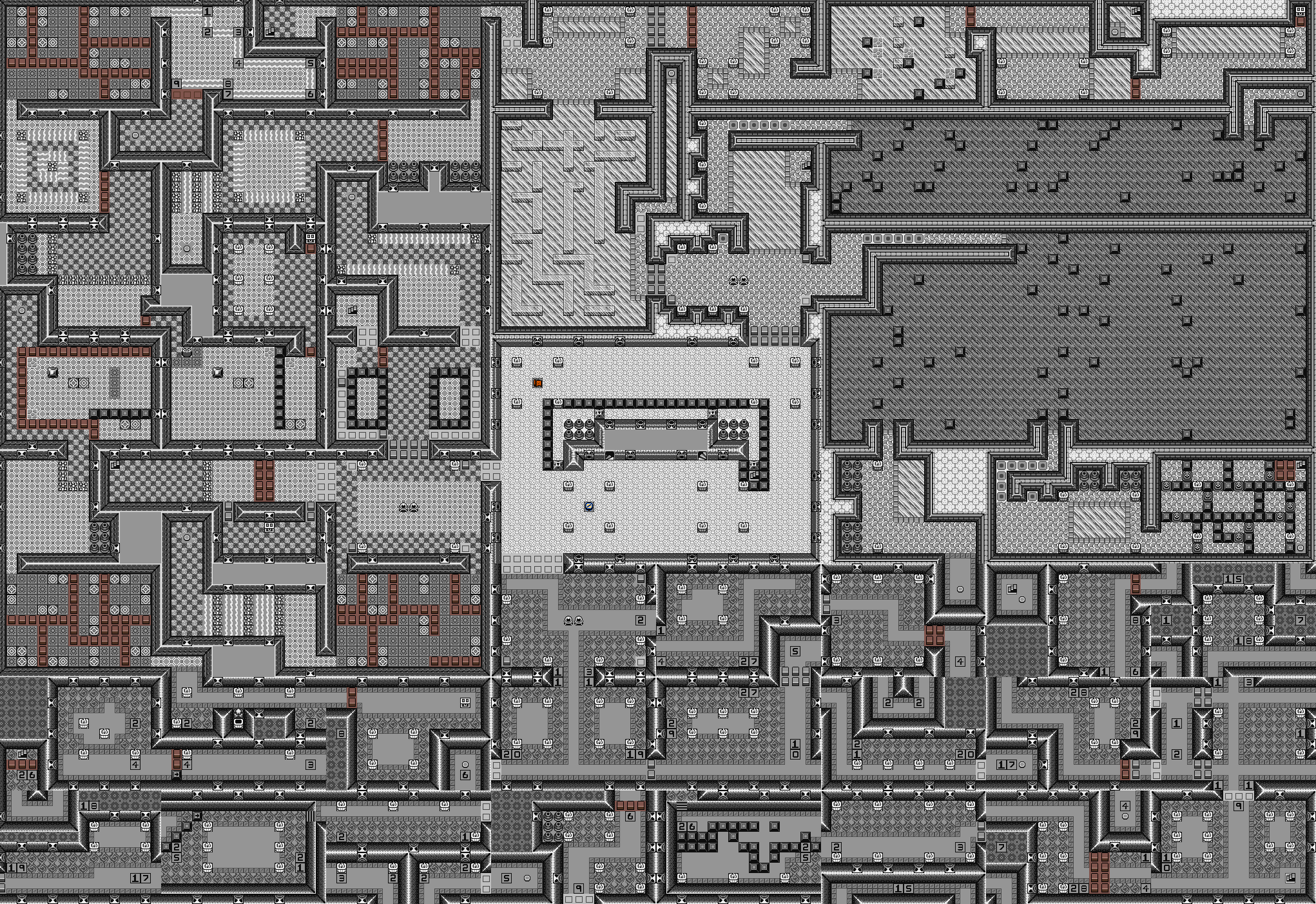
bmc10011 - This is definitely quite the map. I do appreciate the fact that there's plenty of detail to go around and I really do like the greyscale effect, though there are quite a bit of issues that prevent it from getting my vote. For one, I can spot a lot of tile errors where the walls just cut off and lead to nowhere. Things like this bother me and it just doesn't look good. I assume that's all a part of the gimmick of the dungeon, and if that's the case, then it would look much better during gameplay. Another thing is those random brown pillars. If you were trying to go for pure greyscale, it didn't really go too well since those brown pillars kinda destroy the whole greyscale look. Again, I assume that's for a gimmick, but it just doesn't look right to me. Finally, the dungeon content seems to be an over excessive use of puzzles. I dunno if content matters as much as map design for MotM, but I do need to make the comment that there are just far too many puzzles, and it seems like the dungeon will drag on forever and get pretty boring and repetitive pretty fast. There are some cool and unique puzzles though, but I would refrain from spamming them constantly throughout the dungeon, it would just feel better as a dungeon. Again, it's not a bad map, but there is plenty of room for improvement.
(Holy shit, that went on longer than I had thought >_<)
Overall, both maps aren't bad, but they aren't great either and they can both be greatly improved into something much better. Because of that, I'm actually going to null vote this month. I know some of you are like "HOW COULD YOU DO THAT EDDY ;_;" but it's because neither one really appealed to me. That and I dunno which one to vote for anyway lol

 This topic is locked


